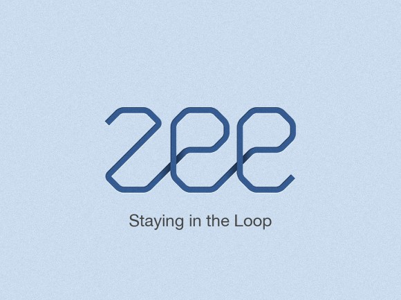
A few weeks ago we decided to redesign the Zee logo. When companies redesign their logos, that means, most of the time, that they are changing something in their business, it can be a new strategy, new products, etc… But it’s pretty much sure that something is new behind the logo. In our case it’s not different, we’ve changed our business model and decided to create a new logo.
With the idea of "Stay in the Loop", I decided to play in Illustrator to create a custom font for it. Also I wanted to make the logo resemble a bit of the Abduzeedo logo. We’re still working on the logo and the tag line, but the concept is this one that I will show you here.
So in this tutorial I will show you how I created the logo in Illustrator and the splash in Photoshop.
Step 1
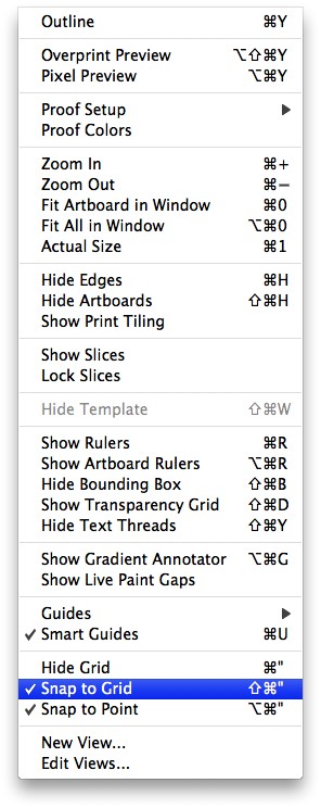
Open Illustrator and create a new document. Then go to View>Show Grid and then go to View>Snap to Grid. These 2 presets will be very important for us to design the font for the logo.
Step 2
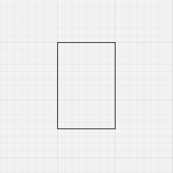
With the Rectangle Tool (M) create a rectangle using the grid.
Step 3
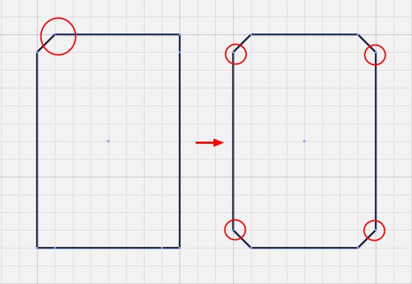
With the Pen Tool (P) add 4 new points on each segment of the rectangle. After that with the Direct Selection Tool (A) select each one of this points and move them um module of the grid away to create a chamfered corner.
Step 4
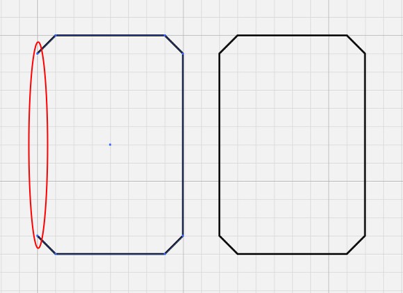
Lets start creating the Z. Still with the Direct Selection Tool (A), select the segment of the left side of the rectangle and delete it.
Step 5
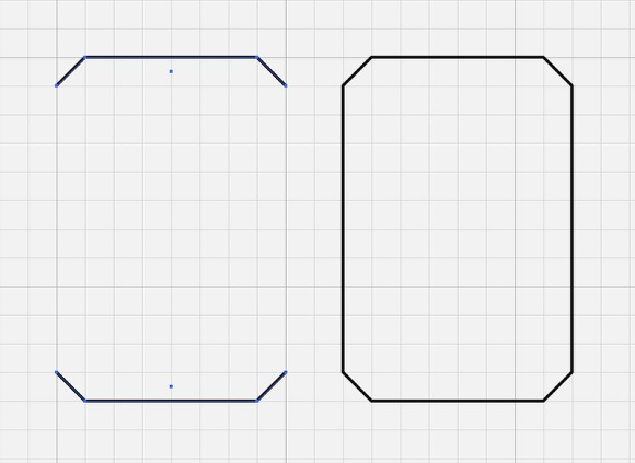
Delete the righ side now still with the Direct Selection Tool (A). Pretty much the whole process will be with the Direct Selection Tool (A) and the Pen Tool (P).
Step 6
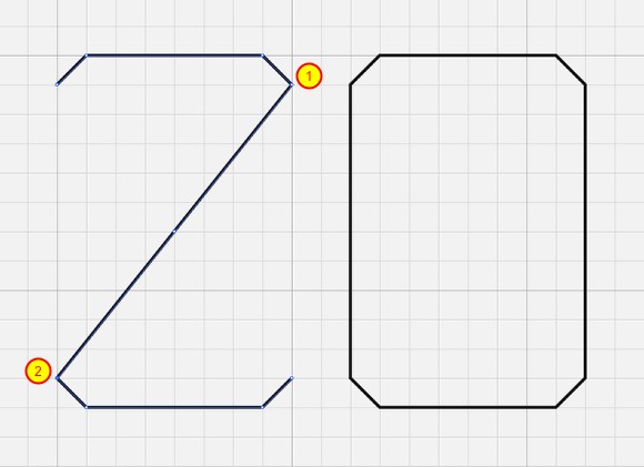
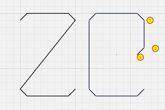
Now with the Pen Tool (P) click on the point 1 and then on the point 2 to create a diagonal segment. Our Z will be done.
Step 7
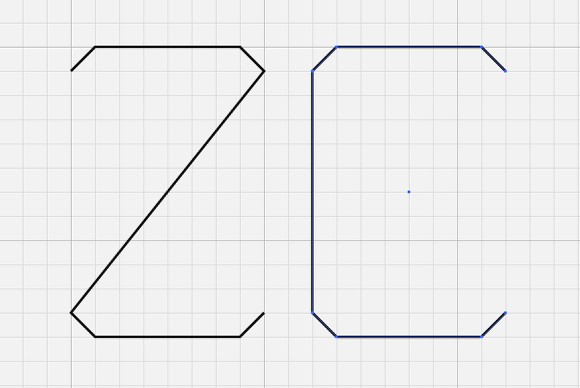
To create the E will be the same process. First let’s delete the right segment of our chamfered rectangle using the Direct Selection Tool (A).
Step 8
With the Pen Tool (P) click on the point 1 then holding SHIFT click a few modules down in the grid (point 2). The click again now one module left and dow to create a chamfered corner (point 3).
Step 9
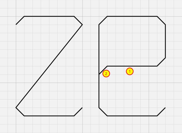
Still with the Pen Tool (P) create the segment 1 and the chamfered corner 2. Hold SHIFT to make sure that you’re creating straight lines, even though we have activated the Snap to Grid option. After that our E will be done.
Step 10
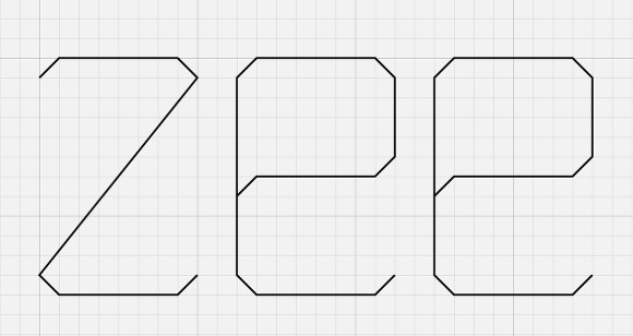
Now just duplicate the E and we will have the word ZEE.
Step 11
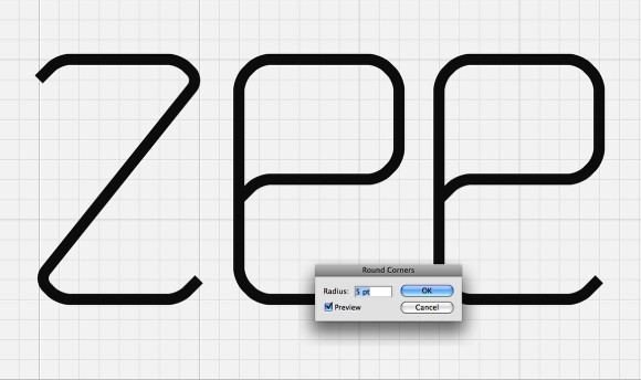
Go to Effect>Stylize>Round Corners. Use 5 points for the Radius or try different values to increase or reduce the round corners effect. However I didn’t like the result I wanted something more stylized.
Step 12
So I decided to increase in 2 modules the chamfer effect.

Step 13
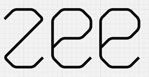
Now apply the Round Corner effect to the new logo, I still used 5 points for the Radius. The result is much better, it is much more like what I was looking for. But now I need to create a connection between the characters to give the idea of loop.
Step 14
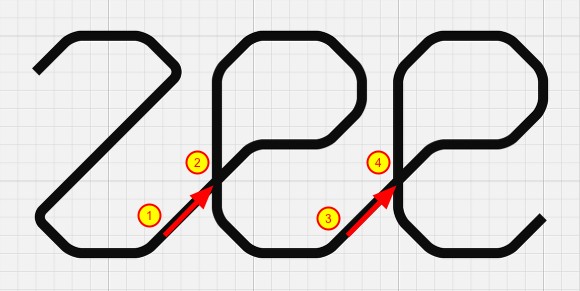
To do that it’s quite easy. With the Pen Tool (P) create the the segments to connect the Z to the E (1-2) and the E to the other E (3-4).
Step 15
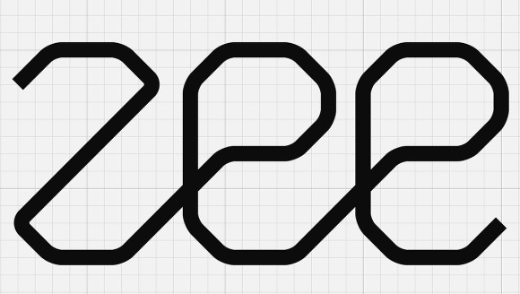
Now just increase the stroke size. I’m using 8 points for the stroke. The logo is done. It resembles those subway maps and has this idea of loop, exactly what I wanted.
Step 16
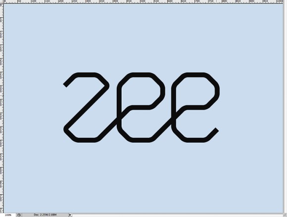
Now let’s open Photoshop and create a new document. I used 1024×768 pixels for the size. Fill the background layer with a very light blue (#dde9f5).
Step 17
Copy the logo from Illustrator and paste it in the Photoshop document.
Step 18
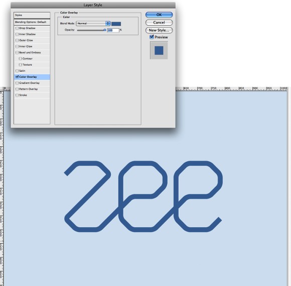
Go to Layer>Layer Style>Color Overlay. Use #5d87b6 for the Color and Normal for the Blend Mode.
Step 19
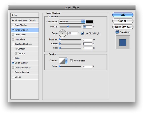
Now go to Layer>Layer Style>Inner Shadow. Use Multiply for the Blend Mode, black for the color, 40% for the Opacity, 120º for the Angle, 1 pixel for the Distance, 0 for the Choke and 1 pixel for the Size.
Step 20
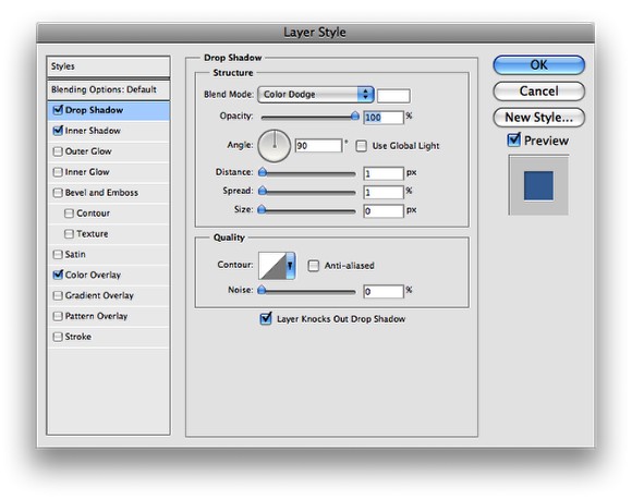
Now go to Layer>Layer Style>Drop Shadow. Use Color Dodge for the Blend Mode, white for the color, 100% for the Opacity, 90º for the Angle, 1 pixel for the Distance, 1 pixel for the Spread, 0 pixel for the Size.
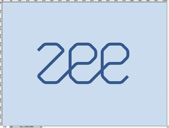
Step 21
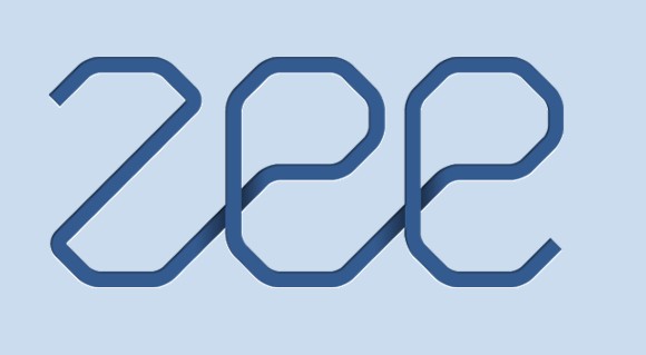
This is the effect you will have gotten so far.
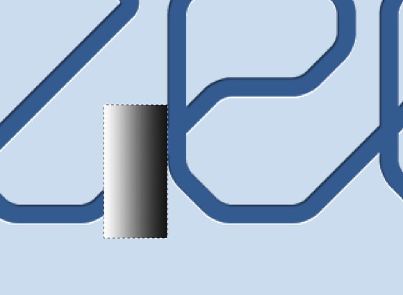
Step 22
Create a new layer and with the Rectangular Marquee Tool (M) create a rectangle selection and fill it with a white to black gradient with the Gradient Tool (G). Use the image below for reference.
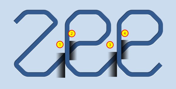
Step 23
Duplicate the rectangle and go to Edit>Transform>Flip Horizontal. Move it so it will be on the other side of the segment of the E (1-2). Duplicate those 2 layers and move to create the same effect on other E (3-4).
Step 24
Select the 4 gradient layers and group them. Them holding the Command key on a MAC or the Control key on a PC, click on the thumbnail of the Zee layer in the Layers Panel to create a marquee selection of the Zee logo. After that select the group with the gradient rectangles and go to Layer>Layer Mask>Reveal Selection.
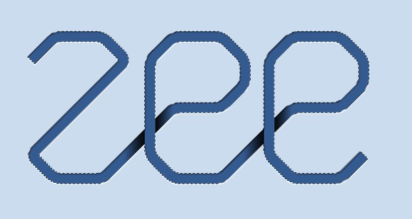
Step 25
Reduce the Opacity of the group with the gradients to 40%. That will make the effect much more subtle.
Step 26
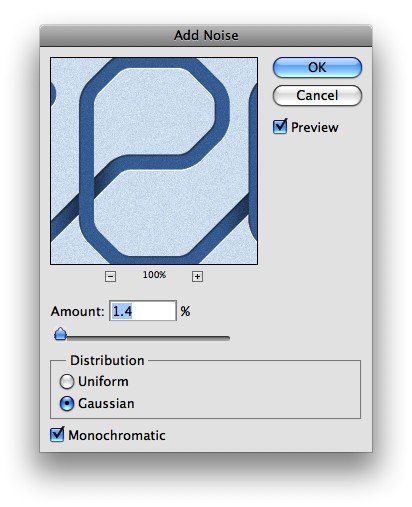
Duplicate all layers and merge the copies to a single layer. Then go to Filter>Noise>Add Noise. Use 1.4% for the Amount and select Gaussian for the Distribution and Monochromatic.
Conclusion
That’s it, we have a nice splash. We can add more stroke if we want to make the logo bolder. If you pasted the vectors in Photoshop using Smart Objects that is pretty easy, you can just double click on the smart object to open it in Illustrator and then just play with strokes over there. Now the cool thing is that the logo uses a font created from scratch what makes it quite original and it was really easy to do that in Illustrator using basic tools and the snap to grid option.


