

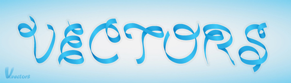
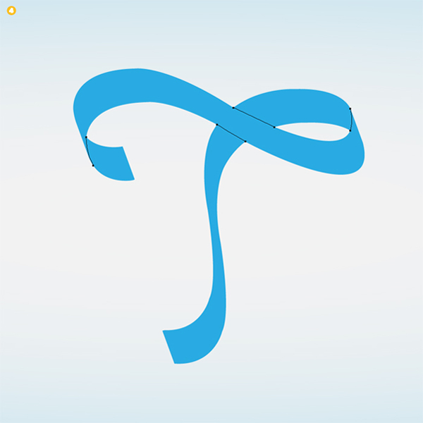
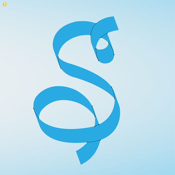
Final Product What You’ll Be Creating
Step 1
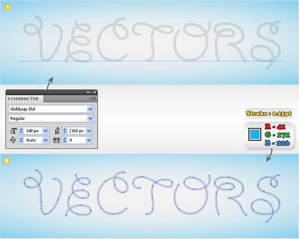
Create a 700 by 200px document. Select the Pen Tool (P) and create the letter shapes. If you don’t have any inspiration or imagination you can use the "Giddyup Std" font as a reference. Select the Type Tool (T) and add your text. Lock this text then pick the Pen Tool (P) and trace the letters. Fill these paths with none and add a 0.25px stroke (R=41 G=171 B=226).
Step 2
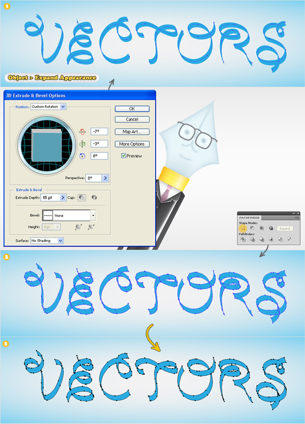
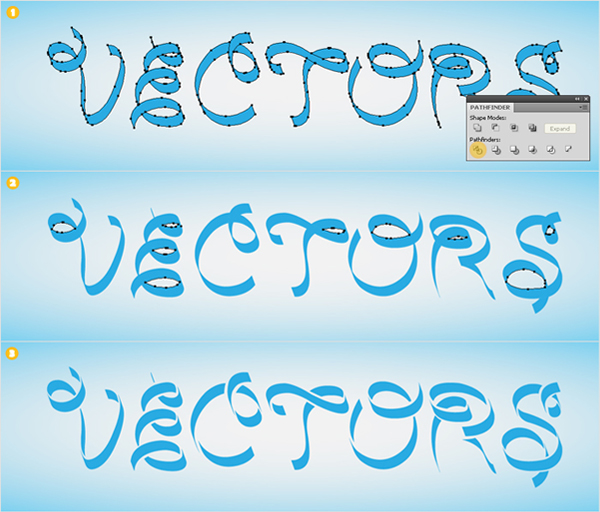
Select the paths created in the previous step, add the 3D Extrude&Bevel effect shown below image #1 then go to Object > Expand Appearance. Select the resulting shapes and click on the Unite button from the Pathfinder panel. Now, you should have the seven shapes shown in image #3.
Step 3
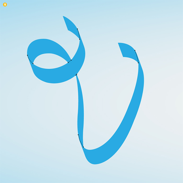
First, you need to take a closer look at these shapes and imagine how the ribbon would curve. Next, turn on the Smart Guides (U), select the Pen Tool (P) and create the separating paths (where the ribbon curves). Fill these paths with none (for both fill and stroke) and turn off the Smart Guides. Make sure that these shapes are filled with R=41 G=171 B=226.

Step 4
Select the paths and the letter shapes then click on the Divide button from the Pathfinder panel. Delete the shapes filled with none (selected in image #2). You should have the shapes shown in image #3. I’ve separated them so that they’re easier to distinguish.
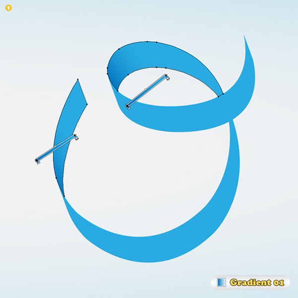
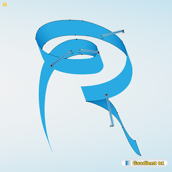
Step 5
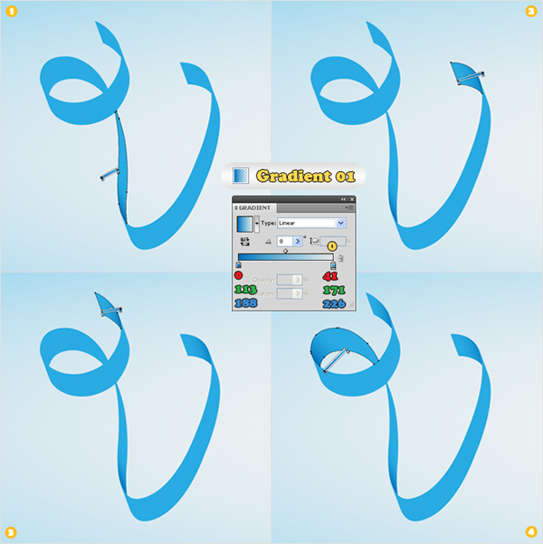
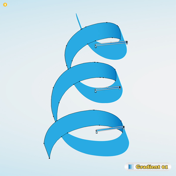
Now, let’s add some new colors. Start with the letter "V". Create the gradient shown in the following image and drag it inside the Swatches panel to save it. Name it "Gradient 01". Use this gradient to fill the shapes selected below.
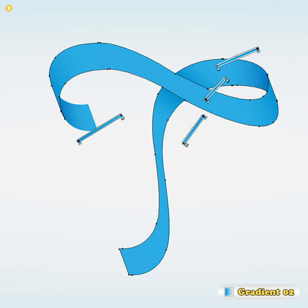
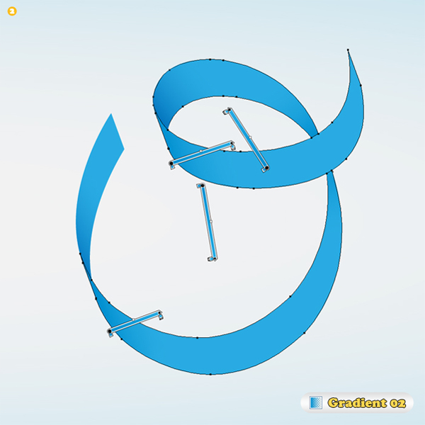
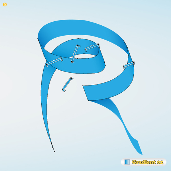
Step 6
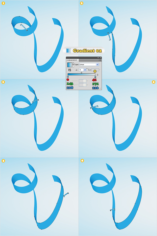
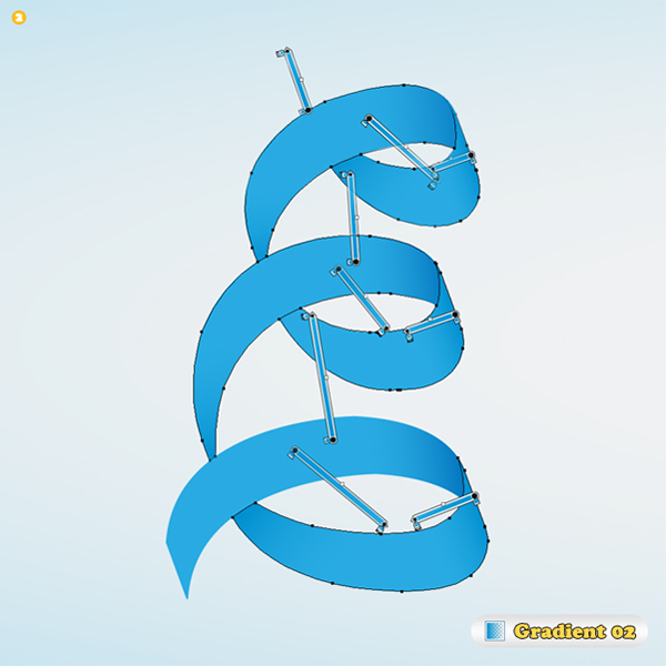
Create the gradient shown in the following image, save it and name it "Gradient 02". Use this gradient to fill the shapes selected below.
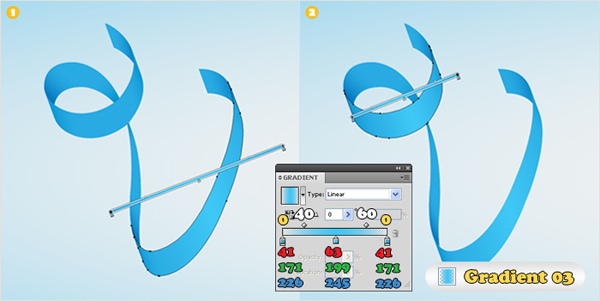
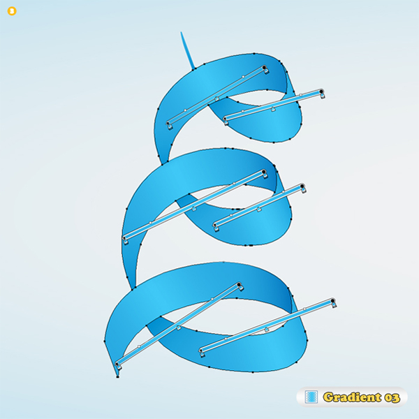
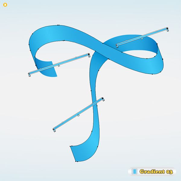
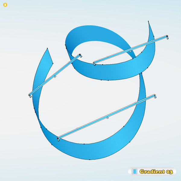
Step 7
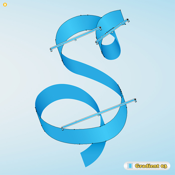
Create the gradient shown in the following image, save it and name it "Gradient 03". Do not forget to change the location of the gradient sliders (to 40% and 60%). Use this gradient to fill the shapes selected below.
Step 8
Continue with the letter "E". Use "Gradient 01" for the shapes selected in image #1, "Gradient 02" for the shapes selected in image #2 and "Gradient 03" for the shapes selected in image #3.
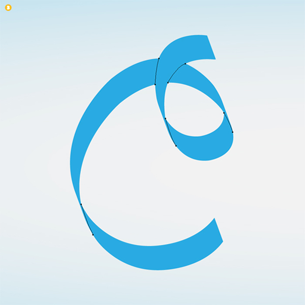
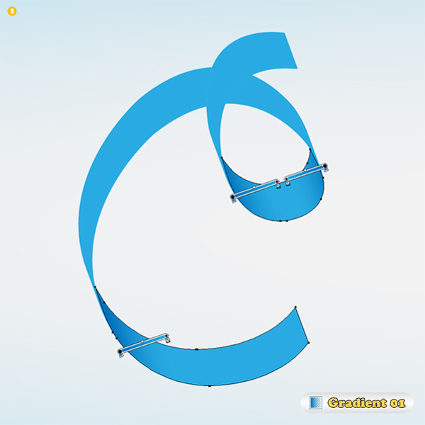
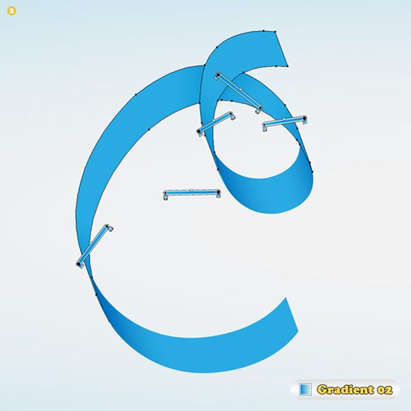
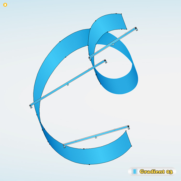
Step 9
Letter "C". Use "Gradient 01" for the shapes selected in image #1, "Gradient 02" for the shapes selected in image #2 and "Gradient 03" for the shapes selected in image #3.
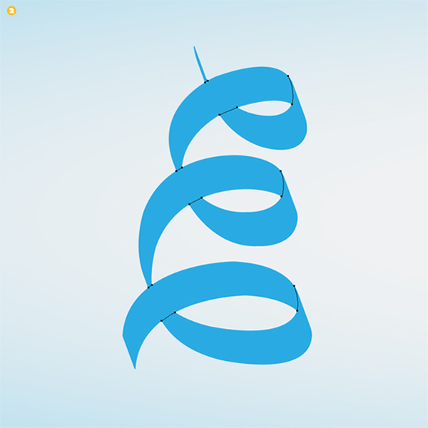
Step 10
Letter "T". Use "Gradient 01" for the shapes selected in image #1, "Gradient 02" for the shapes selected in image #2 and "Gradient 03" for the shapes selected in image #3.
Step 11
Letter "O". Use "Gradient 01" for the shapes selected in image #1, "Gradient 02" for the shapes selected in image #2 and "Gradient 03" for the shapes selected in image #3.
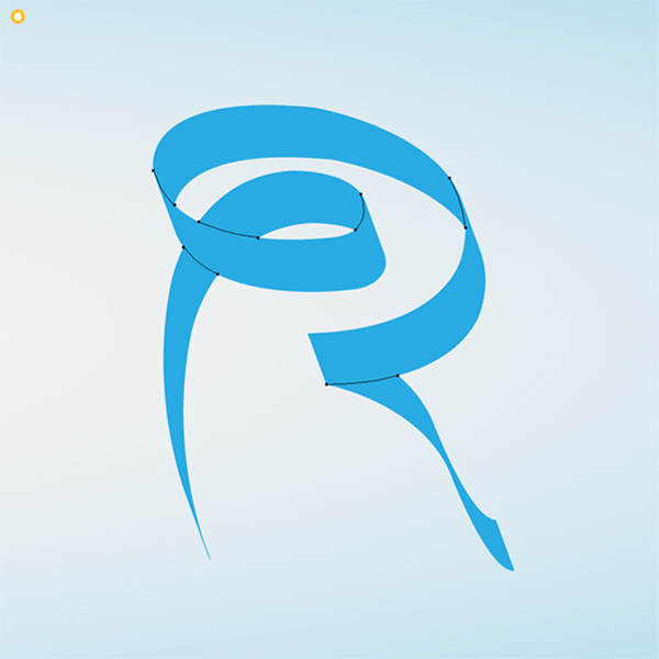
Step 12
Letter "R". Use "Gradient 01" for the shapes selected in image #1, "Gradient 02" for the shapes selected in image #2 and "Gradient 03" for the shapes selected in image #3.

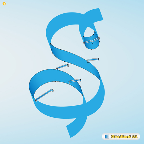
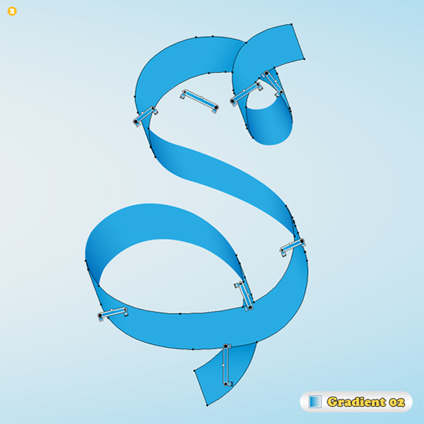
Step 13
And letter "S". Use "Gradient 01" for the shapes selected in image #1, "Gradient 02" for the shapes selected in image #2 and "Gradient 03" for the shapes selected in image #3.
Step 14
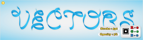
Finally, you can add a discrete stroke to complete the effect. Select all the shapes created so far and duplicate them. Select these copies and click on the Unite button from the Pathfinder panel. Send the resulting shape to back. Fill it with none and add a 5pt black line set to the outside. Lower its opacity to 3% and you’re done.
Conclusion
You’re done! To take this tut further you can try experimenting with varied widths of ribbon and a higher contrast gradients to create the illusion of perspective.