
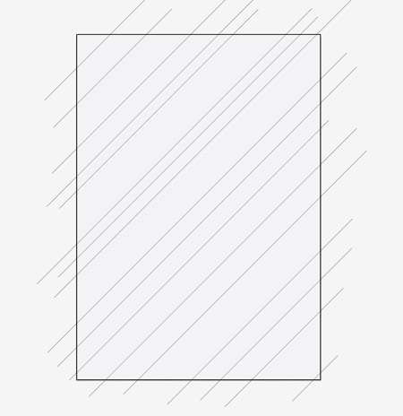
Open up Illustrator and create a document at the dimensions of your preference. Draw a rectangle to completely fill the artboard, then begin drawing diagonal lines across the document. Remember to hold Shift to constrain the axis.
Continue drawing more diagonal lines, this time in the opposite direction. Ensure all the lines start and end beyond the edges of the document.
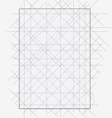
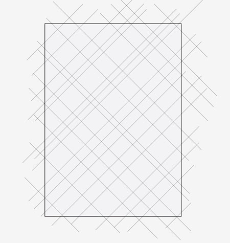
Repeat the process twice more, once with horizontal lines and again with vertical lines. The document should now be filled with plenty of intersecting lines.
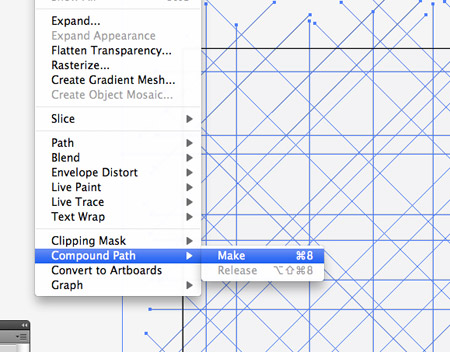
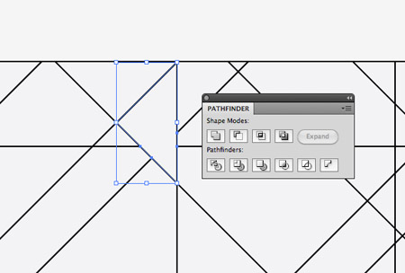
Draw a selection across all the elements, then Shift-click the main rectangle to deselect it. Make a Compound Path out of the selection of lines.
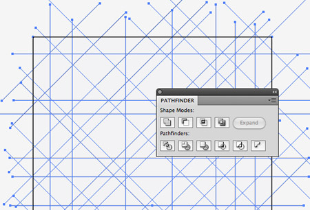
Shift-click the rectangle to bring it back into the selection, then click the Divide option from the Pathfinder palette.
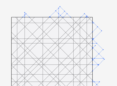
Right click and Ungroup, then draw a selection across all the excess lines around the edges of the document.
Some areas of the design where lines are closely intersecting are very small. Select any tiny shapes and merge then with their neighbouring elements using the Pathfinder.
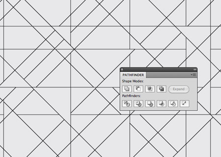
Go over the whole design from top to bottom merging groups of shapes to break up the flow of the linework.
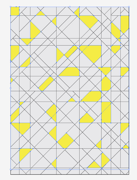
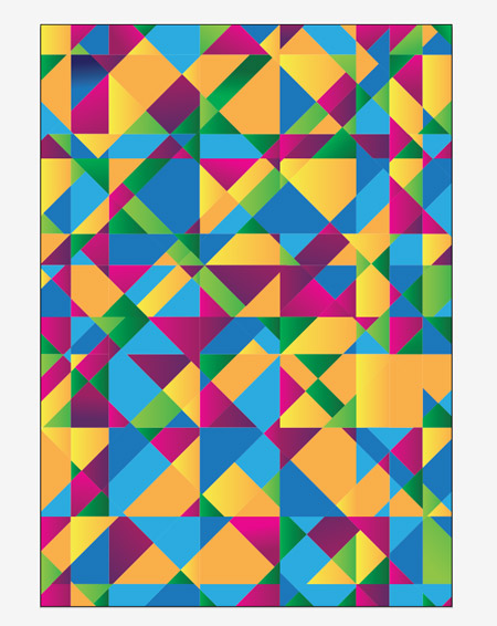
Next, hold Shift and randomly select a bunch of shapes across the whole design. Give these shapes the first colour fill. Press CMD 2 to lock them so you don’t select them in the next step.
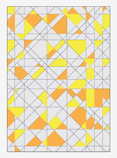
Select another bunch of random shapes and give these the next vibrant colour, this time a bright orange fill.
Continue the process of selecting, filling and locking shapes using blue, pink, green and purple.

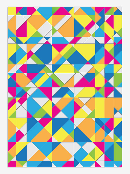
The abstract design is starting to come to life now colour has been added, but it’s still looking a little flat.
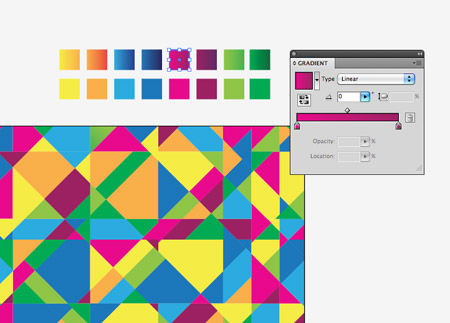
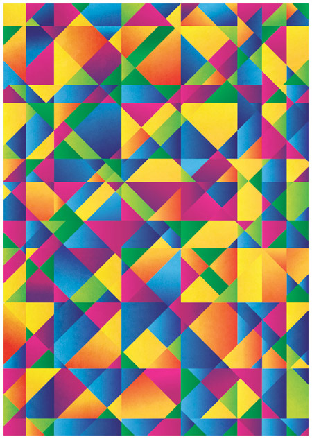
Make a copy your selection of colour swatches, then change the fills to gradients using a darker shade of each colour.
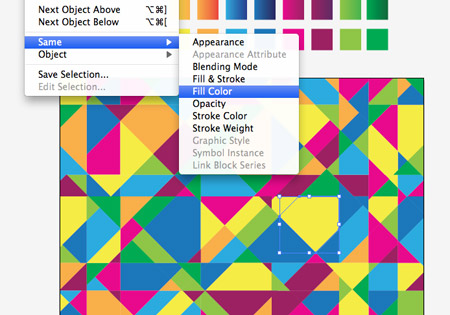
Select one of the coloured elements and go to Select – Same – Fill Color. Change their fill to the corresponding gradient using the Eye Dropper tool.

Repeat the process using the next colour swatch. Use the Gradient Tool to adjust the gradient angle on a few elements to mix up the directions.

Once all the coloured elements have their gradients the design has a much bigger sense of depth where the shapes seem to stand out from the page.
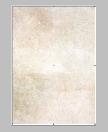
To finish off the design, copy everything and create a new document in Photoshop. Import a subtle texture into the background.
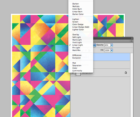
Paste in the vector elements into the Photoshop document and change the blending mode to Linear Light. Alter the opacity to around 80 percents.
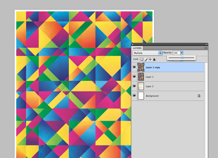
Some of the colours are a little too blown out, so paste in another copy of the vector elements. Change this layer to Multiply at around 55 percents.
The addition of subtle texture to the design really helps give the poster a tactile and more interesting feel, while the clever blending modes in Photoshop enhance and brighten the colours.