


イラストレータでデザインをやってみましょう
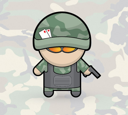
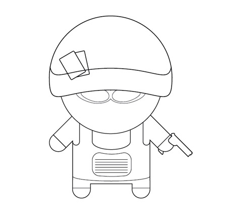
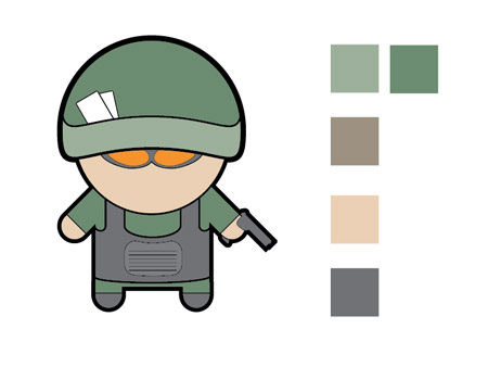
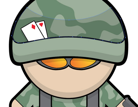
Similar to the recent mechanic character tutorial, this soldier cartoon features a range of basic shapes to give a stylised appearance. The main body of the character uses exactly the same approach, with just the accessories and clothing defining the character. You could go on to create a whole series of characters each with a different profession.
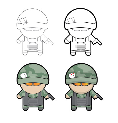
You can see the design take shape as it progresses from the black and white linework versions right through to the final colouring stages. Notice how the varied linework enhances the basic version, and how the shading enhances the flat blocks of colour.
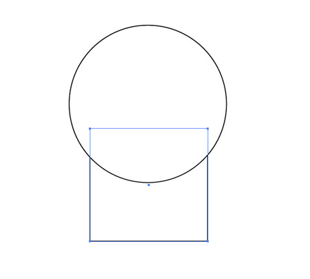
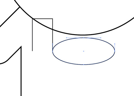
Open up Illustrator and begin by drawing a circle and a rectangle onto the artboard to represent the head and body.
Use the Rounded Rectangle Tool with max corner radius to add some limbs. Align two legs with the edges of the body, then rotate two arms by 45 degrees and position them underneath the head.
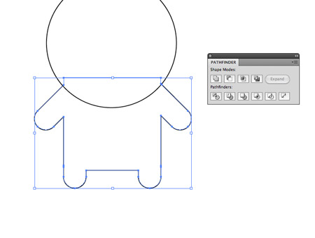
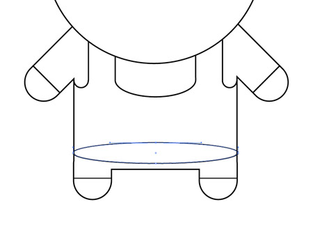
Select all the objects that make up the body and blend them together using the Merge option from the Pathfinder tool.

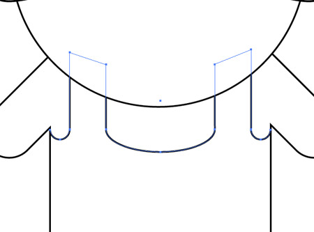
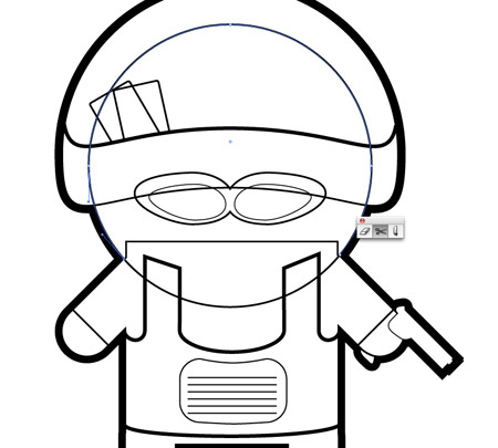
Copy the head (CMD+C) and paste in front (CMD+F), then move the lower most point vertically with the Direct Selection tool. Switch to the Selection Tool and scale up the shape to form a helmet.
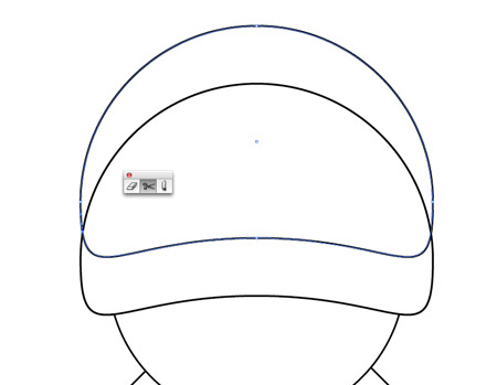
Duplicate the shape and move it upwards to create a parallel line along the lower edge, then use the Scissors tool to clip the shape where the lines intersect. Delete out the excess.
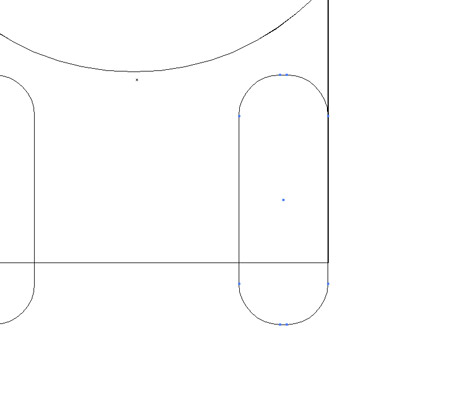
Use a series of rectangle and oval shapes to draw the outline of body armour. Use the Direct Selection Tool to delete out edges and points to create open paths.
These paths can then be aligned and joined by zooming right in, selecting an open point from each shape and hitting CMD+J.
Draw an oval in the lower region of the body area and delete out the top most point to leave a curved line to indicate the edge of the body armour.
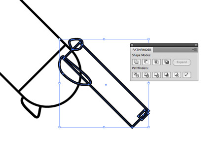
Draw and position a range of shapes using basic rectangles and custom shapes with the Pen tool to create a pistol. Merge all these shapes together with the Pathfinder tool.
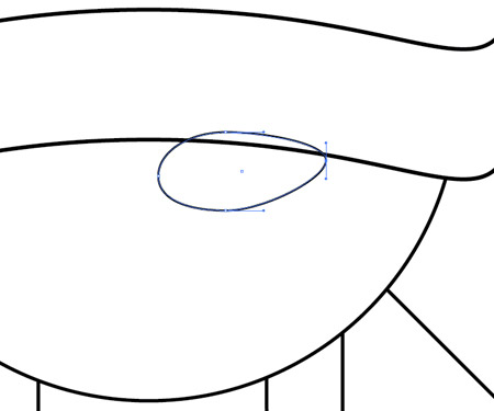
Use an oval as a base for a sunglasses lens. Adjust the shape by dragging the points out of position to distort the shape.
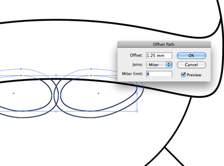
Reflect a copy onto the opposite side, then with both lenses selected go to Object - Path - Offset Path. Enter 1.25mm to create a frame for the sunglasses.
Continue adding in fine details until the character and its features are recognisable. Simple lines across the arms and legs identify where the clothing ends.
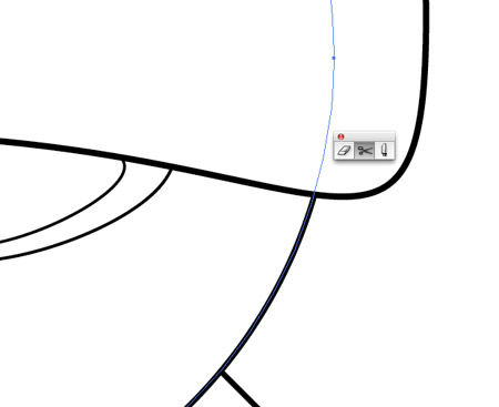
In order to create a thick outline, use the Scissors tool to intersect the paths that flow along the outer edge. Re-join the paths so a continuous path follows the entire outline of the character.
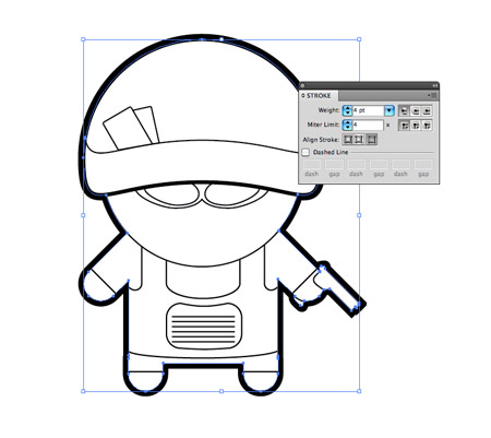
Increase the stroke weight of this outline to 4pt and align the stroke to the outside.
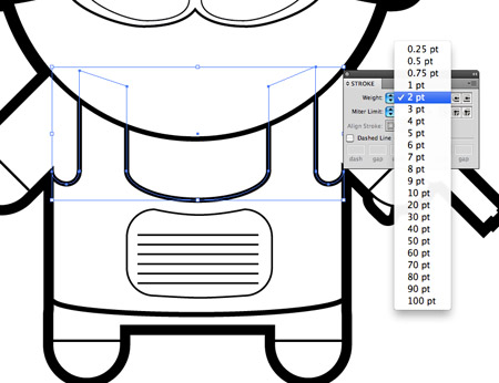
Adjust the stroke weights of the linework in the centre areas of the character. Use 2pt weights on linework that identifies an important feature and lower weights on finer details.
The character is now taking shape with the varied line weights adding great definition to each of the features.
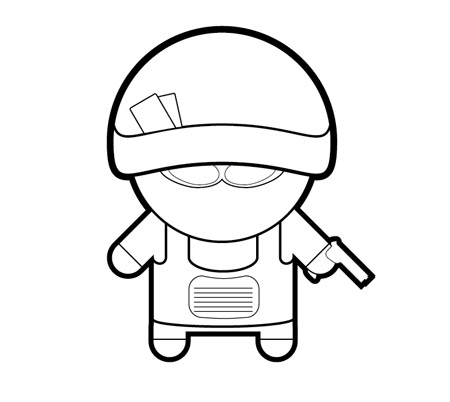
The illustration shouldn't have white fills on any of the elements, so make sure the design doesn't break when these fills are cleared. Use the Scissors tool to clean up the design by deleting out unwanted linework.
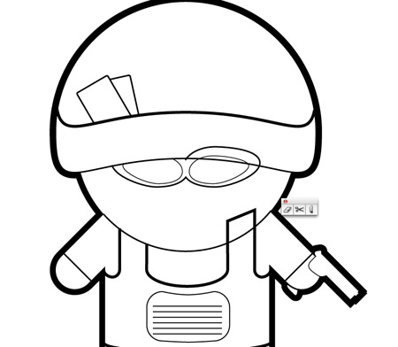
The upper half of the circle used for the head, the excess areas of the body armour and the sunglasses have all been clipped and deleted so the illustration works without any fills.
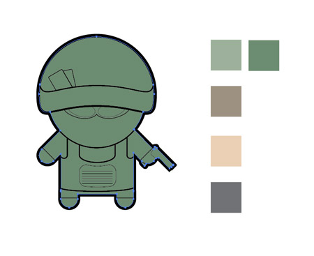
Create a new layer and paste a duplicate of the outlining shape. Swap the black stroke with a green fill to create a base for the colour blocks.
Lock the linework layer and use the Pen tool to carefully trace each object with a fitting fill colour. Aim to keep within the confines of the black stroke areas.
Continue building up blocks of colour to define each area of clothing, skin and armour. Remember these lines can be quick and rough as long as they're hidden by the black linework on the layer above.
The illustration is looking even better with colour, but it still looks a little flat. This is where a couple of simple shading techniques really bring it to life.
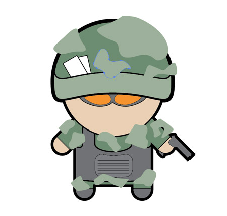
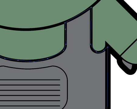
Use the Pen tool to draw a bunch of camo blobs across the character and fill them with a slightly lighter shade of green.
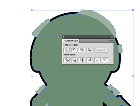
Select all the blobs and hit CMD+8 to create a Compound Path. Copy the outlining shape and bring it to the top (CMD+Shift+]), then use it along with the Pathfinder tool to Intersect the shapes to clip them down to the outline.
For the inner camo blobs, repeatedly press the CMD+[ shortcut until they sit below the other colour elements, which will hide any excess.
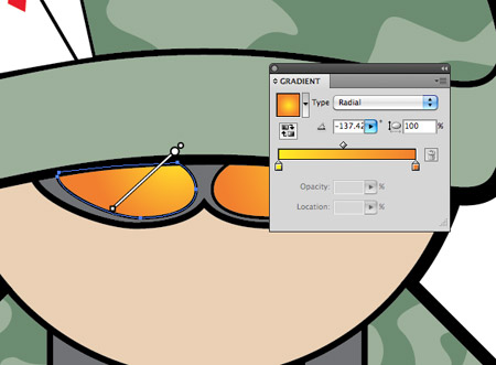
Add an orange to yellow gradient to the sunglasses and adjust the angle with the Gradient tool.
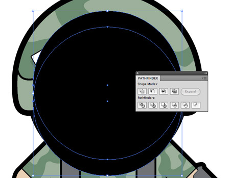
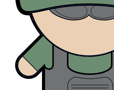
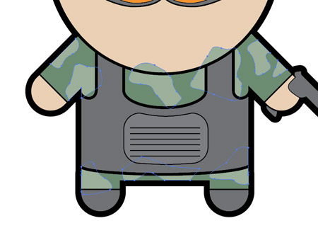
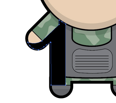
Next, draw a large black circle over the head area that just covers a small area of the body. Duplicate this shape and move it upwards slightly, then click the Subtract option from the Pathfinder palette to clip out the shape.
Draw a quick shape with the Pen tool to overlap any excess that spills onto the helmet and use the Pathfinder to clip away the unwanted shapes.
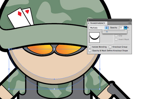
Change the blending mode of this black fill to Multiply and set the opacity to 15% to create a subtle colour change for the shading.
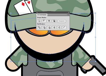
Continue drawing these shading areas across the design to give the impression of depth. Make copies of existing shapes to make parallel lines, then clip out the excess with the Pathfinder.
Use the Pen tool to draw a shadow across the hand, arm and body. Give this shape the same 15% Multiply styling to convert it into shading.
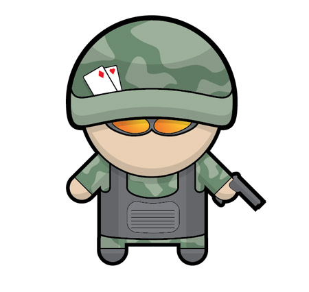
These shading elements don't have to be 100% accurate or realistic, just a few blocks of subtle shadows will do a great job of adding an extra dimension to your illustration.
サイト内検索
イラストレータの勉強
グラデーションと分割 図形と合流・型抜き ロゴマークの作成 テキスト落書き VECTIPS Logo Vectortuts Logo 水滴の作り方 WATER グラデーション背景 竹 リボン 薬カプセル かぼちゃ 緑の玉 亀さん 気球 花びら つやのある球 ロゴ vectips ロゴ Zee ロゴ 風船 ロゴ UPWARD ロゴ ZERO ロゴ VECTORS ロゴ VECTORSその2 ロゴ WOOF ロゴ Don't Break ロゴ Smooth ロゴ VECTORSその3 ロゴ VECTORSその4 ロゴ VECTORSその5 ロゴ VECTORSその6 ロゴ VECTORSその7 ロゴ VECTORSその8 ロゴ VECTTIPSその1 ロゴ VECTTIPS その2 ロゴ VECTTIPS その3 ロゴ VECTTIPS その4 ロゴ VECTTIPS その5 ロゴ VECTORSその8 ロゴ VECTORSその9 ロゴ VECTTIPS その6 ロゴ ROMERO WEEK ロゴ VECTORSその10 ロゴ ECLIPS ロゴ ROCKEY ロゴ VECTORSその11 ロゴ VECTORSその12 ロゴ Tutorial Shock ロゴ VECTORSその13 ロゴ VECTORSTUTS ロゴ ARCADE LOVE ロゴ Zeeその2 ロゴ VECTORS PUFFS イラスト1 イラスト2 イラスト3 イラスト4 イラスト5 イラスト6 夜空 3D ロゴ 葉と水玉とテントウムシ イラスト10 イラストカーテン イラスト木目 イラスト 幻想 イラスト メッシュの葉 イラスト 靴 イラスト 家 イラスト9 イラストレータ フォトショップ イラストレータV10の使い方デザインの勉強
デザインの基礎 AIRに挑戦 AOBADAIに挑戦 DOWNFALLに挑戦 フレームに挑戦 BOXグラフに挑戦 LUCKに挑戦 オレンジに挑戦 リングに挑戦 STORMに挑戦テキストにチャレンジ
カタカナ入力 七夕様 相田みつをの世界 誕生石 誕生石と誕生花 フランスの国旗 ドイツの国旗 イタリアの国旗 日本の国旗 ロシアの国旗 シャガール 犬のおまわりさん 拡張子 メニュー パン 世界の国旗 気になる言葉2 気になる言葉3 大きな古時計 オリエント急行 お料理教室 おしながき パソコン専門用語 地図・・・PC検定 メニュー 紅茶 特殊文字 占いいろいろ ウォルトディズニー 全館停電 ひまわり図鑑 ゆり図鑑 テキスト 初級 テキスト 中級① テキスト 中級② テキスト 上級① テキスト 上級② アロマセラピー講座1 あなたと薬 アロマセラピー講座2 オーストラリアの動物 美人が作るレシピ ブログ お料理知恵袋 ゆば ドトールコーヒー物語 地震 円の国際化 福原 愛 振り込め詐欺 楽しいガーデニング ガーリック クリップアートの色を 埼玉の観光 山梨の観光 ゴールデンウィーク はがきで挨拶 敗戦の時 阪神タイガース ハワイに行こう ヒアルロン酸 肥満の知識 ほくろがガンに要注意 今すぐトライ インターネットで調べよう ITニュース 日本のお茶 時代を切り開いた女性1 時代を切り開いた女性2 地獄めぐり 時間割 スポーツの審判 花粉症 段落番号の設定 神奈川県 漢文とは中国語か? 阪神タイガース 漢字の偏見 関節痛 ゴールデンウィーク 簡単お弁当レシピ キーボード 国民年金 暮らしを楽しく 草花図鑑その1 草花図鑑その2 行頭文字の設定 段落番号の設定 主な国際機構 浅田真央のプロファイル 数学図形の問題1 パソコンについて 中原中也 オーガニックコットン1 オーガニックコットン2 落ち葉の森 お大事に 奥の細道 ページ番号の設定 埼玉の観光 ラーメン博物館 レシピ1 レシピ2 連絡網 履歴書 竜宮城 竜宮城バザー 世界の気候 脂肪を燃やせ 資格 四季折々の野菜 春 四季折々の野菜 冬 下町で 食品の分類 生涯学習 生姜と豚肉 四季の折々野菜(春) 四季折々の野菜 秋 四季の野菜 春 下町で遊ぼう そばの献立 サッカー世界標準 スターバックス すだちとかぼす スーパーサッカー 数学の問題2 体内チェック 寅さんシリーズ1 寅さんシリーズ2 寅さんシリーズ3 寅さんシリーズ4 海から吹く風 横浜ベースターズ 郵便払込み 湯河原独歩の湯 ゆかた祭り模写は意外と簡単
大黒様 着物の柄 富岳百景 ベートーベン オペラ座 ミニー ゴメン 母の日 ドラゴンボール 潮干狩りパソコン教室
パソコン教室の特徴 会員の最大の特典は? パソコン教室の会員の種類 すべて個人指導で、解りやすく 出張!パソコン家庭教師 追加受講する場合 日曜教室、始めました パソコン教室の料金体系何を学ぶか?
どんなサービスか? 学べるソフト一覧 ホームページを作ろう パワーポイントを勉強しよう 模写の勉強 デザインの基礎 ビデオの編集をやってみよう。