

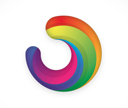
Usually I’d always recommend for a logo to be developed in relation to
the company or brand it is representing, but today we’re just going to look
at the technical part of building this generic icon. This graphic features many
of the trends in logo design seen today – The three dimensional appearance, gradients
and variances in tone.

Open up Illustrator and create a new document. Grab the circle tool and begin
laying out the basic shapes of the icon. Place a small circle inside a large circle,
then add smaller circles between the outlines of the two.

Zoom in and press CMD+Y to switch to outline view. This will help you accurately
align the shapes so the paths match exactly without any overlap.

Use the Scissors tool to clip each path where the two lines meet, then select
the unwanted portions of the shapes and delete them.

Zoom in and select the two open points from each paths, right click and select
Join. Repeat this for each of the clipped lines to form one continuous path outline.
Make a copy of this shape as we’ll need it later.
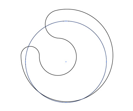
Draw another circle over the shape so the outline cuts across and neatly
flows back into its outline.

Use the Scissors tool to cut points where the two lines intersect and delete
out the excess, leaving just a line flowing along the inside of the graphic.

Continue adding lines inside the graphic using circles of various sizes,
then cut and delete out the excess with the Scissors tool.

Select the Pen tool and click on the open point of the line to continue the path.
Roughly draw a route around the graphic until you reach the other end and click
on the remaining open point to close the path. Select this shape along with the
overall graphic shape and click the Divide option from the Pathfinder window.

Right click and select Ungroup, then delete out the shape with the rough outline.
Give the newly created segment a colour fill to identify it.

Continue this process with the remaining segments, creating smooth shapes from
the intersecting lines. Add random colour fills to each piece.

Use the Gradient tool to switch the ugly tones for vibrant colours.
Select colours in their colour wheel order (or rainbow order!),
so the first piece flows from red to orange, the second from yellow to green and so on.

Switch the gradient style to Radial and adjust the flow so the colours run
nicely along the direction of the shape.

The graphic is looking pretty cool so far, but we can enhance it with some clever shading.
Draw a circle to intersect the first shape.

Select this circle along with the first segment and press the Intersect option
from the Pathfinder palette.

Repeat this process for the other segments, then give these shapes a black fill
with the settings of Multiply at 10% opacity.

Hopefully you saved that original outline we created as we’ll now need it to
overlap our logo graphic. Carefully position the shape so it fits perfectly over our
colour version.

Give the shape a white fill and set it to Multiply, then go to Effect – Stylize
– Inner Glow. Alter the settings to Multiply, Black, 20% opacity and 5mm blur.
The addition of various gradients, shading elements and the inner glow effect
really enhances the graphic, giving it depth and a three dimensional appearance.
If you enjoyed this post, please consider giving it a tweet or a thumbs up using
the social buttons below to share it with your friends. It really helps out!