

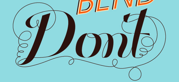
Final Product What You’ll Be Creating

Illustrator Effect on a Typeface
First, I’ll touch base on the Extrude & Bevel Effect in AI. Personally, I rarely ever use effects or filters, but this will give us a good variety to the lettering style options.
Step 1a
First, we’ll lay down a color scheme and background color. Here I have three color swatches, cream (R=246 G=229 B=198 1), orange (R=236 G=116 B=38 1) and brown (R=52 G=22 B=13 1). With a light blue (R=174 G=222 B=228 1) background color.
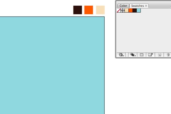
Step 1b
With this bevel style we’ll briefly touch on the Bevel effect options in Illustrator, so just start with an existing typeface. Type out the word “BEND.” I am using the font ITC Avant Garde Gothic, Medium Oblique. We’ll need to fill it with a color (orange) so that you can see the bevel/shading effects.
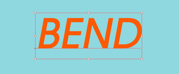
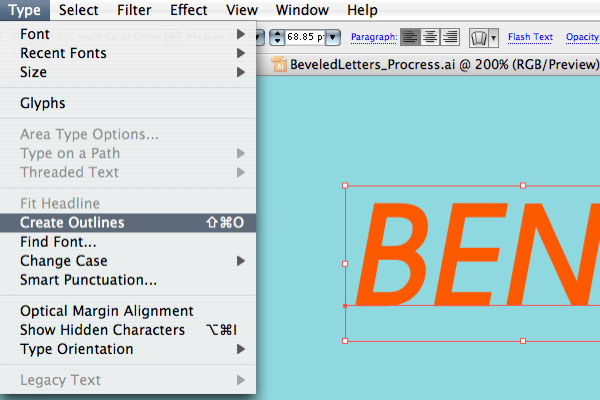
Step 1c
With the type selected go to Type > Create Outlines.
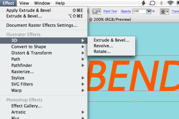
Step 2a
Select the “BEND” type and go to Effect > 3D > Extrude & Bevel.
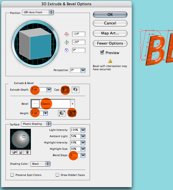
Step 2b
In the option window, first select the Preview check box, so that you can see the effect that is being created. Next, fill in the options as shown here. We will apply a slight extrusion (3D) effect, to better showcase the beveled edge. The key options to pay attention to are as follows: Extrude Depth of 5pt, Height of 2pt, Cap set to On, Bevel of Classic, Bevel Extent In set to On, and Blending Steps at 1. Now hit OK, once you satisfied with the bevel effect.
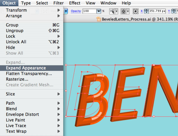
Step 2c
Go to Object > Expand Appearance.
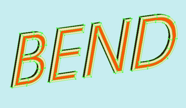
Step 3
Refining the color will better showcase the beveled edge of the “BEND” type. Click into the group and using the direct select arrow, fill the 3D portion with brown, the beveled edges with cream and the front (planes) of the letters with orange.
Adding to a Script
Next, we’ll move into an additive technique based on script lettering. In this approach, by thinking ahead and building the framework of the lettering it only take a few additional steps to render beautiful beveled script lettering.
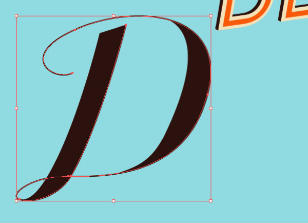
Step 4a
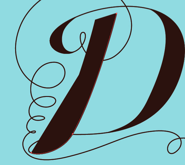
We’re going to create the word “Don’t.” These letterforms will have nice, thick vertical strokes leading into very thin horizontal based strokes. Use the pen tool to draw the thin vertical stroke of the “D.”
Step 4b
To complete the “D” use the Pen Tool to draw a line with a 1pt brown stroke. Remember the super simple technique, that I have showcased in numerous previous tutorials, of selecting an anchor point with the Direct Select Tool and pasting it above the “D,” and continuing to draw with the Pen Tool to get a clear, consistent line.
Step 5a
It is helpful to set-up a few quick guides to help establish some consistency with the letterforms.
Step 5b
Complete the rest of the thick, vertical strokes of the script lettering.
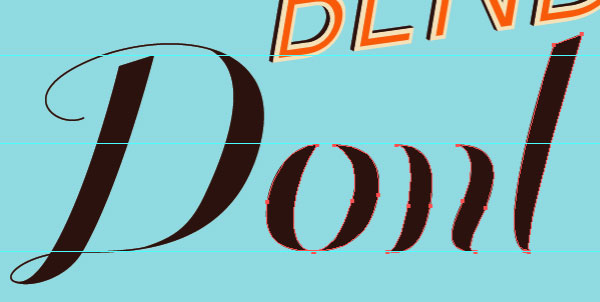
Step 6a
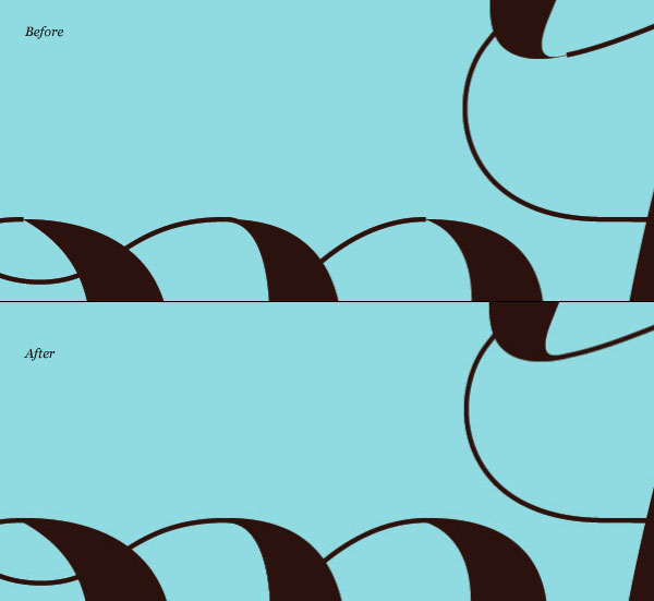
Again, using the direct-select copy and paste method, easily create the thin horizontal strokes of the letters. Don’t forget the apostrophe mark! Mind the guides.
Step 6b
And for a bit of fun, draw a line with a 1pt brown stroke, and add some fancy script ornamentation.
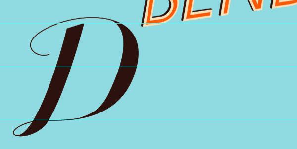
Step 6c
You may notice some small inconsistencies along the edges of the letters. To fix those, select the thick vertical letter-form strokes and apply the same brown 1pt stroke to the already brown fill shape. This should give you a clean, fancy script of the word “Don’t.”
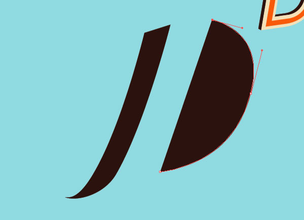
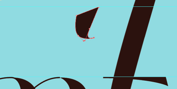
Step 7a
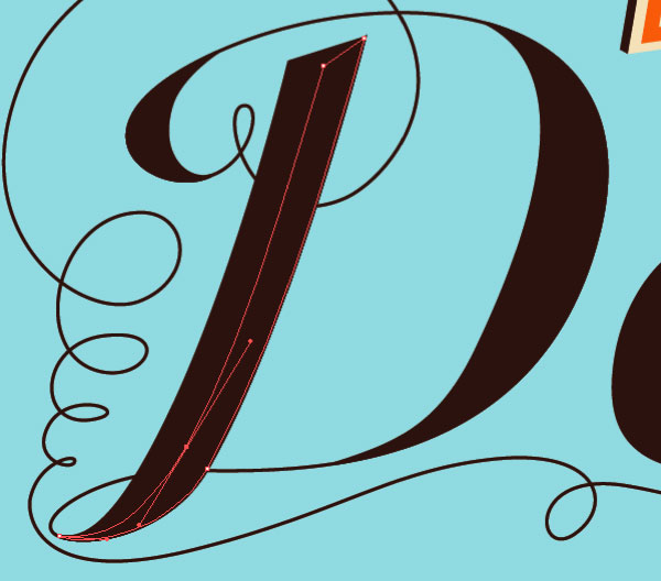
Now, we finally get to the beveling of the script lettering. With the way the letter-forms were made, it’s very easy to create the bevel. Use the Direct Selection Tool (white arrow) to select the bottom right anchor point on the vertical stroke of the “D.” After clicking off of the shape you selected it from, paste in front (Apple + F). This will give you the basis of the bevel shape.
Step7b
Using the pen tool, draw from the top point of the newly pasted shape at an angle and down the middle of the vertical stroke.
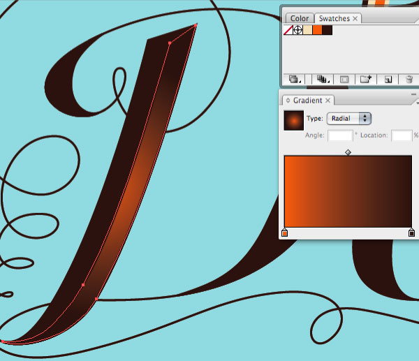
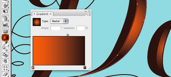
Step 7c
Next, apply a radial gradient, which goes from orange to brown. Boom! You’ve got some nice bevel action.
Step 8a
Apply this same Direct Select + Paste in front + Draw (down center) + Radial Gradient process to the rest of the letters.
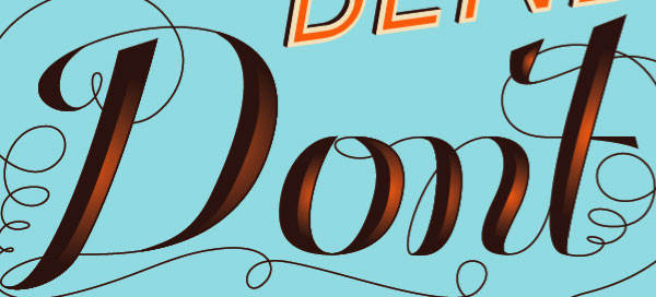
Step 8b
To adjust the highlights, simply use the gradient palette and if needed re-establish the gradient with the Gradient Tool. Just remember to keep the light coming from the right, like the rest of the letters.
Dividing a Slab Serif
And for the finale we’ll render some nice beveled slab serif lettering. This approach can be tedious, but once you get the hang of it, then it will go really fast because you can copy similar shapes. The basic idea is that instead of drawing the actual shapes to execute the bevel, you draw lines to break apart the letter shapes, and with color you create the bevel effect.
Step 9a
Creating these slab serif letters could be a tutorial on their own, but basically keeping consistency in mind, build the letters from congruent shapes and pieces. Thus keeping the stroke width of all the letters consistent throughout.
Step 9b
In-order to work with the letters, be sure each letter is one single shape. To do this, select all of the shapes that create the letter and in the Pathfinder palette select the Add To Shape option, then click expand.
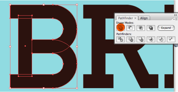
Step 9c
Expand all of the letters to one shape.
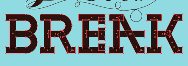
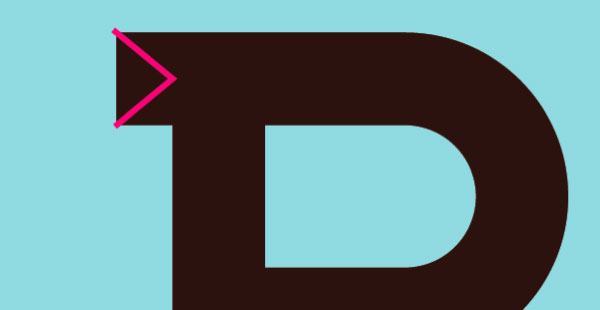
Step 10a
Next we’ll establish the center of each stroke of the letters, where we want the bevel to be, as well as the bevel shape at the end of each stroke. Use the Pen Tool, here in pink for visibility, to draw 45 degrees from each point at top left of the “B”… creating a triangle.
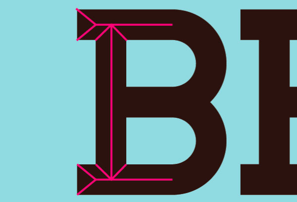
Step 10b
Copy this triangle to the bottom of the “B.” From the right side of both triangles draw a horizontal line. This line will be the center of the top and bottom strokes of the “B.”

Step 10c
Draw two 45 degree lines (or a triangle) on the right-hand vertical stroke of the “B,” both the top and bottom. Connect these points with a simple vertical line.
Step 10d
From the point where the top and bottom bowls (curves) come together on the left, to the centerline of the right side.
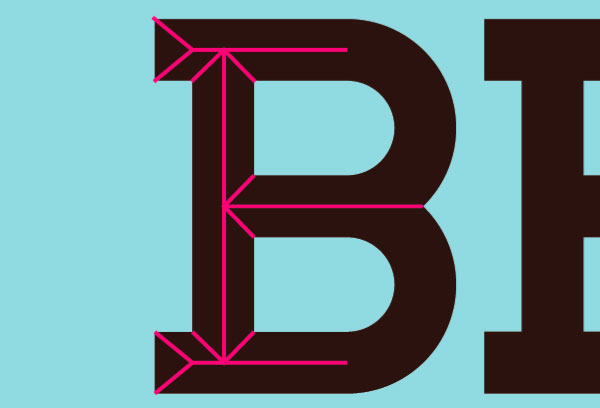
Step 10e
To finish the bevel lines for the “B,” use the interior shape to draw the center of each curve and create a triangle at the center of each curve.

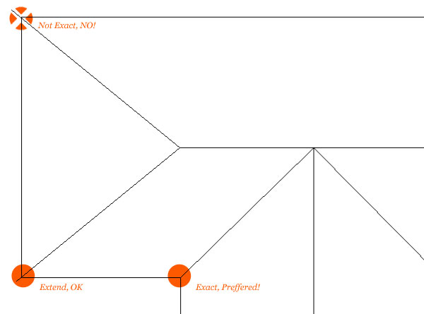
Step 11
Be sure that the bevel lines (pink) that you are creating are straight and precise. I suggest turning Smart Guides on (Command + U), it is a huge help. Also, if ever needed, it’s better to draw the bevel lines extending past the perimeter of the letterforms than to leave it short.
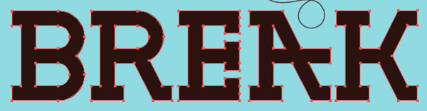
Step 12a
The rest of the letters should go much quicker because you can simply copy and drag over existing lines.
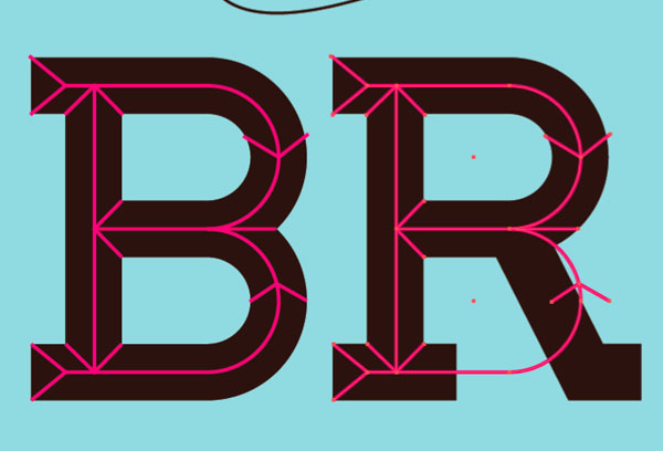
Step 12b
All of the bevel lines are in place.
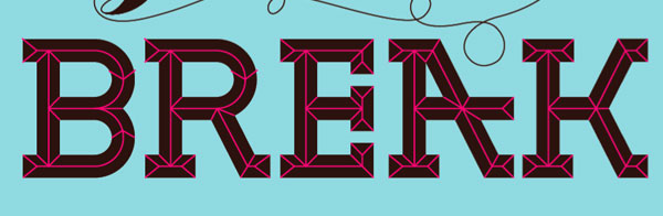
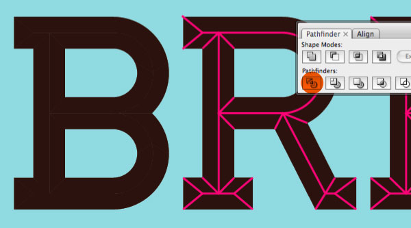
Step 13a
Now for the rewarding part, select all of the pink bevel lines and the exterior letter-form shape of the “B.” In the Pathfinder palette select the Divide option and ungroup (Shift + Command + G). The letter will now be made up of individual shapes. If they aren’t, don’t panic, just refine the pink bevel lines.
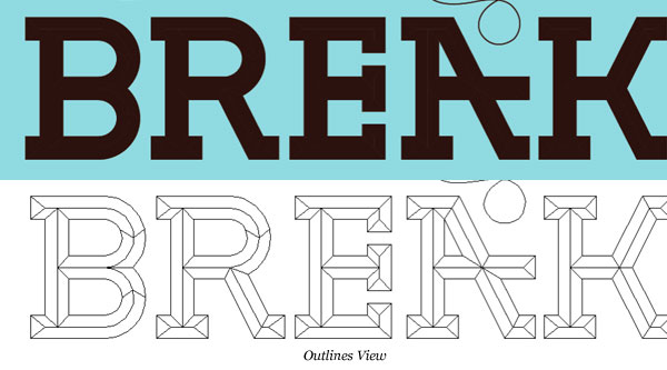
Step 13b
Do this to each letter individually. All of the letter-forms should now be divided.
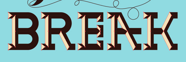
Step 14a
With each letter divided correctly, we’ll finish with the fun part. Establish where you want the light source, here coming from the left, and select all of the necessary shapes and fill them with the cream.
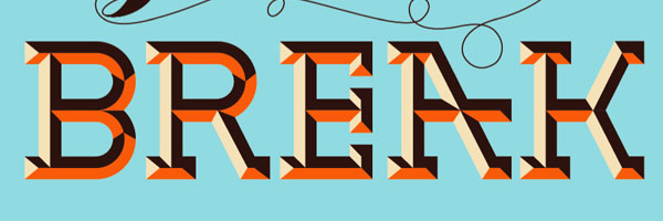
Step 14b
Opposite of the cream shapes keep to brown, and fill the necessary ‘in-between’ shapes orange.
Final Image
The purpose of this tut is to show a variety of approaches and styles of beveled lettering. Hopefully this will help you to create you own, unique beveled lettering. The final image is below. You can view the large version here.