

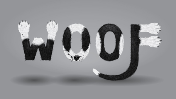
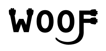
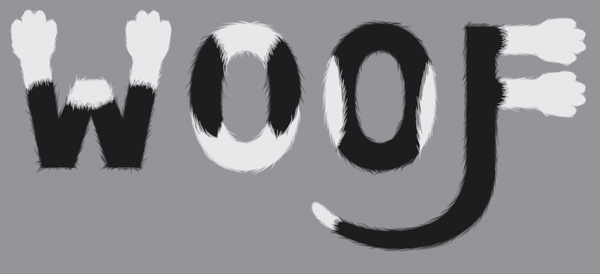
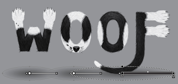
Final Product What You’ll Be Creating
Introduction
I’ve got an obsession with my cat and have done numerous vectors featuring her. One of the pieces I’ve done has been the calligram of “Meow,” which had been rendered in fur with the marking of her fur.
The wonder that is Wikipedia states:
A calligram is a poem, phrase, or word in which the typeface, calligraphy or handwriting is arranged in a way that creates a visual image. The image created by the words expresses visually what the word, or words, say.
To expand my portfolio of animals, I decided to start vectoring dogs, which are a similar process to cats, but for the most part have more shaggy, coarse hair.
In this tutorial I’m going to walk you through the creation of a piece of text art that is inspired by my “Meow” calligram, but this one is based on a dog. I’d like to introduce you to the hyperactive force which is Poppy. I’m going to be referencing her during this tutorial.

Typeface Theory
The word I’m going to render is “WOOF” and this is for two reasons:
- It’s a word that when heard you associate straight away with a dog.
- The letters can be manipulated to illustrate the limbs and body of the dog. For instance, the legs and tail can be illustrated using the “W” and “F,” and the face and body can be constructed from the “OO.”
When selecting a typeface to use as the base for this project, I tend to lean more towards more classic typefaces such as Tahoma, Verdana etc… This is because, for the most part, they are easy on the eyes and not as complex to manipulate.
Stereotypically cats are seen more as a feminine creature, illustrated with curves and very few harsh lines. So in contrast, my dog inspired calligram is going to appear more masculine. So for man’s best friend, I’m going to select a typeface which has many straight lines and minimal curves. I’m going to select a sans serif typeface as I associate serifs as a more feminine quality as they appear delicate.
Another aspect to keep in mind is that you don’t want your letters to be too slim, as you want to show a lot of fur on the letters. However in contrast, you won’t want the letters to be too plump that with the fur on the outsides of the letters you cannot tell what the word is!
For this tutorial, I’m going to use the typeface Tahoma. Let’s get stared!
Step 1
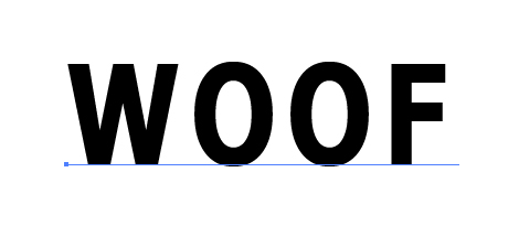
Using the Type Tool (T) to add the text “WOOF” to your canvas.
Go into the Character options (in CS5 it is along the top, under your toolbar) and change the font size to 150pt. Change the Font Style to Bold. Click into the Character Panel and change the tracking to 100 and the Vertical Scale to 125%.
Step 2
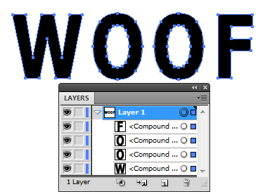
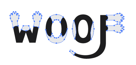
Expand the letters by going to Object > Expand and then clicking OK. Ungroup (Command + Shift + G) the letters to make it easier to manipulate them.
Step 3
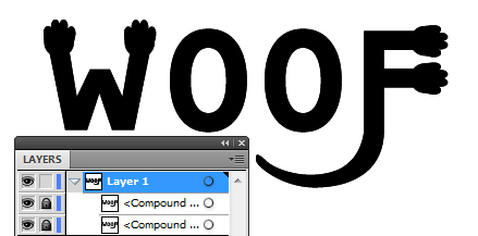
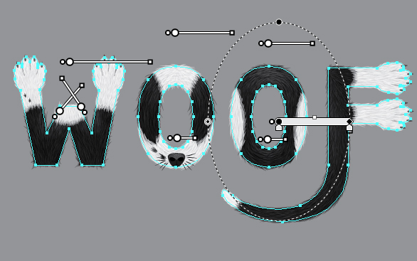
Using the Pen Tool (P), add a tail to the “F.” Now select the tail and “F” shape, then use the Pathfinder to Unite them.

Step 4
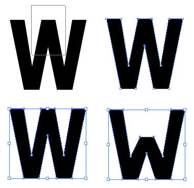
I want the “W” to clearly be just two front legs. In order to create this illusion, I’m going to need to reduce the center of the letter so the two end stems appear a lot more prominent.
Using the Direct Selection Tool (A), select the lines and points which are present in the center of the letter. Then use the Free Transform Tool (E) to move these elements down so it squashes the center of the letter.
Step 5
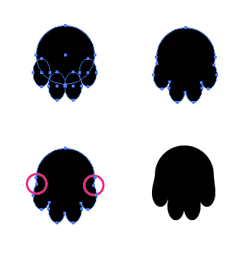
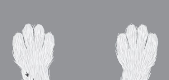
To make the legs more apparent to the viewer, I’m going to add paws onto the letters. I’m going to do this by using the Ellipse Tool (L). Once I have placed the five circles, then I use the Pathfinder to Unite them. Now use the Pen Tool (P) to remove two points on either side.
Step 6
Copy (Command + C) and Paste (Command + V) the paws onto the “W” and “F,” using the Free Transform Tool (E) to rotate and place them. Position the paws on their corresponding letter and Unite them.
Step 7
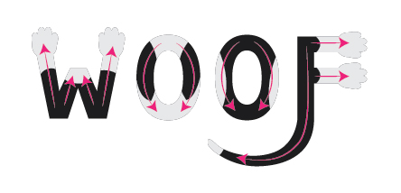
Select all (Command + A) the shapes and create a Compound Path (Command + 8). Copy (Command + C) and Paste in Front (Command + F) the compound path and then lock both shapes.
Step 8
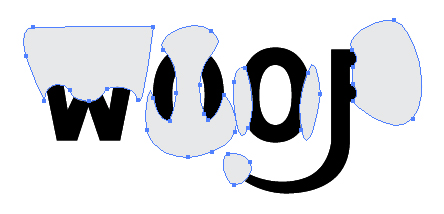
Using the Pen Tool (P), I’m going to draw on top of the shapes where the white fur is for the portions of the body. Instead of white, I’m going to use a very light gray (C=0, M=0, Y=0, K=10), which is because later on we’re going to use white to add highlight to the fur.
Since the front legs are going to be part of the “W,” I’m going to make the first “O” Poppy’s head and the second her body. This makes a slight difference in her coloring.
Step 9
Select all (Command + A) the gray shapes and make them a Compound Path (Command + 8). Unlock one of the black compound paths and select it along with the gray compound path. In the Pathfinder apply Intersect.
Now while the group is selected, make it a Compound Path (Command + 8). Change the black compound path to an off black fill color (C=0, M=0, Y=0, K=95). Lock the layer folder for now. Double-click on the layer folder and rename it “Bases.”
Step 10
For the next part of the tutorial, you’ll need to create the Width Profile, 1 and 5 brushes from my Width Profile brush tutorial.
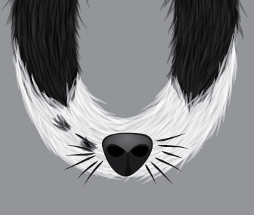
Create a New Layer and rename it “Fur.” I’m going to be using the Paintbrush Tool (B) with the Width Profile 1 brush, stroke color off black, and Opacity of 50%. Use this to draw the fur around the edges of the letters where the shapes are off black.
Modify the length of your strokes to the fur type of your dog. As Poppy is a short haired dog, the fur rendering will require short strokes. Consider the area of fur each letter represents and the direction the fur will be going.
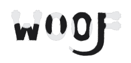
Step 11
Select All (Command + A), Group all the dark gray strokes (Command + G), then lock the group. Now add the light gray fur to the rest of the edges. Where the black and white meets within the letters, still draw strokes but not overlapping. This will make the fur more natural looking.
Tip: If you’re drawing a light colored fur as I am, add a layer behind all your shapes with a dark color. This will make it easier to see where your strokes are being placed.
Select All (Command + A), Group all the dark gray strokes (Command + G), then lock the group.
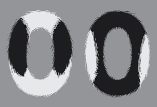
Step 12
To add further depth to the fur, add strokes within the shapes, and some towards the edges using the same brush, but with the corresponding color with the Blending Mode Multiply. For the light gray use an Opacity of 70% and the dark gray the Opacity of 40%. For each of the colors, group them (Command + G) and lock them.
Tip: If you find Illustrator is slowing down as you’re drawing the fur strands, hide the previously drawn groups.
Step 13
Using the same process, I’m going to add highlights to the fur. I’m going to do this by using the same colors for the corresponding areas. Set the Blending Mode to Screen, the light gray Opacity to 50% and the dark gray Opacity at 25%.
For each of the colors, group them (Command + G), then lock them and the layer folder.
Step 14
Create a New Layer and rename it “Spots.”
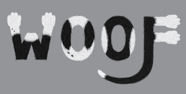
If you notice in the reference image of Poppy, she has some small spots of black on her front legs and around her nose. So using the same brush properties and the dark gray stroke color, add some spots on the “W” and the first “O” in the places where the spots are. Set the brush to a Blending Mode of Multiply and the Opacity to 50%.
When you’re finished, group them (Command + G), then lock them and the layer folder.
Step 15
Create a New Layer and rename it “Nose.” Using the Pen Tool (P), with a dark gray fill color; draw the nose. Then draw in the nostrils and a line in between. Set the Blending Mode to Multiply for those shapes with the nostrils at 100% and the line in between at 50%.
Create a light gray to light gray transparent radial gradient, and add highlights as well as a shine to the nose. Using the Gradient Tool (G) drag the source of the gradient towards the top of the nose.
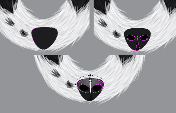
Step 16
Cats are often drawn with their characteristic long whiskers. Dogs have whiskers too, but not as prominent. They are a lot shorter and not as many. Within the “Nose” layer folder, I’m going to add some dark gray whiskers using the Paintbrush Tool (B) and the Width Profile 5 brush.
Step 17
Using the same brush options, however change the opacity to 75%, and add some dots on the top of the nose, as a dogs nose is not completely smooth. This will add some subtle texture to it. When finished, lock the layer folder.
Step 18
Create a New Layer folder and rename it to “Details.” Using the same brush options change the Opacity to 20% and the Blending Mode to Multiply. Add some strokes around the paws to add definition between the digits.
Step 19
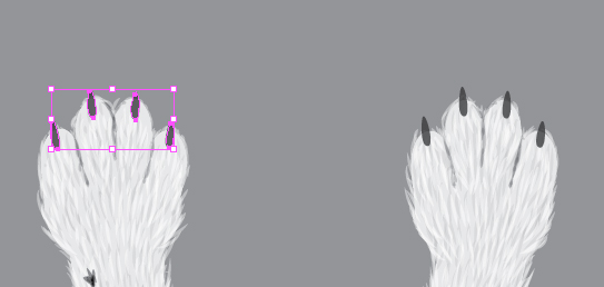
Using the Pen Tool (P), create an oval shape with the fill color of dark gray and Opacity of 80%. Copy (Command + C) and Paste (Command + V) the shape for each digit claw on one paw. Select the four shapes for one paw and then make them a Compound Path (Command + 8).
Copy (Command + C) and Paste (Command + V) the compound path, and move them to each one of the paws. Lock the layer folder when finished.
Step 20
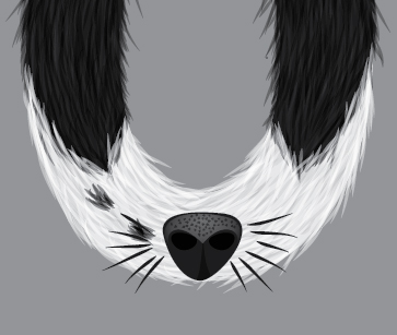
Go into the “Bases” layer folder and Copy (Command + C) the dark gray compound path. Lock the “Bases” layer folder again. Create a New Layer above the “Bases” folder and name it “Light,” then Paste in Front (Command + F) the compound path.
Release the compound path (Alt + Shift + Command + 8). You will need to select the shapes for each of the “O” shapes and use Minus Front from the Pathfinder options.
Using the Gradient Tool (G), apply the light gray to light gray transparent radial gradient to the letters. Place the gradients as if there is light coming from above. Reduce the Opacity to 15% and the Blending Mode to Screen. On some of the letters you will need to Copy (Command + C) and Paste in Front (Command + F). Once completed, lock the layer folder.
Step 21
Create a New Layer below the “Bases” layer folder and rename it “Shadow.” Create a dark gray to dark gray transparent radial gradient. Using the Ellipse Tool (L) draw circles under the letters to give the impression that the letters are floating. Group the shapes together (Command + G) and then change the Blending Mode to Multiply and the Opacity to 70%.
Step 22
Add a soft light gray to light gray transparent radial gradient on Screen 30% in the background to complete the piece. Now you’ve finished your Woof calligram!
Conclusion
By adding different colors into the fur and varying the length of the strokes, you can achieve a unique looking piece of text art. By knowing the subtle differences between cats and dogs, you can also create a purrfect calligram for a cat using these same techniques as well.