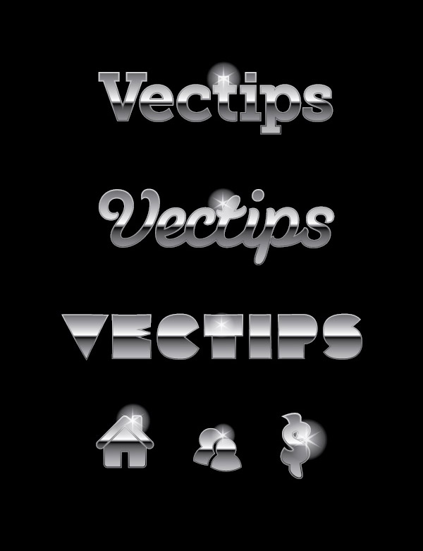
Final Image
Below is the final type treatment we will be working towards. You probably have seen many other metal type tutorials, but in this one you will be able to edit the text after the effect is created!

Tutorial Detail
- Program: Adobe Illustrator CS4
- Difficulty: Beginner
- Estimated Completion Time: 15-20 minutes
Step 1
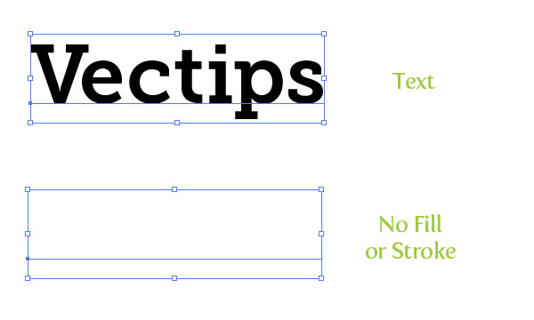
Choose a font (I am using Museo Slab 700) and type out some text with the Type tool (T). I like to start with a clean slate in the Appearance panel, so take of any fill or stroke on the type.
Step 2
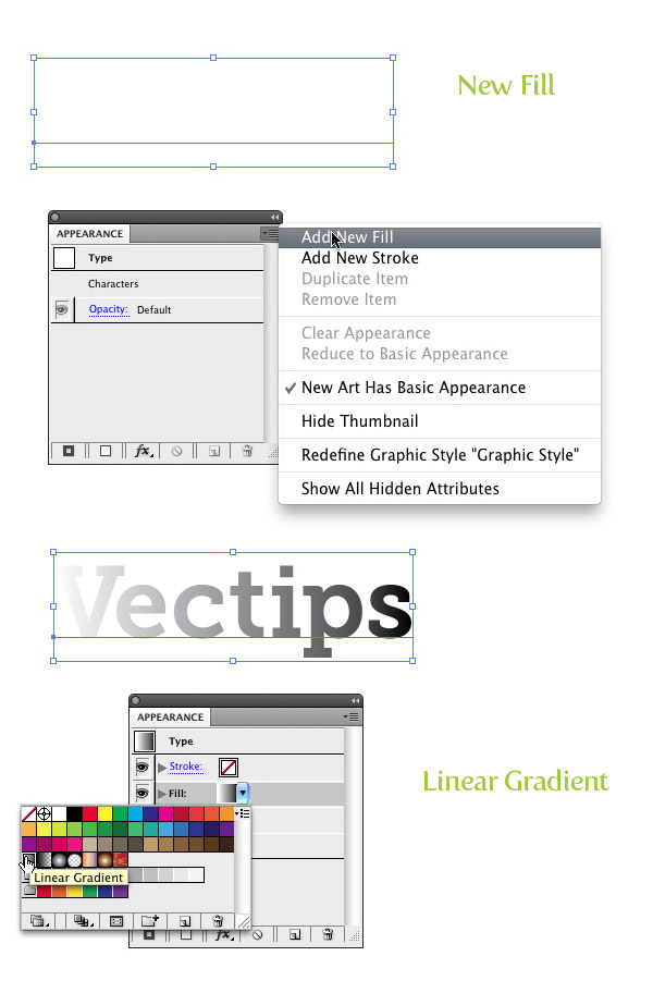
From the pop-up menu of the Appearance panel, choose New Fill. Next, click the swatch thumbnail in the Appearance panel of the new fill and change the swatch to a linear gradient.
Step 3
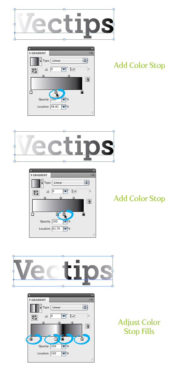
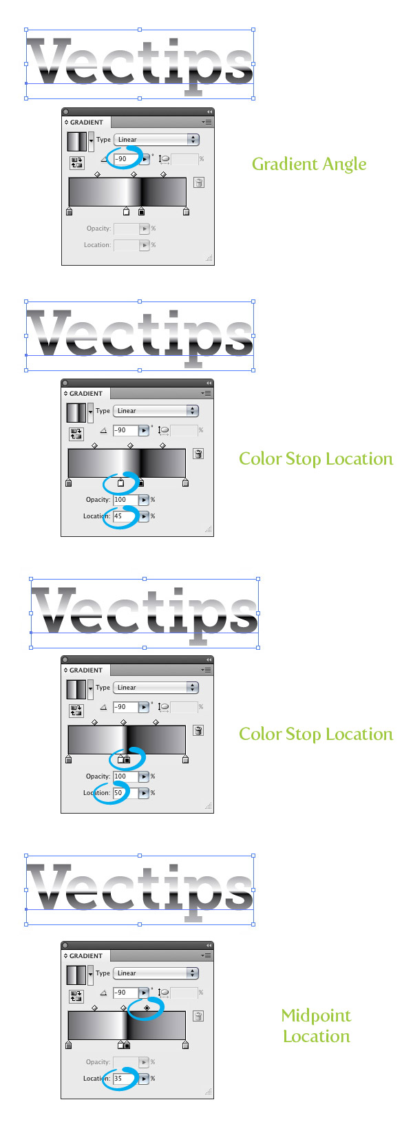
For this step we are going to add two Color Stops to the gradient to give us the metal effect. First click on the Gradient Slider in the Gradient panel around in the middle of the other two Color Stops. Next, add another Color Stop to the Gradient Slider so you have a total of four. Change the first Color Stop to a 70% black, the second to white, the third to 100% black and the last to a 30% black.
Step 4
Now that we have the correct Color Stops, we need to adjust the gradient. Within the Gradient panel change the Angle to -90. Next, select the white Color Stop and change the Position to 45%, then select the black Color Stop and change the Position to 50%. Finally, select the Midpoint in-between the black and 30% Colors Stops and change the Location to 35%.
Step 5
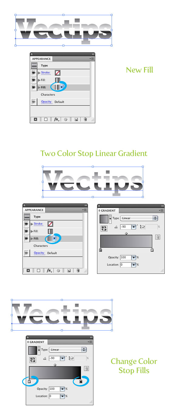
From the pop-up menu of the Appearance panel, choose New Fill. Select the second fill in the Appearance panel and change the linear gradient to a two Color Stop linear gradient. Change the first Color Stop to a 32% black and the second to 100% black. Make sure the gradient Angle is set to -90%.
Step 6
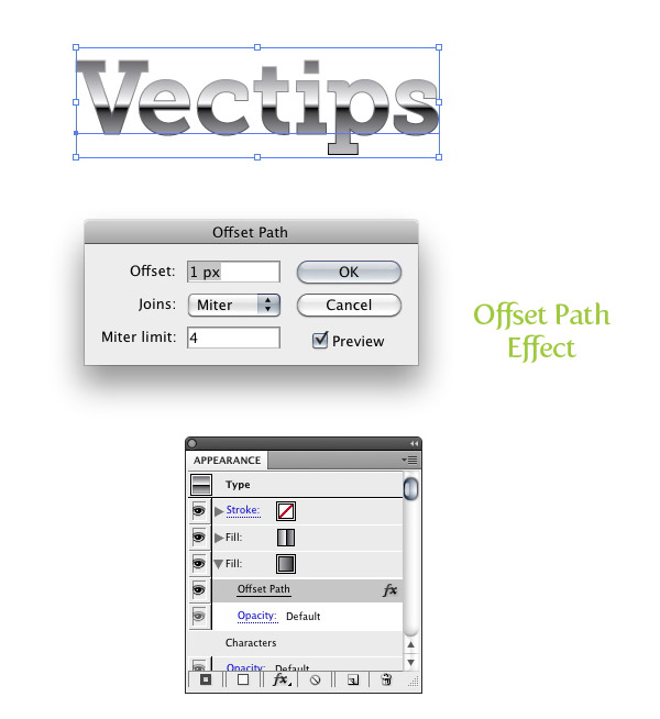
With the new fill still selected in the Appearance panel, go Effect > Path > Offset Path. When the Offset path dialog opens, change the Offset to 1 px. This might be different depending upon the dimensions of your text. If you click the arrow for the latest fill in the Appearance panel you should see the Offset effect under it.
Step 7
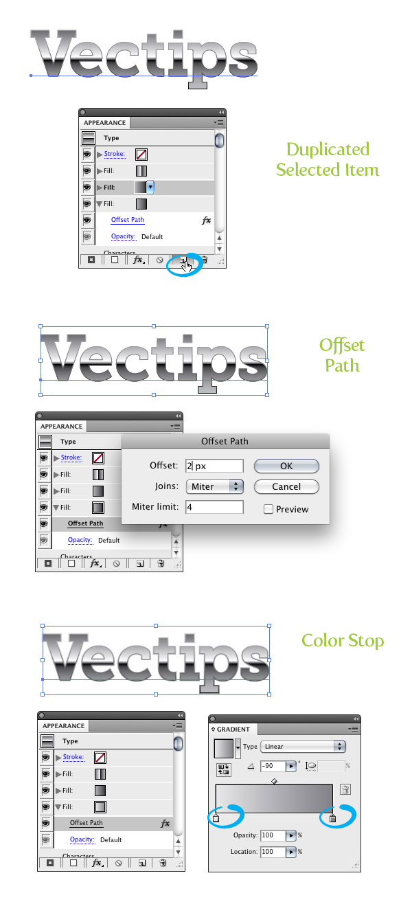
Make sure the two Color Stop fill is selected in the Appearance panel and press the Duplicate Selected Item button from the bottom of the Appearance panel. Select the new copy below the first and click the Offset Path item. When the dialog opens, change the Offset to 2 px. Next Change the first Color Stop in the new fill selection to 10% and the second Color Stop to a 60% black.
Step 8
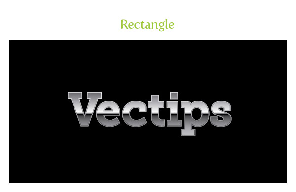
For the next couple of steps it is good idea to have the treatment on a dark background so you can see the effects. Create a rectangle with the Rectangle tool (M) and place it behind the other artwork.
Step 9
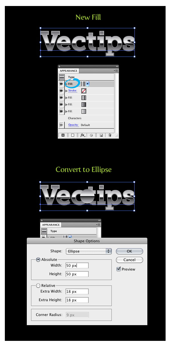
You can stop here if you would like but you can really jazz up the treatment by adding some sprites. The cool thing is you can add these in the Appearance panel as well as the other effects! Start by creating a new fill it the Appearance panel and making sure you select the top most item. Go Effect > Convert to Shape > Ellipse. In the Shape Options dialog, check the Absolute radial button and change the Width and Height to 50px.
Step 10
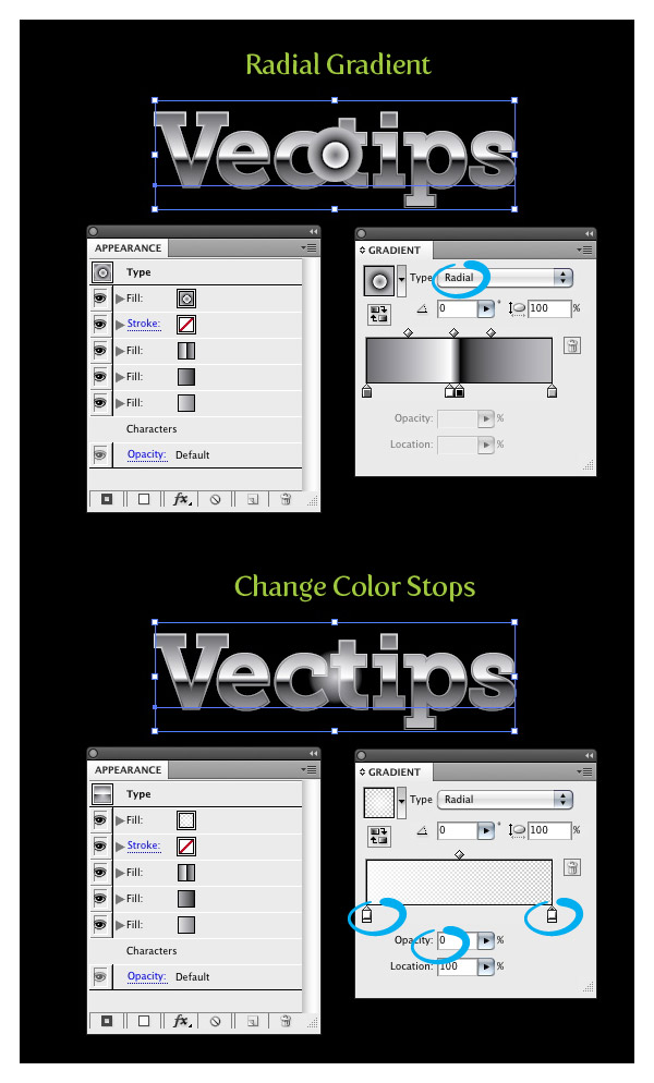
With the new fill still selected, change it to a radial gradient. You only need two Colors Stops for this effect, so delete any other Color Stops in the gradient. Next, change the first Color Stop to white with a 80% Opacity and change the last Color Stop to white with 0% Opacity.
Step 11
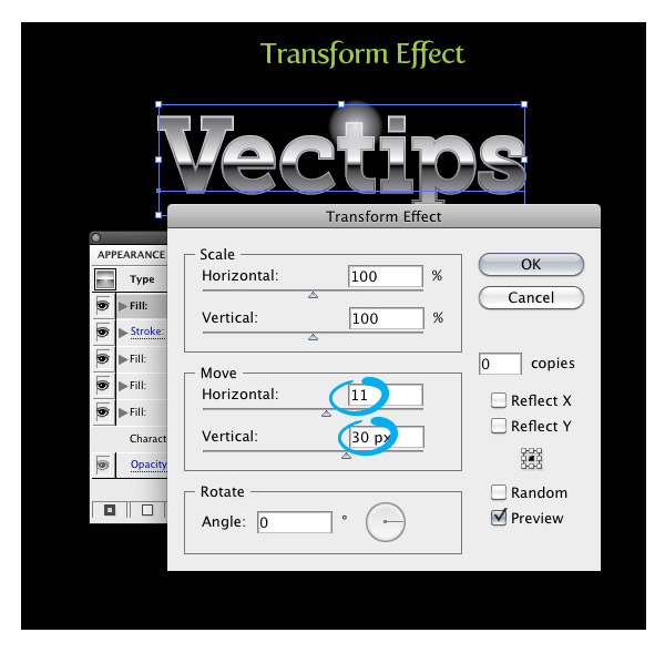
We can position the burst wherever we like. To do this, make sure the same item is selected in the Appearance panel as the previous step and go Effect > Distort & Transform > Transform. In the Transform Effect dialog, change the Move Horizontal and Vertical positions to the desired amount.
Step 12
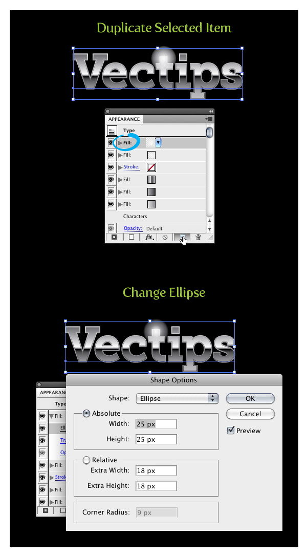
With the latest item select, press the Duplicate Selected Item button in the Appearance panel. Select the new duplicated item and press the arrow to the left of it in the Appearance panel, showing all the effects in the item. Click on Ellipse to bring up the Shape options and change the Absolute Width and Height to 25px.
Step 13
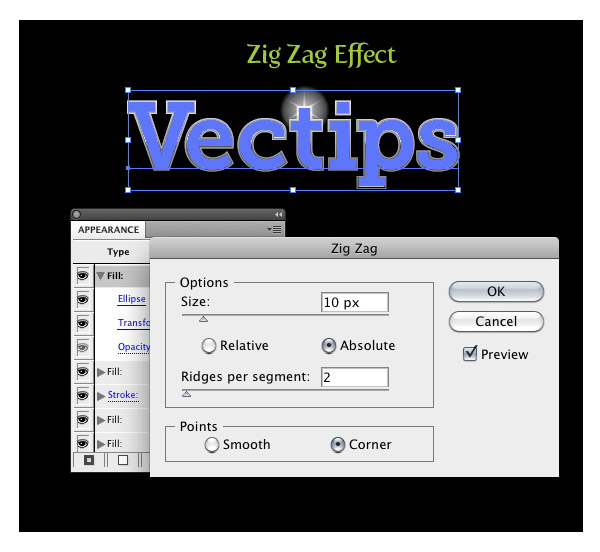
With the adjusted ellipse still selected in the Appearance panel, go Effect > Distort & Transform > Zig Zag. In the Zig Zag dialog, change the Size to 10 px and the Ridges to 2 (you might have to change the Size to more or less depending on the original size of your text).
Step 14
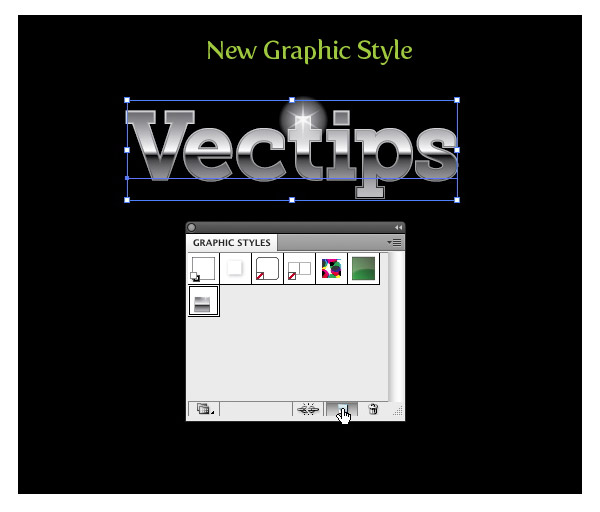
We are done! That was pretty easy. You can easily create this effect without the Appearance panel, but creating this effect like in this tutorial you can easily adjust anything with the text without changing the effect. It is also a good idea to create a Graphic Style for easy implementation to other text and objects within Illustrator. Simply select the text with the metal treatment and press the New Graphic Styles button in the Graphic Styles panel. Now just select some text or other object and select your new Graphic Style!
Final Image
Below is the final image with a couple of other fonts and object with the applied Graphic Style.
