

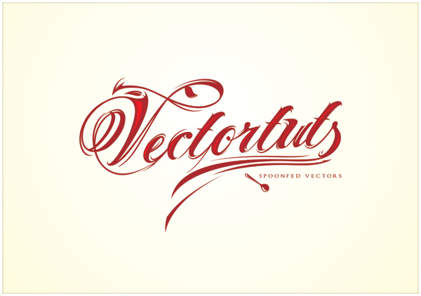
Final Image Preview
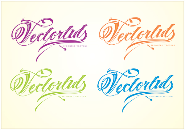
Below is the final image we will be working towards, as well as a few color variations. Want access to the full Vector Source files and downloadable copies of every tutorial, including this one? Join Vector Plus for just 9$ a month.
For this tutorial, I used CorelDRAW but the techniques discussed apply for most vector editing software.
Step 1 – Type, Organize, and Choose the Font
Find the relationships in your copy and organize the text accordingly. For this tutorial, I’ve chosen a calligraphic font called Old Script from dafont.com, but any script font will do.

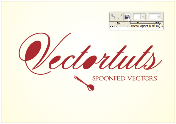
Step 2 – Convert to Curves and Break Apart
To modify the font we will need curves. Select your text and press Command + Q (convert to curves) and then press Command + K or use the Break Apart icon form the Property Bar, to break apart the components of the font. Since inner parts are separate elements we need to trim them from the rest of the character.
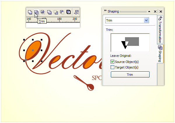
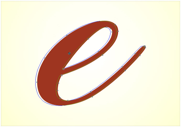
Step 3 – Trim Inner Parts
Shift-select the inner (I’ve altered their color to orange) and the outer parts of a character and press trim on the Property Bar. If you want to have more control over boolean operations, then you can turn on the Shaping docker from the Window menu. Then select the source object, press Trim, and select the target object with the special cursor.
Sometimes after the break apart operation the inner parts go behind the outer parts. In this case, select the outer part and press Shift + Page Down to send it to the back. It is always a good idea to have two different colors for boolean operations.
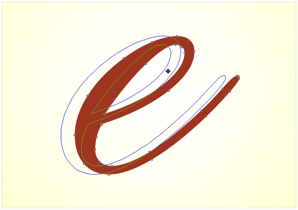
Step 4 – Give Some Flesh to the Characters
Select an individual letter and drag away. Before releasing your button, click with the right button and you will get a copy of the original shape. Repeat the copy operation, but this time move the copy to the left a little bit to have two overlapping shapes.
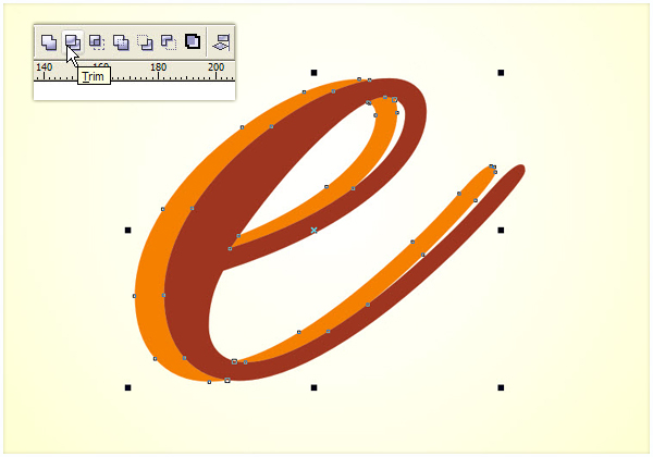
Step 5 – Trim and Break
Select the two overlapping copies and click the Trim icon on the toolbar. Select the resulting shape and press Command + K to break apart.
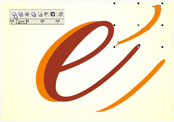
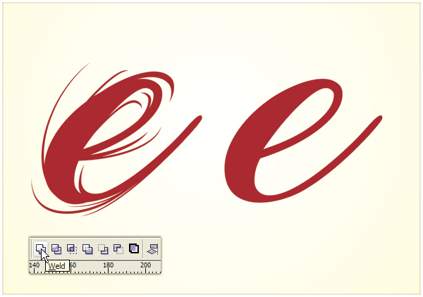
Step 6 – Weld
Move away some of the resulting shapes to the right and weld the rest. The goal is to achieve a more dynamic look by increasing the difference between the thick and thin parts of the character. I find steps 4-6 the easiest way, but you can use any other techniques to achieve the desired alteration.
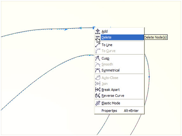
Step 7 – Clean Up Messy Curves
Remove unneeded nodes to have a clean flowing curve. Select the Shape Tool (F10) and right-click on a point, then select Delete from the context menu, or simply double-click the node with the Shape Tool. After a boolean operations, always check for stray segment and undesired nodes.
Step 8 – Glamorizing Begins
Make a copy of the character by moving it to the left, but just a tiny bit. Select the resulting shapes and press trim in the Property Bar. Repeat the copy and trim operation to the right, up and down.
Always move away the resulting chips and break them apart (Command + K). These small shapes will be the building bricks of the look we’re creating.

Step 9 – The Creative Part
Arrange the chips so that they overlap the original object. Rotate, scale, or duplicate them in a creative way, until you’re satisfied with the outcome.

Make an extra copy of the original shape for later use. Select the original shape and the chips and weld them by pressing the Weld icon on the Property Bar.
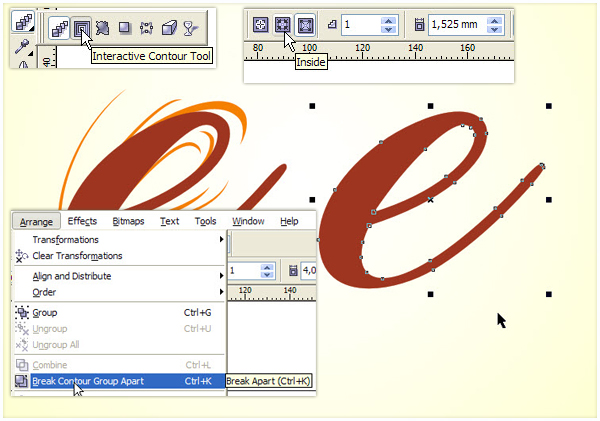
Step 10 – Let There Be Highlight
Pick the Interactive Contour Tool by pressing longer on the Effects Tool on the toolbar. In the properties bar, choose Inner contour, Number of steps 1, and a small offset depending on the size of your character. From the Arrange menu choose Break Contour Group Apart.
Step 11 – Finishing the Highlight
Pick the resulting object, clean it up, and position somewhere towards the top-left part of your character.

We are almost there. Make one more highlight if you wish following Steps 11-12.

Step 12 – The Tedious Part
Repeat Steps 4-12 on all the characters.
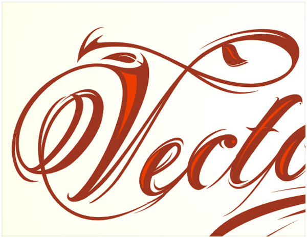
Step 13 – Bring it All Together
Using the original text as a template move the modified characters to their place.

Get creative on the initials and use swirls and swashes derived from the characters to make the design coherent.
Step 14 – Experiment with Color Setups
When finished, group the characters and highlights in two separate groups to make the color experimentation easier. The ideal color setup would be something like a darker base color and a lighter shade of it for the highlight.