


イラストレータでデザインをやってみましょう
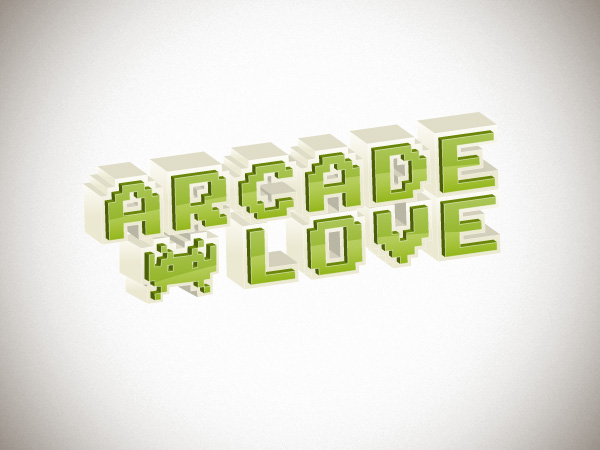
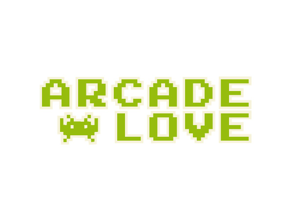
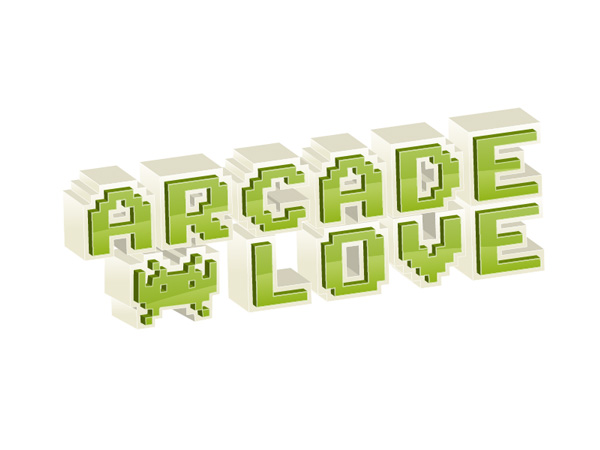
The final image
This is what we will be creating:
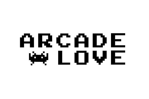
Step 1
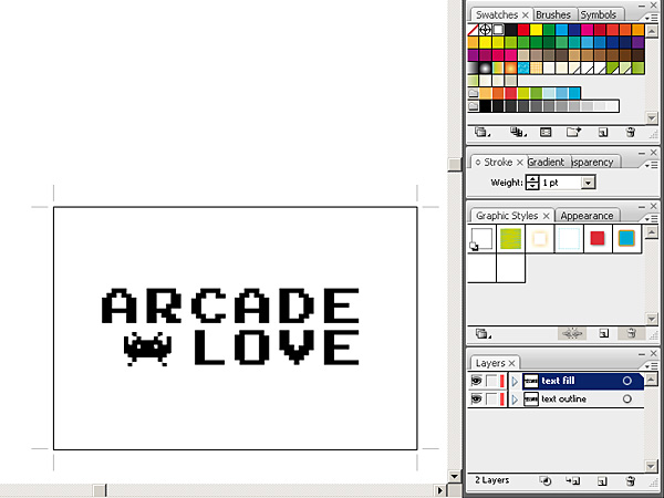
There are actually two ways to begin this illustration. You may draw all the blocky shapes with the pen tool or just download a blocky font like Arcade and Invaders from Space. I’m a man who values his time so I used the font instead of drawing.
Step 2
Duplicate the layer with the text on it. Name the original layer "text outline" and name the second one "text fill". "Text fill" layer should be on top of "text outline" in the layers panel.

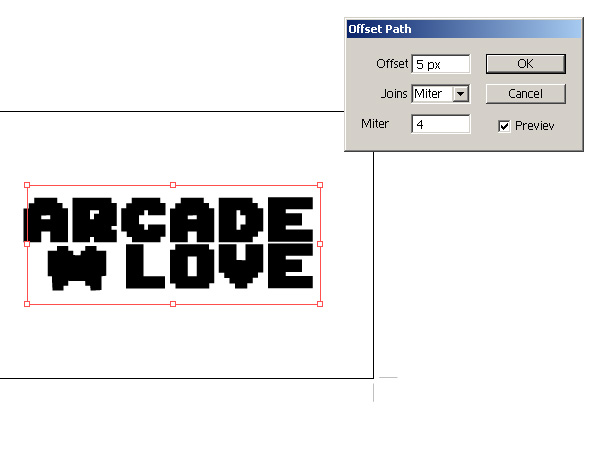
Step 3
Make the "text fill" layer invisible and select all the contents of the "text outline" layer. Then go to Effec t > Path > Offset Path to make the text thicker. Type 5 px into the Offset parameter, leave the rest unchanged and click OK (you may need to input a higher offset value if your text is larger than mine).
Step 4
Fill the "text outline" layer with a creamy white colour like #F7F3DB. Make the "text fill" layer visible again and fill it with green colour like #96BD0D.
Step 5
Now we’re ready to take our typography into the third dimension. Select all the contents of the "text fill" layer and go to Effect > 3D > Extrude & Bevel.
Input: -18, -20, 8 as respective X, Y, Z values.
Set the extrusion to 10 pt and shading to Plastic. Extrude & Bevel the "text outline" layer with exactly the same parameters except the extrusion which should be set to 50 pt.
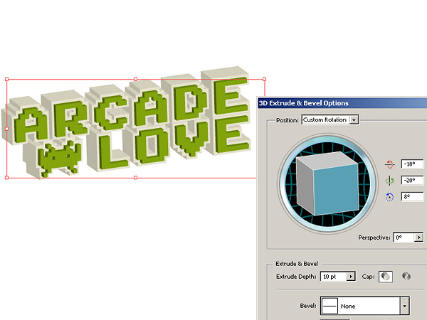
Align the layes, to obtain effect as in the picture below.
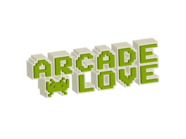
Step 6
Select everything (Ctrl/Cmd+A) and go to Object>Expand Apperance. Now we will take care of lighting and specular reflections on our type.
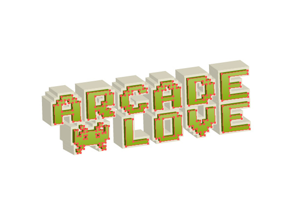
Select every front of every green letter (like in the picture below) and give it a smooth light green gradient fill with 94 degrees angle. Colours of my gradient are #88AD11 (dark) and #ACC658 (light).
Step 7
Make the same selection as in the step before, preferably by selecting one object filled with the green gradient and going to Select>Same>Fill Color. Now this is going to be a weird operation because of how Illustrator handles copying, pasting and putting grouped objects on different layers, so follow those steps precisely.
Make a new layer on top of the other layers and name it "front outline".
Copy your selection and paste it in front (ctrl/cmd+F).
Now cut the selection, and paste it in front again (ctrl/cmd+F).
Give the selection a white stroke and no fill.
Select the "front outline" layer on the layers panel.
Now with the selection still active, click the right mouse button and select Arrange>Send to Current Layer.
If everything went allright you hould see a white stroke over your green letters like in the picture below.
Step 8
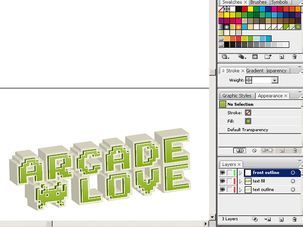
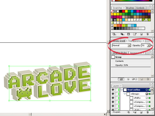
Select every object on the "front outline" layer and group them. Change their stroke to 0,75 pt and opacity to about 50%.
Step 9
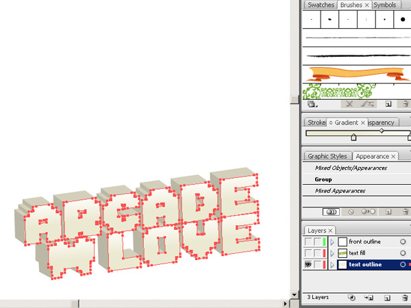
Make the "text fill" and "front outline" layers invisible. Pick the direct selection tool and select every front of every letter just like in step 6. Fill them with with a light creamy gradient (mine is from #ECE9D2 to #FDFCF7) with 94 degrees angle and give theam a really thin white stroke. 0,25 pt would be just right.
Step 10
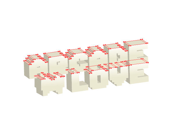
Now we have to select every edge that is facing the top like in the picture below and give them a light brownish fill (#E0DDC8). This won’t be an easy process since Illustrator has a really weird manner of cutting 3D objects into milions of little bits and pieces… Just focus, be precise and remember that you can always save your selection by using Select>Save Selection.
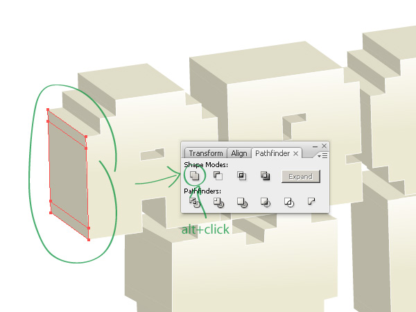
Step 11
Before we proceed we need to tidy up the mess that Illustrator left us after Expanding the 3D efect. If you take a close look you will notice that every left facing edge of our leters is cut into 3 or 2 pieces. We will be filling those edges with a gradient in the next step, so each one of them has to be constructed of a single object, not three…
You need to use the Pathfinder to combine the edges into a single object. On every letter make a selection like in the picture below and use Pathfinders "Add to shape area" option and then click Expand, or just Alt+Click the first option to expand the shape automaticaly.
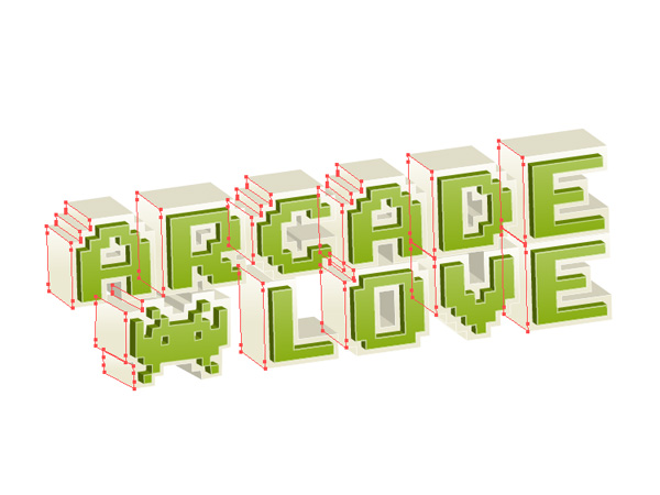
Step 12
Now if you merged all the unnecessary shapes you have to select every edge that faces left except for the inner edges of the letters. If you’re confused just do this like in the picture below. After selecting the edges fill them with a gradient from Step 9 (from #ECE9D2 to #FDFCF7, 90 degrees).
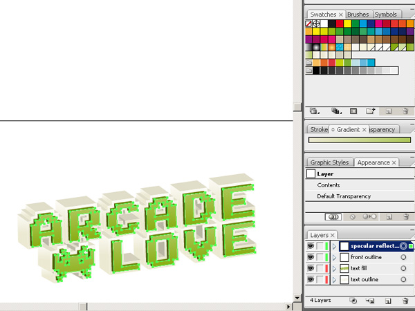
Step 13
Turn on visibility of every layer. Duplicate the "front outline" layer and name it "specular reflection". Select every object on the newly created layer and turn off their strokes and fills.
We’ll use this layer as a clipping mask for our reflections.
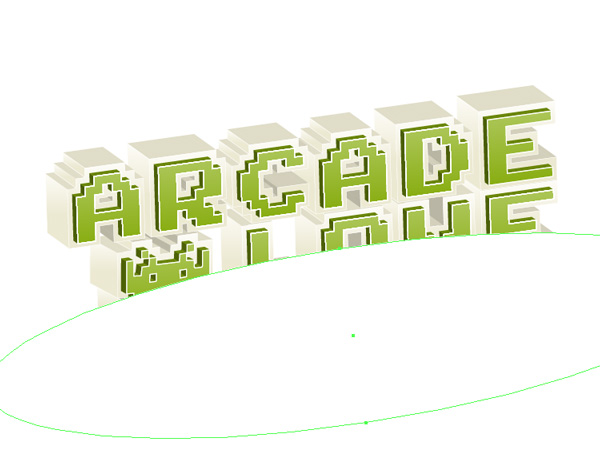
Step 14
Select the Ellipse Tool to draw a wide, white ellipse on the "specular reflection" layer and adjust its rotation as in the picture below.
Step 15
Copy the white ellipse and paste it in front (ctrl/cmd+F). Fill it with a linear white to black gradient and use the Gradient Tool to adjust the gradient to the picture below.
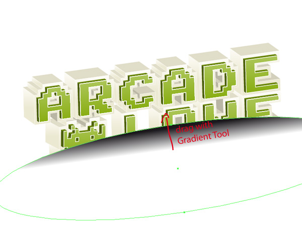
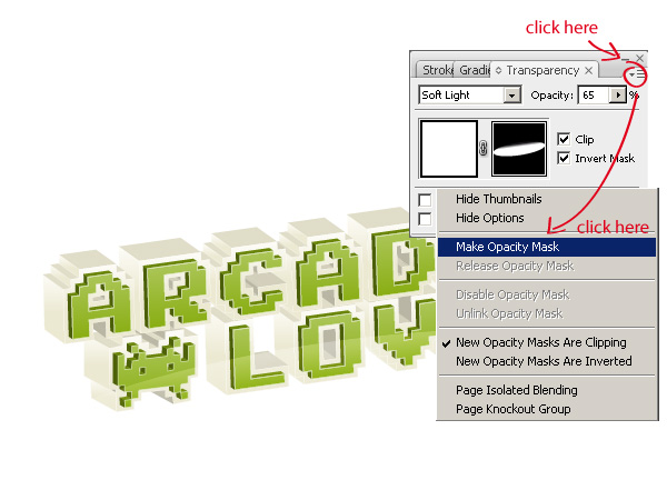
Step 16
Select the both ellipses, go to the Transparency palette, click the "triangle menu" and select Make Opacity Mask. Tick the Invert Mask option, adjust opacity to about 65% and select Soft Light as the blending mode. Your result should be similar to the picture below:
Step 17
Our typography is getting all shiny but we are not quite finished. There is one thing that we need to fix. The reflection should be visible only on the front of the green letters:
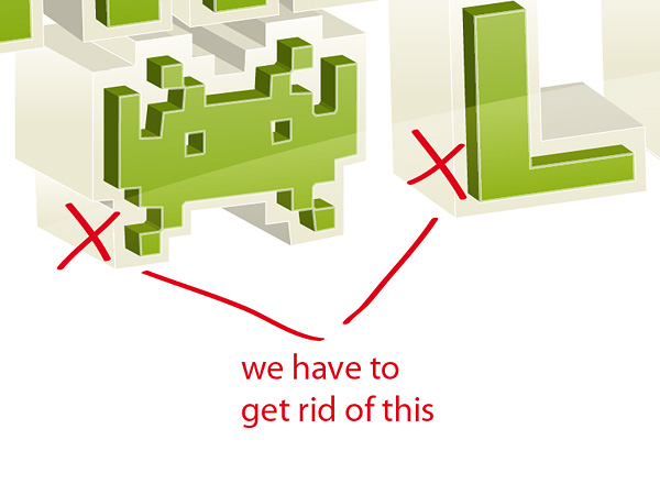
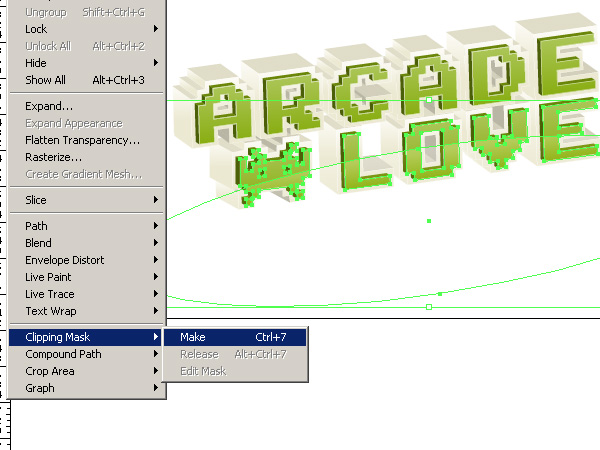
To fix the problem lock every layer besides the "specular reflection" and select the lower part of the typography (the space invader, L, O, V and E). Then rightclick, select Arrange>Bring to Front, and press ctrl/cmd+8 or go to Object>Compound Path>Make to make a compound path out of this selection.
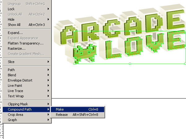
With the compound path selected add the white opaque ellipse to the selection and press ctrl/cmd+7 or go to Object>Clipping Mask>Make. The reflection is ready.
Step 18
Now copy the white ellipse and position it over the top part of the typography. You also need to adjust its width so it fits like in the picture below.
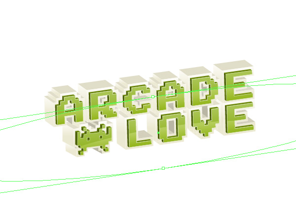
Step 19
Select the top letters (Arcade), bring them to front, and make a Compound Path out of them just like in Step 17 (ctrl/cmd+8). Then select the compound path and the ellipse and make a clipping mask just like in Step 17 (ctrl/cmd+7).
Step 20
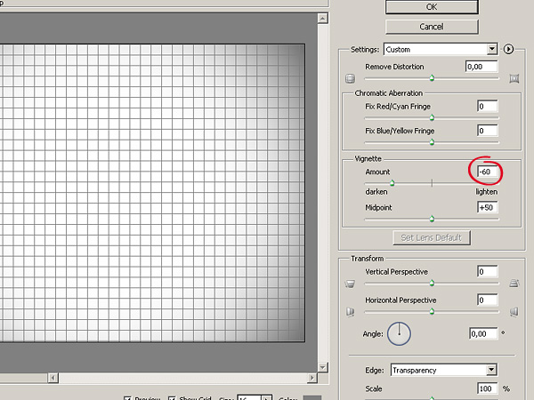
The typography is ready so now all we need is a background, actually I made mine in Photoshop, because it was quicker and easier to obtain the effect that I wanted.
Make a new Photoshop file, create a new layer, fill it with white. Go back to Illustrator, select everything (ctr/cmd+A) and paste it to Photoshop as a Smart Object.
In Photoshop, select the white layer, go to Filter>Distort>Lens Correction and set the vignette amount to – 60
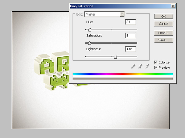
To make the vignette less gray we will colorize it with the Hue/Saturation adjustment layer. So create new Hue/Saturation adjustment layer and input the following values:
Step 21
This is the end of the tutorial I hope you liked it, and learned a few new techniques. Here is the result
サイト内検索
イラストレータの勉強
グラデーションと分割 図形と合流・型抜き ロゴマークの作成 テキスト落書き VECTIPS Logo Vectortuts Logo 水滴の作り方 WATER グラデーション背景 竹 リボン 薬カプセル かぼちゃ 緑の玉 亀さん 気球 花びら つやのある球 ロゴ vectips ロゴ Zee ロゴ 風船 ロゴ UPWARD ロゴ ZERO ロゴ VECTORS ロゴ VECTORSその2 ロゴ WOOF ロゴ Don't Break ロゴ Smooth ロゴ VECTORSその3 ロゴ VECTORSその4 ロゴ VECTORSその5 ロゴ VECTORSその6 ロゴ VECTORSその7 ロゴ VECTORSその8 ロゴ VECTTIPSその1 ロゴ VECTTIPS その2 ロゴ VECTTIPS その3 ロゴ VECTTIPS その4 ロゴ VECTTIPS その5 ロゴ VECTORSその8 ロゴ VECTORSその9 ロゴ VECTTIPS その6 ロゴ ROMERO WEEK ロゴ VECTORSその10 ロゴ ECLIPS ロゴ ROCKEY ロゴ VECTORSその11 ロゴ VECTORSその12 ロゴ Tutorial Shock ロゴ VECTORSその13 ロゴ VECTORSTUTS ロゴ ARCADE LOVE ロゴ Zeeその2 ロゴ VECTORS PUFFS イラスト1 イラスト2 イラスト3 イラスト4 イラスト5 イラスト6 夜空 3D ロゴ 葉と水玉とテントウムシ イラスト10 イラストカーテン イラスト木目 イラスト 幻想 イラスト メッシュの葉 イラスト 靴 イラスト 家 イラスト9 イラストレータ フォトショップ イラストレータV10の使い方デザインの勉強
デザインの基礎 AIRに挑戦 AOBADAIに挑戦 DOWNFALLに挑戦 フレームに挑戦 BOXグラフに挑戦 LUCKに挑戦 オレンジに挑戦 リングに挑戦 STORMに挑戦テキストにチャレンジ
カタカナ入力 七夕様 相田みつをの世界 誕生石 誕生石と誕生花 フランスの国旗 ドイツの国旗 イタリアの国旗 日本の国旗 ロシアの国旗 シャガール 犬のおまわりさん 拡張子 メニュー パン 世界の国旗 気になる言葉2 気になる言葉3 大きな古時計 オリエント急行 お料理教室 おしながき パソコン専門用語 地図・・・PC検定 メニュー 紅茶 特殊文字 占いいろいろ ウォルトディズニー 全館停電 ひまわり図鑑 ゆり図鑑 テキスト 初級 テキスト 中級① テキスト 中級② テキスト 上級① テキスト 上級② アロマセラピー講座1 あなたと薬 アロマセラピー講座2 オーストラリアの動物 美人が作るレシピ ブログ お料理知恵袋 ゆば ドトールコーヒー物語 地震 円の国際化 福原 愛 振り込め詐欺 楽しいガーデニング ガーリック クリップアートの色を 埼玉の観光 山梨の観光 ゴールデンウィーク はがきで挨拶 敗戦の時 阪神タイガース ハワイに行こう ヒアルロン酸 肥満の知識 ほくろがガンに要注意 今すぐトライ インターネットで調べよう ITニュース 日本のお茶 時代を切り開いた女性1 時代を切り開いた女性2 地獄めぐり 時間割 スポーツの審判 花粉症 段落番号の設定 神奈川県 漢文とは中国語か? 阪神タイガース 漢字の偏見 関節痛 ゴールデンウィーク 簡単お弁当レシピ キーボード 国民年金 暮らしを楽しく 草花図鑑その1 草花図鑑その2 行頭文字の設定 段落番号の設定 主な国際機構 浅田真央のプロファイル 数学図形の問題1 パソコンについて 中原中也 オーガニックコットン1 オーガニックコットン2 落ち葉の森 お大事に 奥の細道 ページ番号の設定 埼玉の観光 ラーメン博物館 レシピ1 レシピ2 連絡網 履歴書 竜宮城 竜宮城バザー 世界の気候 脂肪を燃やせ 資格 四季折々の野菜 春 四季折々の野菜 冬 下町で 食品の分類 生涯学習 生姜と豚肉 四季の折々野菜(春) 四季折々の野菜 秋 四季の野菜 春 下町で遊ぼう そばの献立 サッカー世界標準 スターバックス すだちとかぼす スーパーサッカー 数学の問題2 体内チェック 寅さんシリーズ1 寅さんシリーズ2 寅さんシリーズ3 寅さんシリーズ4 海から吹く風 横浜ベースターズ 郵便払込み 湯河原独歩の湯 ゆかた祭り模写は意外と簡単
大黒様 着物の柄 富岳百景 ベートーベン オペラ座 ミニー ゴメン 母の日 ドラゴンボール 潮干狩りパソコン教室
パソコン教室の特徴 会員の最大の特典は? パソコン教室の会員の種類 すべて個人指導で、解りやすく 出張!パソコン家庭教師 追加受講する場合 日曜教室、始めました パソコン教室の料金体系何を学ぶか?
どんなサービスか? 学べるソフト一覧 ホームページを作ろう パワーポイントを勉強しよう 模写の勉強 デザインの基礎 ビデオの編集をやってみよう。