


イラストレータでデザインをやってみましょう
How To Create Detailed Gothic Linework Typography
Follow this step by step walkthough of the design process for my recent gothic typography design. We’ll be customising a blackletter font with various black and white elements and creating a range of tones with detailed linework to create a cool gothic style design that would be right at home as a logo for a heavy metal band or dark apparel brand.
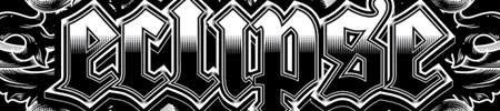
The ‘Eclipse’ design (no Twilight jokes, please!) is made up of a series of outlines around the type, combined with various tiny details to add shading to the text. These shading elements include a series of closely packed sharp triangles and a spread of horizontal lines.
View full size gothic typography design
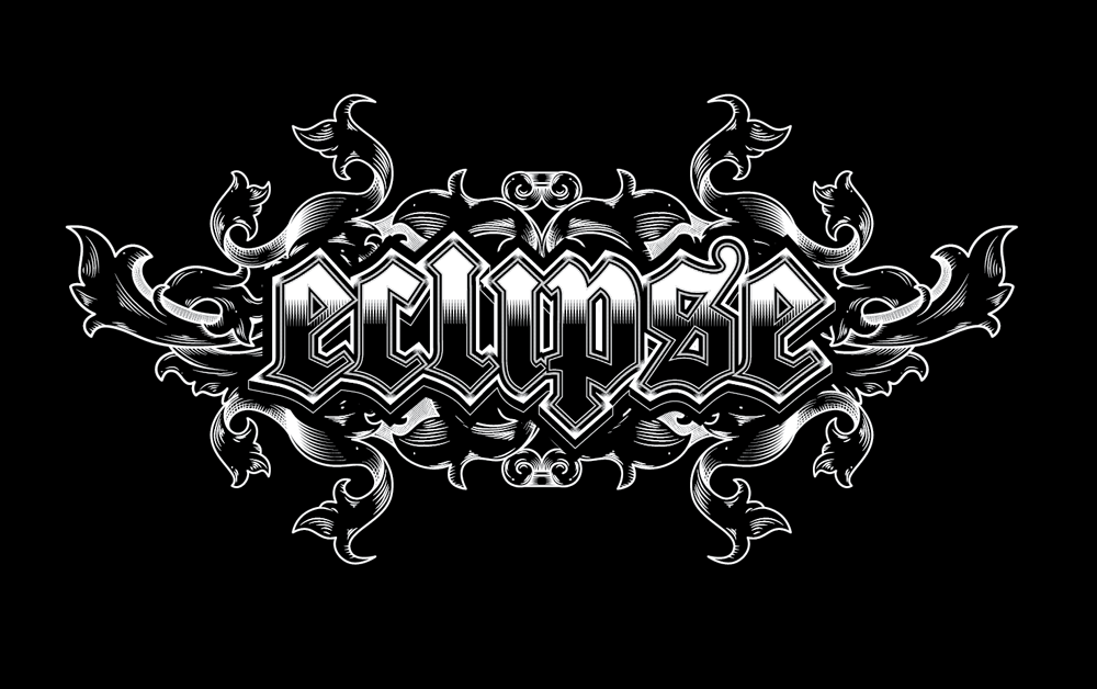
Open up Illustrator and type out your band name / apparel brand / random word of choice in a suitable blackletter style font. Here I’m using the font named Cloister Black as it includes some nice sharp angles and a cool looking traditional ‘S’.

I wasn’t too keen on the tails on the letters ‘L’ and ‘P’, so one of the first steps for me was to customise the type by copying a selection from the letter ‘I’ and using it as a replacement ascender/descender. Convert the font to outlines using the shortcut CMD+Shift+O so edits can be made.
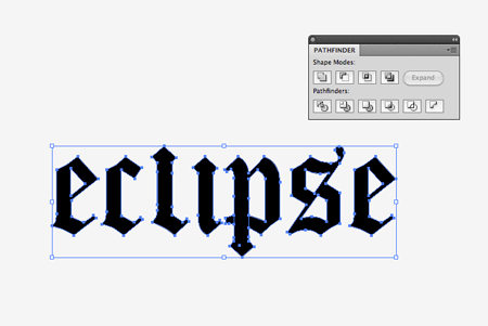
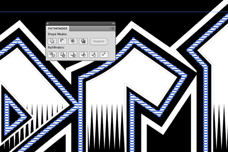
Once all the type customisations are made, Merge all the elements together using the Pathfinder tool.
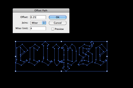
Draw a large black rectangle across the artboard to use as a background on a new layer and lock it in place. With the text selected, go to Object > Path > Offset Path. Enter 0.25mm in the options window.

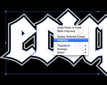
Right click and Ungroup the two text elements then add a white fill to the newly created outline.
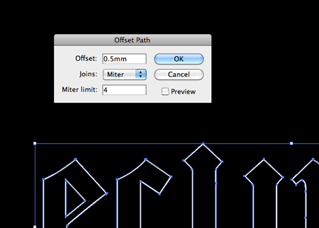
Select the outlining shape then go to Object > Path > Offset Path, this time enter 0.75mm in the options window. Fill this outline with black.
With the newly created black outline still selected make another Offset Path of 1mm and fill it with white.
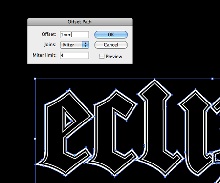
Make yet another offset path using the largest outline, this time use a 1mm setting.
Fill this largest outline with a white swatch. These outlines alone are already giving the type a cool Guitar Hero style effect.
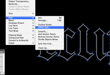
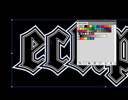
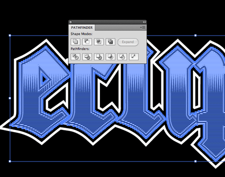
Each letter’s outline currently overlaps the previous letter, which looks a little ugly. Select all the shapes that make up the largest outline and Merge them with the Pathfinder. Send these items to the back (CMD+Shift+[).
Repeat the process, but this time with the next outline. Select and merge together all the black outlines to convert them into one shape. Send it to the back, then up one level (CMD+]) to sit above the outer white outline.
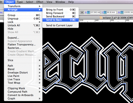
Select the next thin white outline and merge them all together. Send the merged item to the back then bring it back into the correct level using the CMD+[ shortcut.
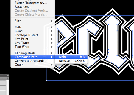
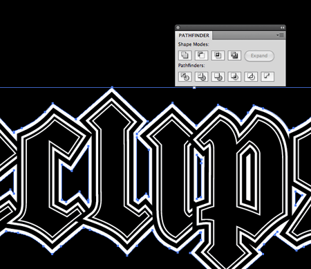
Select all the original letters from the centre of the design, copy and paste in front (CMD+F). Give them a white fill, then go to Object > Compound Path > Make.
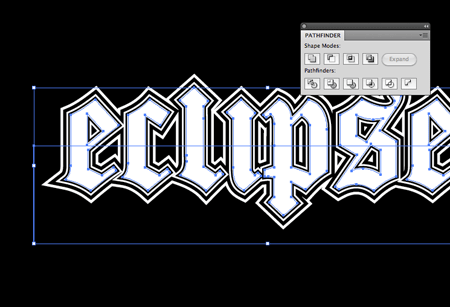
Draw a clear rectangle covering the lower half of the text and use this along with the Subtract option from the Pathfinder to trim down the white text.
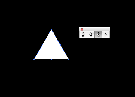
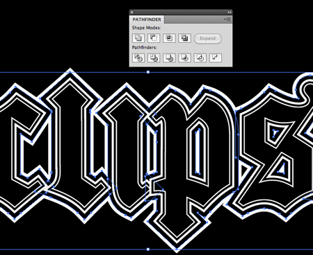
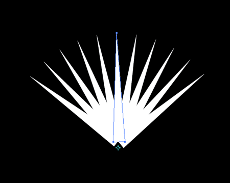
Elsewhere on the document use the Star tool to draw a triangle. Press the downwards cursor key while dragging the shape to lower the number of points. Remove the bezier points from the centre of each line with the Pen tool.
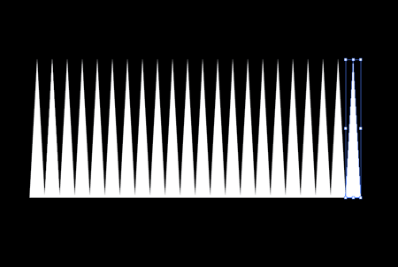
Select and nudge the two side points inwards to make the triangle thinner, then move the upper point vertically to stretch it out. Hold Alt and Shift while dragging the triangle to the side to make a duplicate, then continuously press the shortcut CMD+D to repeat the transformation until you have a series of repeating shapes.
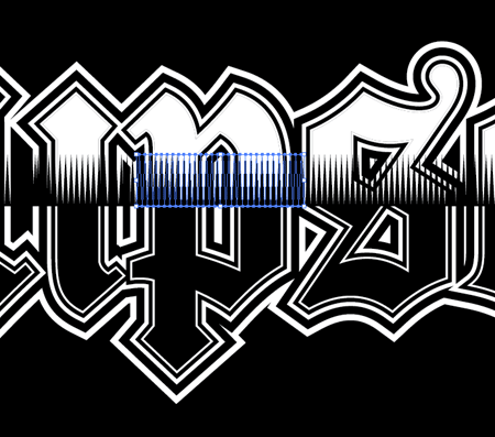
Make a Compound Path out of the triangles, then make copies and position them over each letter where the white and black shapes meet in the centre.
Working on each letter individually, make a copy of the original black letter, send it to the top (CMD+Shift+]) and use this as a tool to trim to the triangles to size using the Pathfinder Intersect option.
Continue making copies of each subsequent letter and trim down the triangles so they sit perfectly inside the letter outlines.
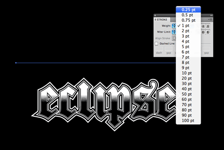
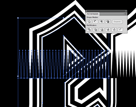
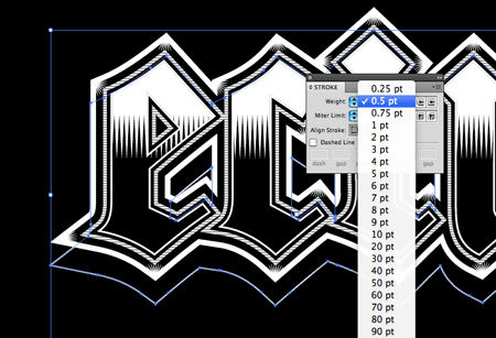
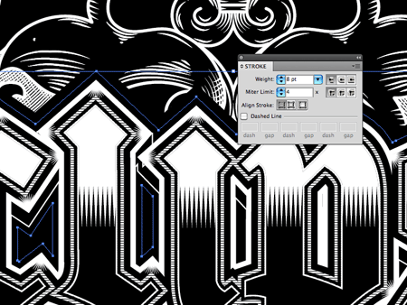
Draw a horizontal line on the artboard and give it a 0.25pt black stroke. Make sure it’s longer than the design itself.
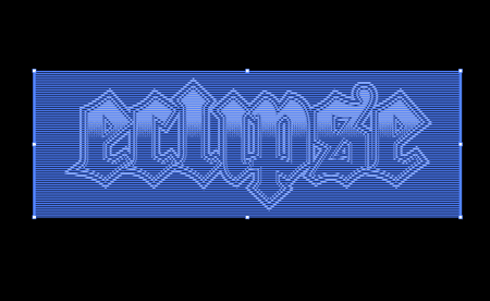
With the line selected hold Alt and press the downward cursor key. Continuously press CMD+D to repeat this transformation until you have a series of lines larger than the text.
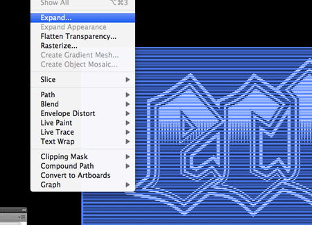
Draw a selection over all the lines and go to Object > Expand. Select just the stroke setting in the options box.
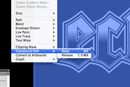
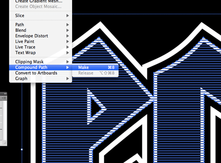
Make a Compound Path out of the series of lines by going to Object > Compound Path > Make.
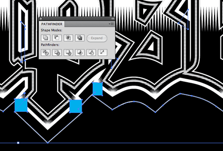
To trim the lines down so they fit inside the text we’ll need to create a duplicate of one of the outline shapes. Bring this item to the top and Ungroup the objects. Make a Compound Path of all these letter shapes.
With the series of lines and the duplicated letter outlines selected, click the Intersect option from the Pathfinder palette.
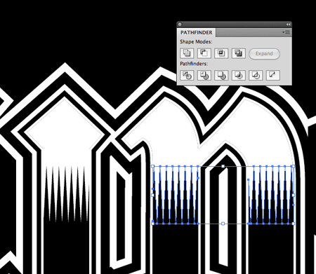
The lines have been trimmed so they fit within the text, but we don’t want them to fill the centre of the text.
Make a copy of the inner letters and make a Compound Path. Ungroup the series of lines and make another Compound Path out of these objects.
Use the Pathfinder once again, but this time choose the Subtract option in order to punch out the letters from the linework so they fit exactly into the confines of the outline.
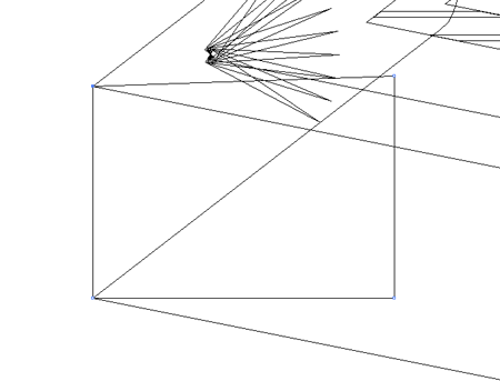
Elsewhere on the artboard use a duplicate of the small triangle to create a radial flare with the Rotate tool. Set the pivot point at the bottom and drag a copy using the Alt key. Make duplicates using the CMD+D shortcut.
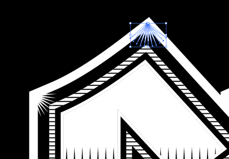
Make copies of this group of radial triangles and position them across the design wherever there’s a concave corner.
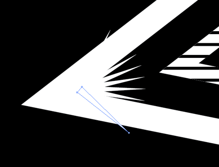
Go back through the design with a crazy zoom level to check for any overlapping points. Delete out such shapes using the Direct Selection Tool.
Make a Copy (CMD+C) and Paste Behind (CMD+B) a duplicate of the outer outline. Nudge this shape downwards vertically then switch the fill to black and give it a 0.5pt white stroke.
In order to finish off the three dimensional appearance, some areas of the duplicated outline need filling. Toggle outline mode (CMD+Y) and zoom right in. Use the Pen tool to draw gap filling shapes between the relevant points.
Select all the newly created gap filling shapes along with the black and white outline and merge them together with the Pathfinder tool.
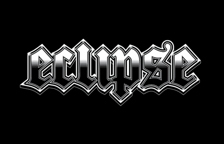
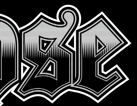
This leaves the actual typographic portion of the design complete. The detailed linework does a great job of adding shading and tone to the design, while the little flares on each corner give a shiny/sparkly effect – All without the use of gradients or colours.
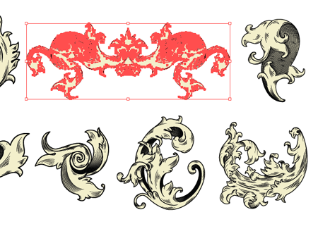
To finish off the design, download some accompanying ornamental elements. This particular vector pack is courtesy of WeGraphics and is available for download in the Access All Areas section.
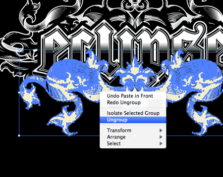
Ungroup the vector elements in order to change the linework to white and switch the inner fill from yellow to black to match the rest of the design.
Add an additional stroke to the black outline to give the text prominence against the detail of the ornamental elements.
Combined with the ornamental elements the typographic design looks great. The vectors really enhance the gothic style and disguise the text a little to make the design a tad more abstract.
サイト内検索
イラストレータの勉強
グラデーションと分割 図形と合流・型抜き ロゴマークの作成 テキスト落書き VECTIPS Logo Vectortuts Logo 水滴の作り方 WATER グラデーション背景 竹 リボン 薬カプセル かぼちゃ 緑の玉 亀さん 気球 花びら つやのある球 ロゴ vectips ロゴ Zee ロゴ 風船 ロゴ UPWARD ロゴ ZERO ロゴ VECTORS ロゴ VECTORSその2 ロゴ WOOF ロゴ Don't Break ロゴ Smooth ロゴ VECTORSその3 ロゴ VECTORSその4 ロゴ VECTORSその5 ロゴ VECTORSその6 ロゴ VECTORSその7 ロゴ VECTORSその8 ロゴ VECTTIPSその1 ロゴ VECTTIPS その2 ロゴ VECTTIPS その3 ロゴ VECTTIPS その4 ロゴ VECTTIPS その5 ロゴ VECTORSその8 ロゴ VECTORSその9 ロゴ VECTTIPS その6 ロゴ ROMERO WEEK ロゴ VECTORSその10 ロゴ ECLIPS ロゴ ROCKEY ロゴ VECTORSその11 ロゴ VECTORSその12 ロゴ Tutorial Shock ロゴ VECTORSその13 ロゴ VECTORSTUTS ロゴ ARCADE LOVE ロゴ Zeeその2 ロゴ VECTORS PUFFS イラスト1 イラスト2 イラスト3 イラスト4 イラスト5 イラスト6 夜空 3D ロゴ 葉と水玉とテントウムシ イラスト10 イラストカーテン イラスト木目 イラスト 幻想 イラスト メッシュの葉 イラスト 靴 イラスト 家 イラスト9 イラストレータ フォトショップ イラストレータV10の使い方デザインの勉強
デザインの基礎 AIRに挑戦 AOBADAIに挑戦 DOWNFALLに挑戦 フレームに挑戦 BOXグラフに挑戦 LUCKに挑戦 オレンジに挑戦 リングに挑戦 STORMに挑戦テキストにチャレンジ
カタカナ入力 七夕様 相田みつをの世界 誕生石 誕生石と誕生花 フランスの国旗 ドイツの国旗 イタリアの国旗 日本の国旗 ロシアの国旗 シャガール 犬のおまわりさん 拡張子 メニュー パン 世界の国旗 気になる言葉2 気になる言葉3 大きな古時計 オリエント急行 お料理教室 おしながき パソコン専門用語 地図・・・PC検定 メニュー 紅茶 特殊文字 占いいろいろ ウォルトディズニー 全館停電 ひまわり図鑑 ゆり図鑑 テキスト 初級 テキスト 中級① テキスト 中級② テキスト 上級① テキスト 上級② アロマセラピー講座1 あなたと薬 アロマセラピー講座2 オーストラリアの動物 美人が作るレシピ ブログ お料理知恵袋 ゆば ドトールコーヒー物語 地震 円の国際化 福原 愛 振り込め詐欺 楽しいガーデニング ガーリック クリップアートの色を 埼玉の観光 山梨の観光 ゴールデンウィーク はがきで挨拶 敗戦の時 阪神タイガース ハワイに行こう ヒアルロン酸 肥満の知識 ほくろがガンに要注意 今すぐトライ インターネットで調べよう ITニュース 日本のお茶 時代を切り開いた女性1 時代を切り開いた女性2 地獄めぐり 時間割 スポーツの審判 花粉症 段落番号の設定 神奈川県 漢文とは中国語か? 阪神タイガース 漢字の偏見 関節痛 ゴールデンウィーク 簡単お弁当レシピ キーボード 国民年金 暮らしを楽しく 草花図鑑その1 草花図鑑その2 行頭文字の設定 段落番号の設定 主な国際機構 浅田真央のプロファイル 数学図形の問題1 パソコンについて 中原中也 オーガニックコットン1 オーガニックコットン2 落ち葉の森 お大事に 奥の細道 ページ番号の設定 埼玉の観光 ラーメン博物館 レシピ1 レシピ2 連絡網 履歴書 竜宮城 竜宮城バザー 世界の気候 脂肪を燃やせ 資格 四季折々の野菜 春 四季折々の野菜 冬 下町で 食品の分類 生涯学習 生姜と豚肉 四季の折々野菜(春) 四季折々の野菜 秋 四季の野菜 春 下町で遊ぼう そばの献立 サッカー世界標準 スターバックス すだちとかぼす スーパーサッカー 数学の問題2 体内チェック 寅さんシリーズ1 寅さんシリーズ2 寅さんシリーズ3 寅さんシリーズ4 海から吹く風 横浜ベースターズ 郵便払込み 湯河原独歩の湯 ゆかた祭り模写は意外と簡単
大黒様 着物の柄 富岳百景 ベートーベン オペラ座 ミニー ゴメン 母の日 ドラゴンボール 潮干狩りパソコン教室
パソコン教室の特徴 会員の最大の特典は? パソコン教室の会員の種類 すべて個人指導で、解りやすく 出張!パソコン家庭教師 追加受講する場合 日曜教室、始めました パソコン教室の料金体系何を学ぶか?
どんなサービスか? 学べるソフト一覧 ホームページを作ろう パワーポイントを勉強しよう 模写の勉強 デザインの基礎 ビデオの編集をやってみよう。