


イラストレータでデザインをやってみましょう
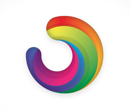
Usually I'd always recommend for a logo to be developed in relation to the company or brand it is representing, but today we're just going to look at the technical part of building this generic icon. This graphic features many of the trends in logo design seen today - The three dimensional appearance, gradients and variances in tone.
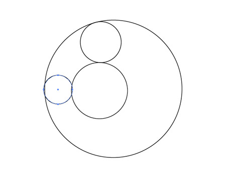
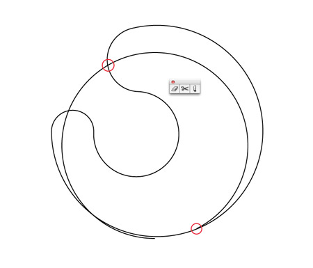
Open up Illustrator and create a new document. Grab the circle tool and begin laying out the basic shapes of the icon. Place a small circle inside a large circle, then add smaller circles between the outlines of the two.
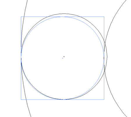
Zoom in and press CMD+Y to switch to outline view. This will help you accurately align the shapes so the paths match exactly without any overlap.
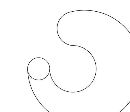
Use the Scissors tool to clip each path where the two lines meet, then select the unwanted portions of the shapes and delete them.
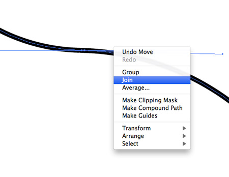
Zoom in and select the two open points from each paths, right click and select Join. Repeat this for each of the clipped lines to form one continuous path outline. Make a copy of this shape as we'll need it later.
Draw another circle over the shape so the outline cuts across and neatly flows back into its outline.
Use the Scissors tool to cut points where the two lines intersect and delete out the excess, leaving just a line flowing along the inside of the graphic.
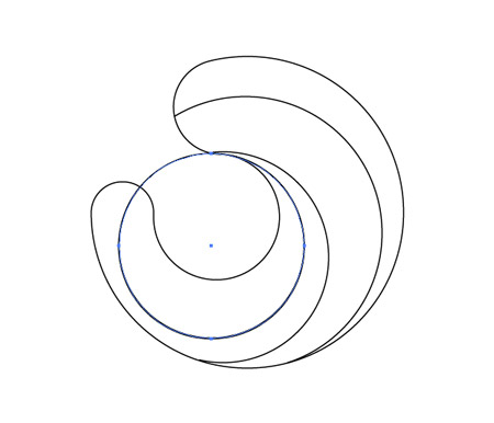
Continue adding lines inside the graphic using circles of various sizes, then cut and delete out the excess with the Scissors tool.
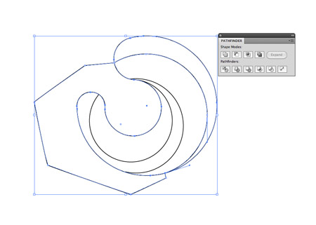
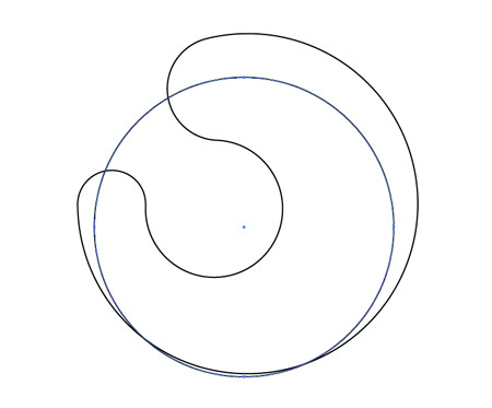
Select the Pen tool and click on the open point of the line to continue the path. Roughly draw a route around the graphic until you reach the other end and click on the remaining open point to close the path. Select this shape along with the overall graphic shape and click the Divide option from the Pathfinder window.
Right click and select Ungroup, then delete out the shape with the rough outline. Give the newly created segment a colour fill to identify it.

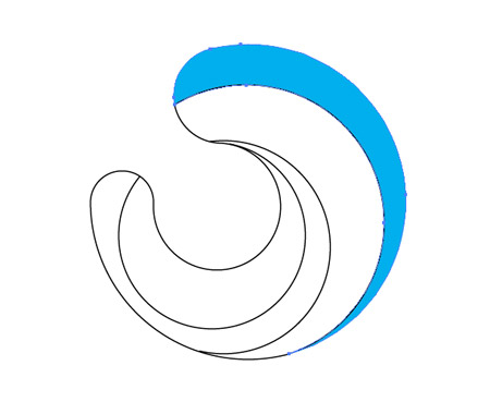
Continue this process with the remaining segments, creating smooth shapes from the intersecting lines. Add random colour fills to each piece.
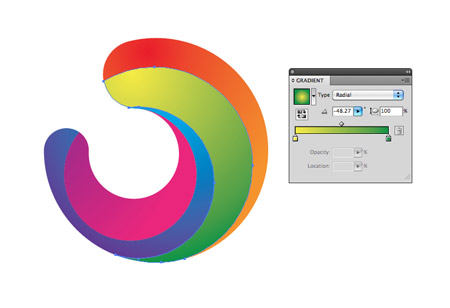
Use the Gradient tool to switch the ugly tones for vibrant colours. Select colours in their colour wheel order (or rainbow order!), so the first piece flows from red to orange, the second from yellow to green and so on.
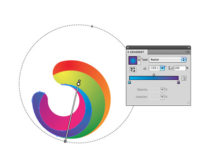
Switch the gradient style to Radial and adjust the flow so the colours run nicely along the direction of the shape.
The graphic is looking pretty cool so far, but we can enhance it with some clever shading. Draw a circle to intersect the first shape.
Select this circle along with the first segment and press the Intersect option from the Pathfinder palette.
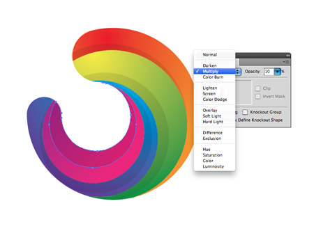
Repeat this process for the other segments, then give these shapes a black fill with the settings of Multiply at 10% opacity.
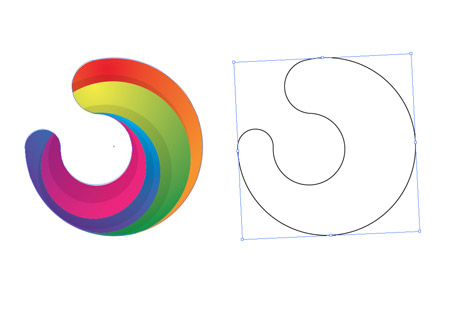
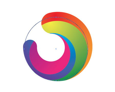
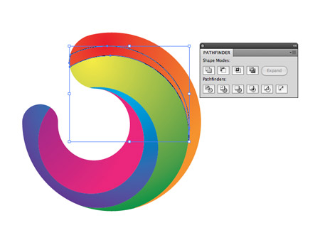
Hopefully you saved that original outline we created as we'll now need it to overlap our logo graphic. Carefully position the shape so it fits perfectly over our colour version.
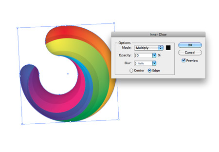
Give the shape a white fill and set it to Multiply, then go to Effect - Stylize - Inner Glow. Alter the settings to Multiply, Black, 20% opacity and 5mm blur.
The addition of various gradients, shading elements and the inner glow effect really enhances the graphic, giving it depth and a three dimensional appearance.
If you enjoyed this post, please consider giving it a tweet or a thumbs up using the social buttons below to share it with your friends. It really helps out!
サイト内検索
イラストレータの勉強
グラデーションと分割 図形と合流・型抜き ロゴマークの作成 テキスト落書き VECTIPS Logo Vectortuts Logo 水滴の作り方 WATER グラデーション背景 竹 リボン 薬カプセル かぼちゃ 緑の玉 亀さん 気球 花びら つやのある球 ロゴ vectips ロゴ Zee ロゴ 風船 ロゴ UPWARD ロゴ ZERO ロゴ VECTORS ロゴ VECTORSその2 ロゴ WOOF ロゴ Don't Break ロゴ Smooth ロゴ VECTORSその3 ロゴ VECTORSその4 ロゴ VECTORSその5 ロゴ VECTORSその6 ロゴ VECTORSその7 ロゴ VECTORSその8 ロゴ VECTTIPSその1 ロゴ VECTTIPS その2 ロゴ VECTTIPS その3 ロゴ VECTTIPS その4 ロゴ VECTTIPS その5 ロゴ VECTORSその8 ロゴ VECTORSその9 ロゴ VECTTIPS その6 ロゴ ROMERO WEEK ロゴ VECTORSその10 ロゴ ECLIPS ロゴ ROCKEY ロゴ VECTORSその11 ロゴ VECTORSその12 ロゴ Tutorial Shock ロゴ VECTORSその13 ロゴ VECTORSTUTS ロゴ ARCADE LOVE ロゴ Zeeその2 ロゴ VECTORS PUFFS イラスト1 イラスト2 イラスト3 イラスト4 イラスト5 イラスト6 夜空 3D ロゴ 葉と水玉とテントウムシ イラスト10 イラストカーテン イラスト木目 イラスト 幻想 イラスト メッシュの葉 イラスト 靴 イラスト 家 イラスト9 イラストレータ フォトショップ イラストレータV10の使い方デザインの勉強
デザインの基礎 AIRに挑戦 AOBADAIに挑戦 DOWNFALLに挑戦 フレームに挑戦 BOXグラフに挑戦 LUCKに挑戦 オレンジに挑戦 リングに挑戦 STORMに挑戦テキストにチャレンジ
カタカナ入力 七夕様 相田みつをの世界 誕生石 誕生石と誕生花 フランスの国旗 ドイツの国旗 イタリアの国旗 日本の国旗 ロシアの国旗 シャガール 犬のおまわりさん 拡張子 メニュー パン 世界の国旗 気になる言葉2 気になる言葉3 大きな古時計 オリエント急行 お料理教室 おしながき パソコン専門用語 地図・・・PC検定 メニュー 紅茶 特殊文字 占いいろいろ ウォルトディズニー 全館停電 ひまわり図鑑 ゆり図鑑 テキスト 初級 テキスト 中級① テキスト 中級② テキスト 上級① テキスト 上級② アロマセラピー講座1 あなたと薬 アロマセラピー講座2 オーストラリアの動物 美人が作るレシピ ブログ お料理知恵袋 ゆば ドトールコーヒー物語 地震 円の国際化 福原 愛 振り込め詐欺 楽しいガーデニング ガーリック クリップアートの色を 埼玉の観光 山梨の観光 ゴールデンウィーク はがきで挨拶 敗戦の時 阪神タイガース ハワイに行こう ヒアルロン酸 肥満の知識 ほくろがガンに要注意 今すぐトライ インターネットで調べよう ITニュース 日本のお茶 時代を切り開いた女性1 時代を切り開いた女性2 地獄めぐり 時間割 スポーツの審判 花粉症 段落番号の設定 神奈川県 漢文とは中国語か? 阪神タイガース 漢字の偏見 関節痛 ゴールデンウィーク 簡単お弁当レシピ キーボード 国民年金 暮らしを楽しく 草花図鑑その1 草花図鑑その2 行頭文字の設定 段落番号の設定 主な国際機構 浅田真央のプロファイル 数学図形の問題1 パソコンについて 中原中也 オーガニックコットン1 オーガニックコットン2 落ち葉の森 お大事に 奥の細道 ページ番号の設定 埼玉の観光 ラーメン博物館 レシピ1 レシピ2 連絡網 履歴書 竜宮城 竜宮城バザー 世界の気候 脂肪を燃やせ 資格 四季折々の野菜 春 四季折々の野菜 冬 下町で 食品の分類 生涯学習 生姜と豚肉 四季の折々野菜(春) 四季折々の野菜 秋 四季の野菜 春 下町で遊ぼう そばの献立 サッカー世界標準 スターバックス すだちとかぼす スーパーサッカー 数学の問題2 体内チェック 寅さんシリーズ1 寅さんシリーズ2 寅さんシリーズ3 寅さんシリーズ4 海から吹く風 横浜ベースターズ 郵便払込み 湯河原独歩の湯 ゆかた祭り模写は意外と簡単
大黒様 着物の柄 富岳百景 ベートーベン オペラ座 ミニー ゴメン 母の日 ドラゴンボール 潮干狩りパソコン教室
パソコン教室の特徴 会員の最大の特典は? パソコン教室の会員の種類 すべて個人指導で、解りやすく 出張!パソコン家庭教師 追加受講する場合 日曜教室、始めました パソコン教室の料金体系何を学ぶか?
どんなサービスか? 学べるソフト一覧 ホームページを作ろう パワーポイントを勉強しよう 模写の勉強 デザインの基礎 ビデオの編集をやってみよう。