


イラストレータでデザインをやってみましょう
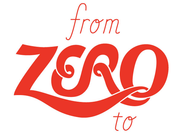
Final Product What You'll Be Creating
Introduction
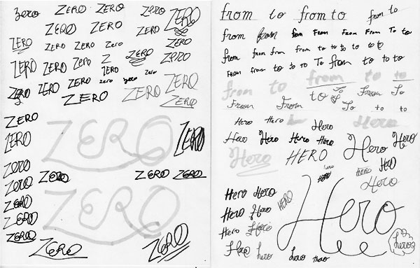
Script lettering can take on many forms, from athletic logos, to tattoos, all the way to wedding invitations – and many places in between – but they all are rooted in handwriting. So thats where we’ll start.
Simply Drawn Script
First, we’ll start with simply re-creating the words ‘to’ and ‘from’ directly off of the sketch/reference. This is a fairly straight forward approach, but still useful because this style of lettering could be used for almost any project.
Step 1a
Break out the drawing utensils and write. I like to start with drawing because its helps to understand how the letter-forms are naturally formed.
Step 1b
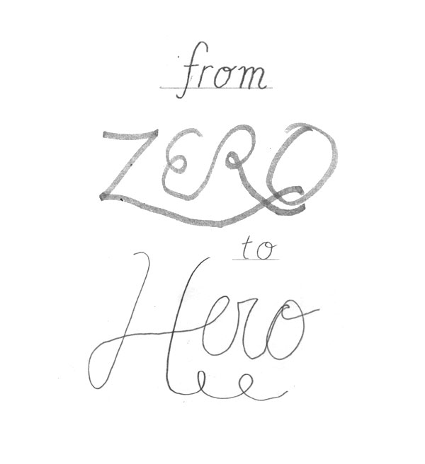
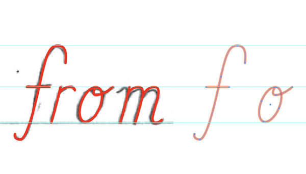
Here is the super quick sketch/mock-up to use as reference for creating the script lettering.
Step 2a
First up is the simple/basic script, based pretty closely off of the sketch. Bring in the reference image to AI and lock it in place (Command + 2).
Step 2b
As you can see in the sketch I even used a guideline (baseline), this is to keep the letter-form on an even plane and consistent. Guides definitely will help when building the letters in Illustrator, so simply drag guidelines for the height of the letters from the sketch.
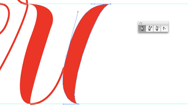
Step 3a
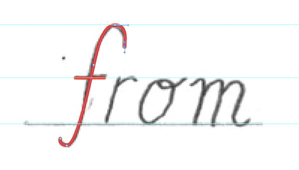
The rest is fairly simple on this first style, simply follow the basic forms of the sketch with the Pen Tool. Here I am using a 2pt (red) stroke on the lines.
Step 3b
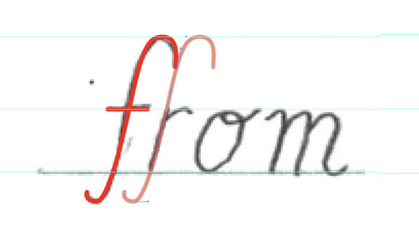
In-order to keep the lines consistent, specifically the angle of the letterforms, it helps to copy+drag existing lines and modify to help create the next letter. This also helps speed things along.
Step 3c
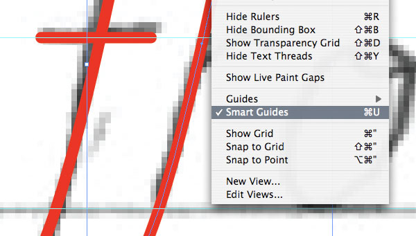
Another good tip is to make sure that you have Smart Guides on (View > Smart Guides). This will help to make sure things are precise.
Step 3d
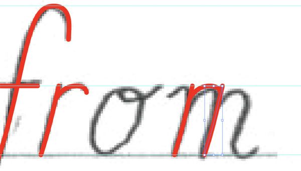
Things should move along quite swiftly and pain free. As you can see, for example, it’s fairly easy to create the letter ‘m’ using parts of the letter ‘r’ and a few simple variations with the Pen Tool.
Step 3e
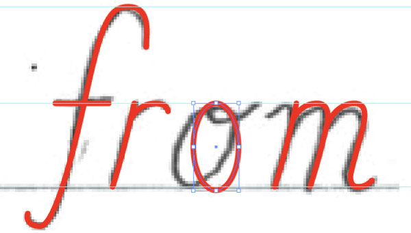
Again, keep things simple. The letter ‘o’ can be started using the Ellipse Tool. Then refine according to the sketch.
Step 3f
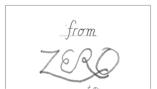
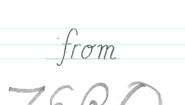
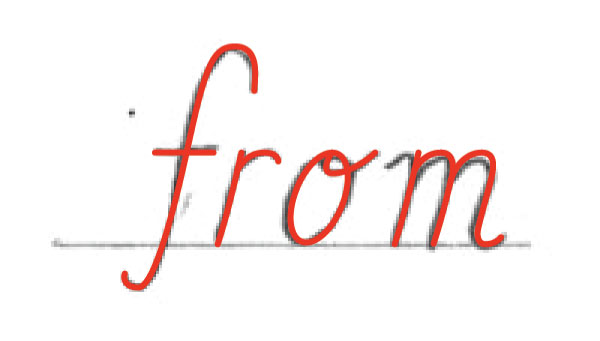
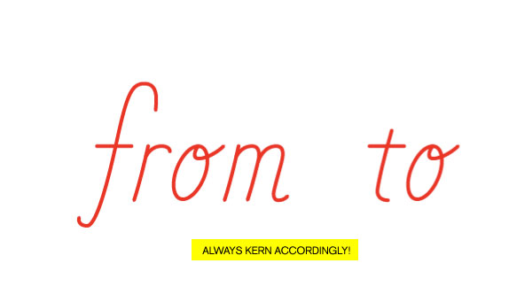
There you go, you have the word “from.” Notice, that I varied from the sketch, this is an important thing to be open to, because the sketch is just for reference it’s not the perfect drawing. Start with the sketch, but make sure the letterforms look good by themselves.
Step 4a
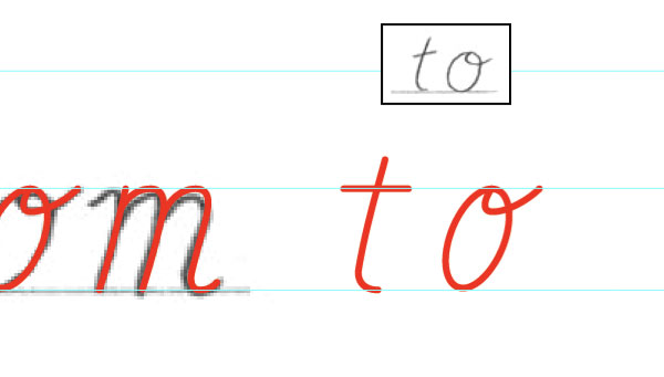
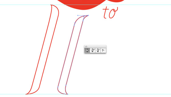
To create the next word, “to,” we’ll create the same style letters but this time we won’t even need to use the sketch. Simple copy + drag over the pieces/parts of the letters you have already created.
Step 4b
Referencing the sketch, simply modify and draw the word “to.”
Step 4c
There you have it, two words drawn and the first of three script lettering styles finished.
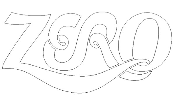
Building a Bold Script
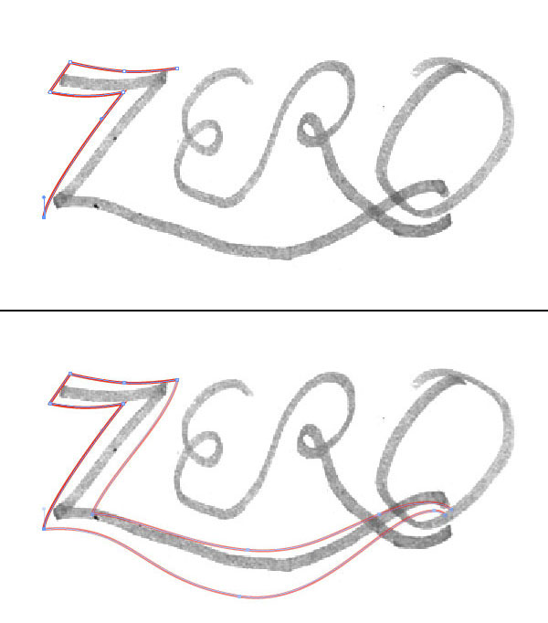
For the next style we’re building the word “ZERO.” This approach uses the reference/sketch to understand how to build the framework of the letters so they intertwine/flow correctly. This is an energetic looking letter style and could be used for things like athletics or anything playful.
Step 5a
Using the sketch as reference to build from, start drawing the “Z” with the Pen Tool. The basic idea is to use the sketch as a framework – or how the letters flow into each other – not tracing them like in the last style.
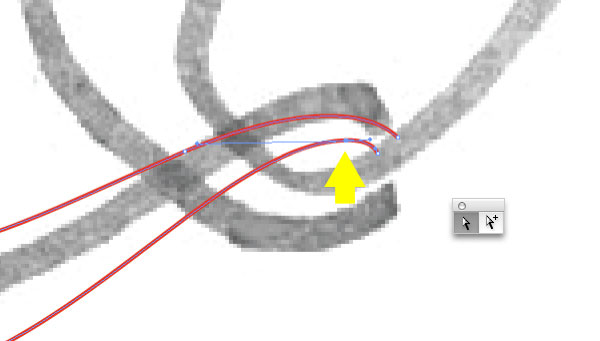
Step 5b
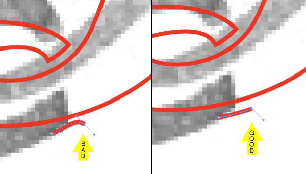
In-order to achieve the allusion that the letters intertwine we will need to create a bridge or white gap between two shapes. And to keep these gaps precise and consistent simply start with a point from an existing line. Direct Select (white arrow) the closet point to where the new shape where the gap will appear.
Step 5c
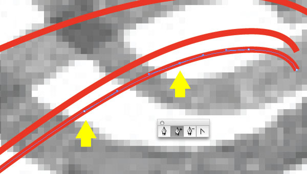
Copy + Paste the point in front and using the up/down and left/right arrows position the line in place. Keeping track of how the distance (4 down) you’ve moved the piece and using that same distance throughout the lettering will keep things consistent. Though it may not always be the same, depending on the orientation/position of the shapes.
Step 5d
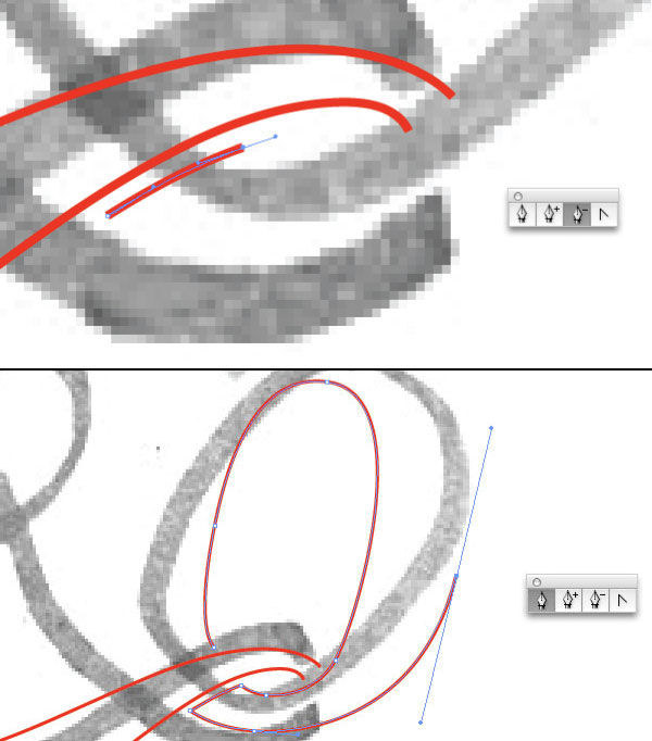
Using the Add Anchor Point Tool (+ Arrow) add 2 points where you want to start the next shape, in this case it being the “O” in “ZERO.”
Step 5e
Next, using the Delete Anchor Points Tool (- Arrow), delete the unneeded points and continue drawing the “O” with the Pen Tool.
Step 5f
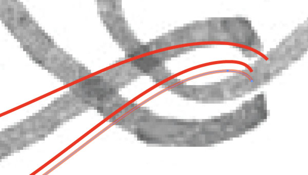
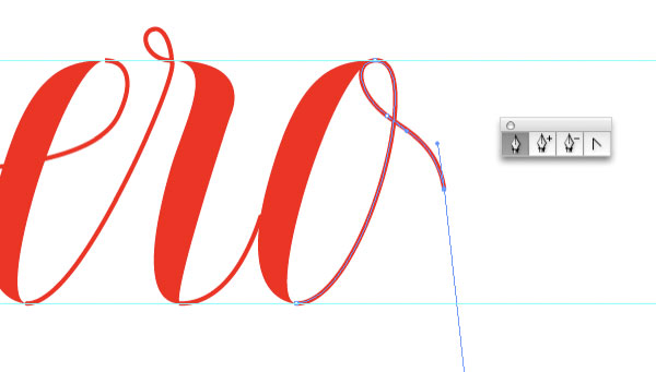
The completed “Z” and “O” in “ZERO.”
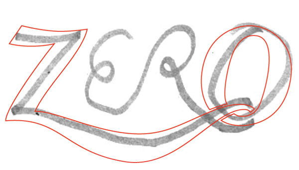
Step 6
If the bezier handles from the Copy + Pasted line segment are not in the correct position and are changing the angle/direction of the intended line, hold Option and drag a new bezier handle.
Step 7a
Because you already have the gap segments to work from, it should be fairly easy to continue on with the letter “R,” working your way towards the “E.”
Step 7b
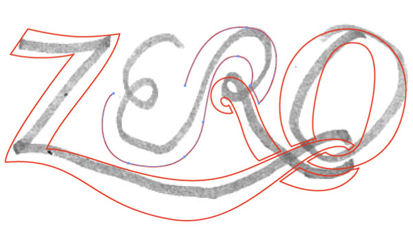
Completed line-work for the word “ZERO.”
Step 7c
In outline form (Command + Y) you can see that the linework is clean, meaning there aren’t any overlapping or over complicated shapes.
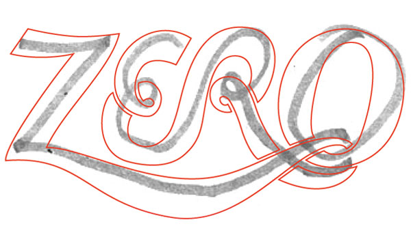
Step 8
By changing the “ZERO” linework from a red line with stroke to red fill, and popping back in the previous “from” and “to” lettering – you have only one word to go.
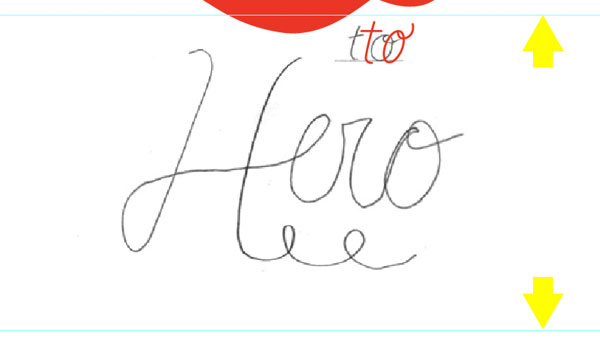
Finessing a Fancy Script
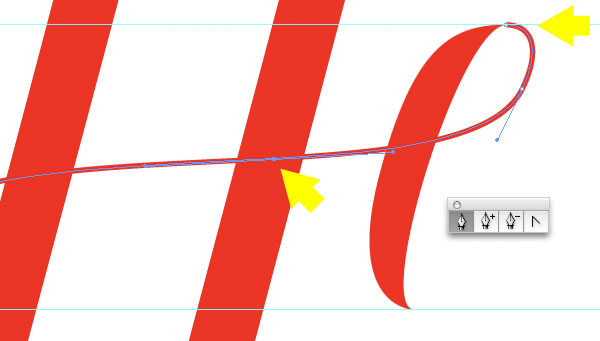
Now let’s work on the the final style, the word “HERO.” This approach uses the reference/sketch only as reference, and is more about setting up guides to create letterforms that have nice, thick vertical strokes leading into very thin horizontal based strokes. This is a classic looking letter style that has been around forever, but still could be used for anything from a wedding invite to a rock bands logo.
Step 9a
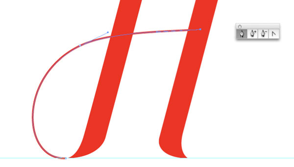
First, establish guides for consistency. Referencing the sketch, the ‘H’ in ‘Hero’ be larger then the rest of the script, so that is a good place to start. Determine the guides for the height of the ‘H’. Since the sketch is so crude, there wont be a need to keep it in the artboard. Hide it and reference it when needed as you draw the rest of the letters.
Step 9b
Using the Pen Tool, draw the first thick vertical stroke of the “H.” I am using a 2pt stroke line (red) to start.
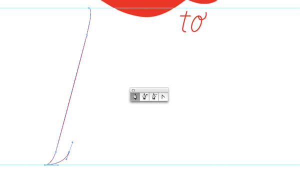
Step 9c
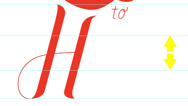
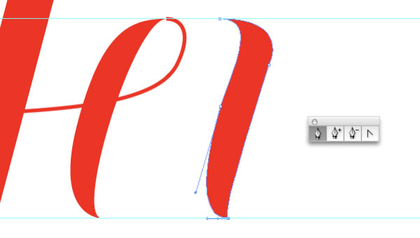
Remember the think vertical strokes will curve into thin, delicate lines, so taper each end. Also, notice the right side of the “H,” will need to be slightly shorter, so it doesn’t interfere with the above lettering. Rules (guides) are meant to be broken. Both sides of the “H” are finished.
Step 9d
Change both vertical tapered strokes of the ‘H’ to a fill. With the Smart Guides still on, draw a line (2 pt) from the bottom left taper, swooping across to the right of the “H.”
Step 10
Next, we’ll need to establish an additional set of guides for the height of the smaller letters “e,” “r” and “o.”
Step 11a
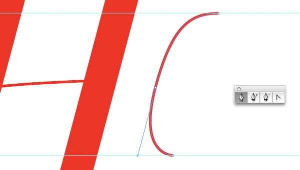
The same as the “H,” using the Pen Tool, draw the thick stroke of the “e.”
Step 11b
Complete the thick stroke of the “e” and change it to a fill. From the top of the “e” draw, using a 2pt stroke line, from the top of the “e,” connecting it to the line of the “H.”
Step 12a
Draw the thick stroke of the “r” and change it to a fill.
Step 12b
Add the thin stroke of the connecting “e” and “r,” and then finish the shape of the “r.”
Step 12c
Don’t forget the nice little loop on the cursive “r.” It’s all in finessing the details.
Step 13a
And for the last letter, draw the thick stroke of the “o,” be sure to change it to fill.
Step 13b
Complete the “o” by drawing the thick (2pt) stroke.
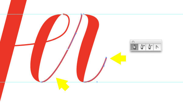
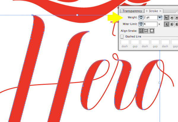
Step 14
You may notice that the transitions from thick to thin on “Hero” are inconsistent. To fix that, select all of the filled shapes (thick strokes) and apply a 2 pt stroke weight to the shapes. All of the transitions are now smooth and refined.
Step 15a
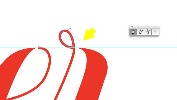
To add a bit of finesse, or fanciness, add a swash coming from the “o,” and maybe a few more loops to the lettering. Now we’ve got the spirit of the script.
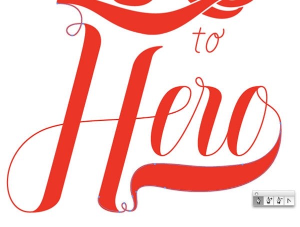
Step 15b
And how about even more fancy swoops to tie all of the different lettering together.
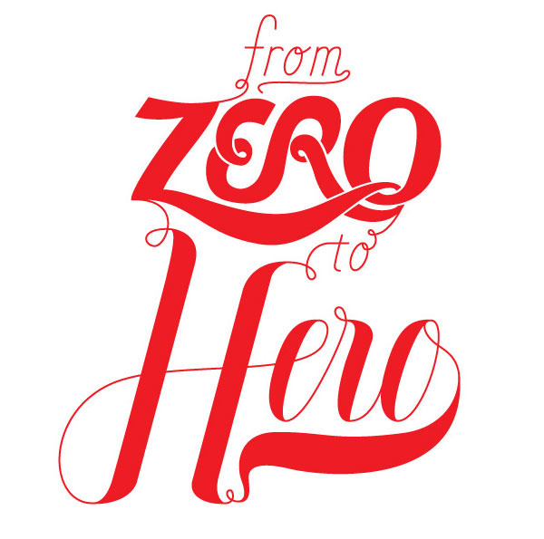
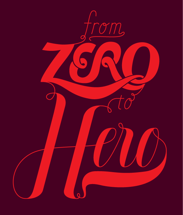
Final Image
Finish it of with a background color that makes the lettering pop. Boom!
The purpose of this tut is to show a variety of approaches and styles of script lettering. Hopefully this will help you to create you own, unique script lettering. The final image is below.
サイト内検索
イラストレータの勉強
グラデーションと分割 図形と合流・型抜き ロゴマークの作成 テキスト落書き VECTIPS Logo Vectortuts Logo 水滴の作り方 WATER グラデーション背景 竹 リボン 薬カプセル かぼちゃ 緑の玉 亀さん 気球 花びら つやのある球 ロゴ vectips ロゴ Zee ロゴ 風船 ロゴ UPWARD ロゴ ZERO ロゴ VECTORS ロゴ VECTORSその2 ロゴ WOOF ロゴ Don't Break ロゴ Smooth ロゴ VECTORSその3 ロゴ VECTORSその4 ロゴ VECTORSその5 ロゴ VECTORSその6 ロゴ VECTORSその7 ロゴ VECTORSその8 ロゴ VECTTIPSその1 ロゴ VECTTIPS その2 ロゴ VECTTIPS その3 ロゴ VECTTIPS その4 ロゴ VECTTIPS その5 ロゴ VECTORSその8 ロゴ VECTORSその9 ロゴ VECTTIPS その6 ロゴ ROMERO WEEK ロゴ VECTORSその10 ロゴ ECLIPS ロゴ ROCKEY ロゴ VECTORSその11 ロゴ VECTORSその12 ロゴ Tutorial Shock ロゴ VECTORSその13 ロゴ VECTORSTUTS ロゴ ARCADE LOVE ロゴ Zeeその2 ロゴ VECTORS PUFFS イラスト1 イラスト2 イラスト3 イラスト4 イラスト5 イラスト6 夜空 3D ロゴ 葉と水玉とテントウムシ イラスト10 イラストカーテン イラスト木目 イラスト 幻想 イラスト メッシュの葉 イラスト 靴 イラスト 家 イラスト9 イラストレータ フォトショップ イラストレータV10の使い方デザインの勉強
デザインの基礎 AIRに挑戦 AOBADAIに挑戦 DOWNFALLに挑戦 フレームに挑戦 BOXグラフに挑戦 LUCKに挑戦 オレンジに挑戦 リングに挑戦 STORMに挑戦テキストにチャレンジ
カタカナ入力 七夕様 相田みつをの世界 誕生石 誕生石と誕生花 フランスの国旗 ドイツの国旗 イタリアの国旗 日本の国旗 ロシアの国旗 シャガール 犬のおまわりさん 拡張子 メニュー パン 世界の国旗 気になる言葉2 気になる言葉3 大きな古時計 オリエント急行 お料理教室 おしながき パソコン専門用語 地図・・・PC検定 メニュー 紅茶 特殊文字 占いいろいろ ウォルトディズニー 全館停電 ひまわり図鑑 ゆり図鑑 テキスト 初級 テキスト 中級① テキスト 中級② テキスト 上級① テキスト 上級② アロマセラピー講座1 あなたと薬 アロマセラピー講座2 オーストラリアの動物 美人が作るレシピ ブログ お料理知恵袋 ゆば ドトールコーヒー物語 地震 円の国際化 福原 愛 振り込め詐欺 楽しいガーデニング ガーリック クリップアートの色を 埼玉の観光 山梨の観光 ゴールデンウィーク はがきで挨拶 敗戦の時 阪神タイガース ハワイに行こう ヒアルロン酸 肥満の知識 ほくろがガンに要注意 今すぐトライ インターネットで調べよう ITニュース 日本のお茶 時代を切り開いた女性1 時代を切り開いた女性2 地獄めぐり 時間割 スポーツの審判 花粉症 段落番号の設定 神奈川県 漢文とは中国語か? 阪神タイガース 漢字の偏見 関節痛 ゴールデンウィーク 簡単お弁当レシピ キーボード 国民年金 暮らしを楽しく 草花図鑑その1 草花図鑑その2 行頭文字の設定 段落番号の設定 主な国際機構 浅田真央のプロファイル 数学図形の問題1 パソコンについて 中原中也 オーガニックコットン1 オーガニックコットン2 落ち葉の森 お大事に 奥の細道 ページ番号の設定 埼玉の観光 ラーメン博物館 レシピ1 レシピ2 連絡網 履歴書 竜宮城 竜宮城バザー 世界の気候 脂肪を燃やせ 資格 四季折々の野菜 春 四季折々の野菜 冬 下町で 食品の分類 生涯学習 生姜と豚肉 四季の折々野菜(春) 四季折々の野菜 秋 四季の野菜 春 下町で遊ぼう そばの献立 サッカー世界標準 スターバックス すだちとかぼす スーパーサッカー 数学の問題2 体内チェック 寅さんシリーズ1 寅さんシリーズ2 寅さんシリーズ3 寅さんシリーズ4 海から吹く風 横浜ベースターズ 郵便払込み 湯河原独歩の湯 ゆかた祭り模写は意外と簡単
大黒様 着物の柄 富岳百景 ベートーベン オペラ座 ミニー ゴメン 母の日 ドラゴンボール 潮干狩りパソコン教室
パソコン教室の特徴 会員の最大の特典は? パソコン教室の会員の種類 すべて個人指導で、解りやすく 出張!パソコン家庭教師 追加受講する場合 日曜教室、始めました パソコン教室の料金体系何を学ぶか?
どんなサービスか? 学べるソフト一覧 ホームページを作ろう パワーポイントを勉強しよう 模写の勉強 デザインの基礎 ビデオの編集をやってみよう。