


イラストレータでデザインをやってみましょう
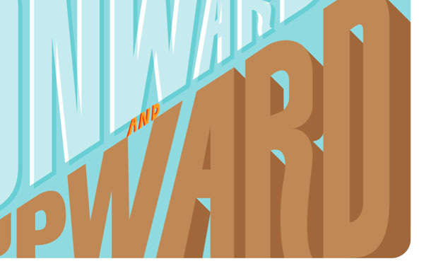
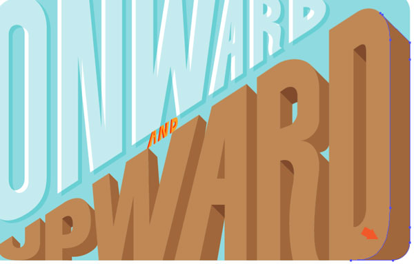
Final Product What You'll Be Creating
Introduction
I will start off by drawing the letter-forms for the three words “ONWARD,” “AND” and “UPWARD.” From there I will show three ways to create simple, yet interesting 3D effects. 3D is the latest craze (See: nearly every movie that has come out in the last two years) but my interests are in 3-Dimensional lettering that has old school, subtle, simple, imperfect, more humanistic qualities. Drawing inspiration from vintage poster lettering, and overall aesthetics, everything will be wrapped together to create the full poster design.
Drawing Lettering
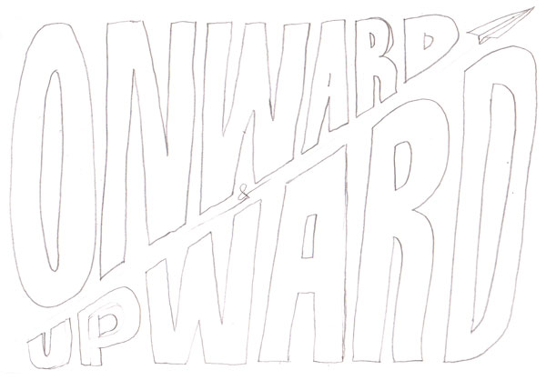
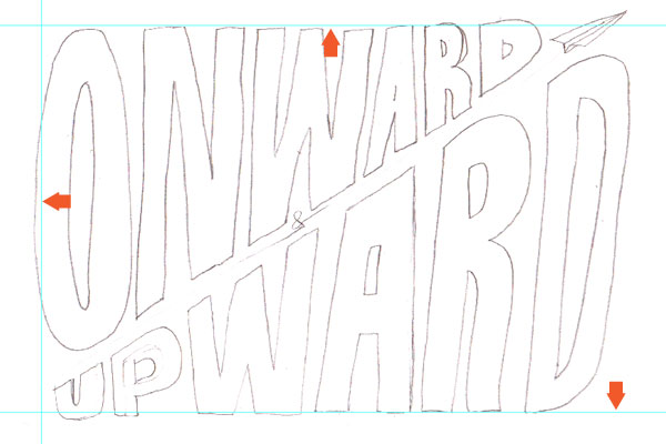
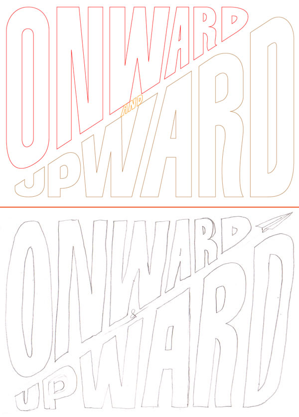
As always, good lettering starts with a sketch. You just need to get the basic idea and composition. The basic idea for this tut is that the poster will be split diagonally and the letters will go from big to small (and vise versa).
Step 1a
This sketch is very rough and is basically there to reference when actually creating the lines in Adobe Illustrator (AI).
Step 1b
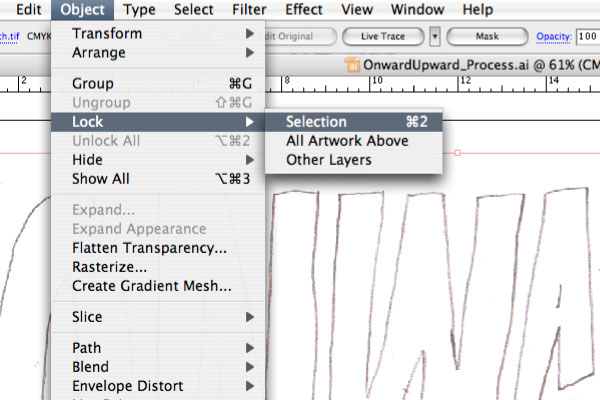
Open a new document in AI and paste in the sketch. Lock it in place.
Step 2
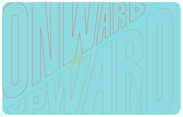
Create outside guides loosely based on the sketch (Drag from the Rulers).
Step 3a
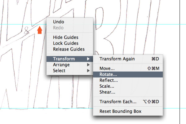
Next, we’ll create diagonal guides. Create another guide, but while still selected go Control-click > Transform > Rotate.
Step 3b
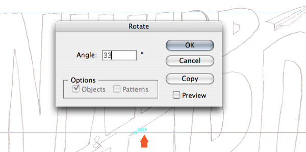
In the prompt window enter an Angle of 33 and hit OK.
Step 3c
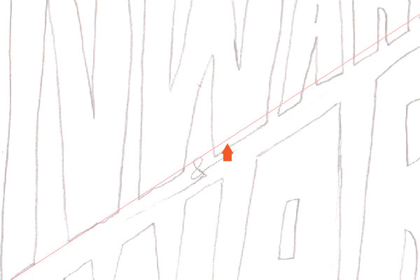
The guide is now diagonal. Copy another guide (Click + Drag + Shift) above and below. All guides are now setup.
Step 4a
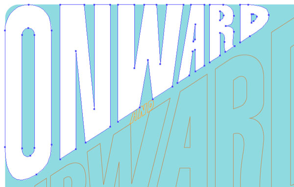
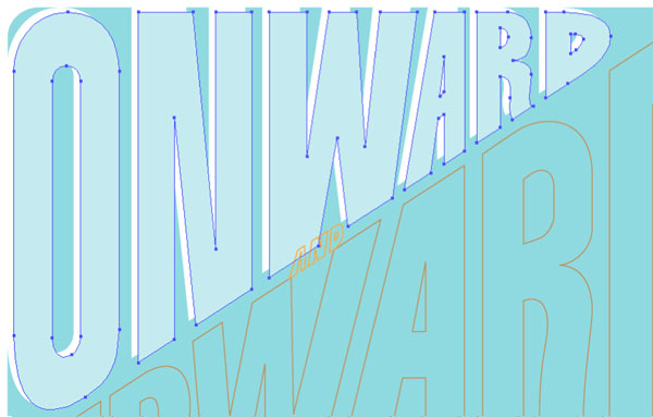
Next, referencing the sketch and start drawing the letterforms using the Pen Tool. The color/line-weight doesn’t matter at this point, they will be addressed later. Also, as mentioned previously, the basic idea is that the letters will go from big to small along the diagonal.
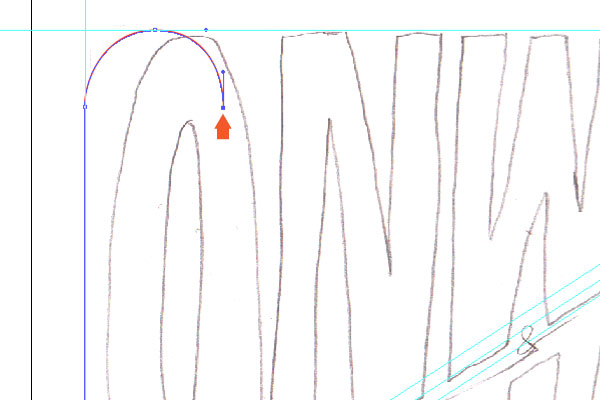
Step 4b
Using the guides as starting points, be sure to keep the vertical lines on the letter-forms precise by holding shift while drawing. It might be easier to draw if you hide the sketch (Toggle the eye icon in the layers palette).
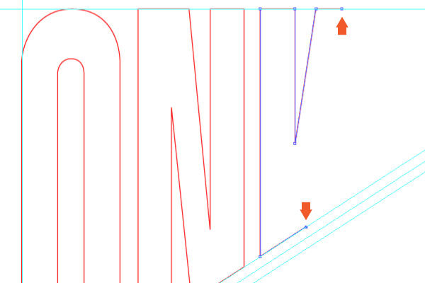
Step 4c
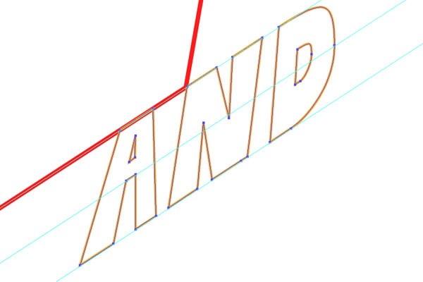
The first word, “ONWARD,” is complete.
Step 5a
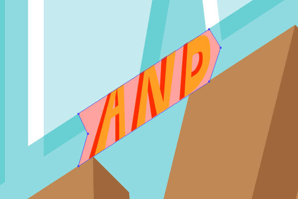
Next, use the diagonal guides and draw the word “AND.” There isn’t a reference for this in the sketch, but the idea is to draw the letters between the 3 diagonal guides. Sometimes, I like to start with the center letter and work my work out from there.
Step 5b
Finished the word “AND.” Remember, the letterforms can have some variance and unique characteristics, but they still need to stay contained within the guidelines.
Step 6a
Moving on to the third word, “UPWARD.”
Step 6b
We’re getting closer. Also, just an FYI, I often toggle on and off the sketch to see how the letterform should be drawn.
Step 6c
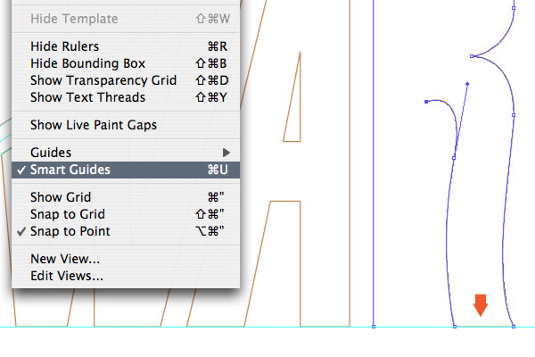
Tip: Smart Guides will make drawing on the guides and keeping things contained/precise a great deal easier.
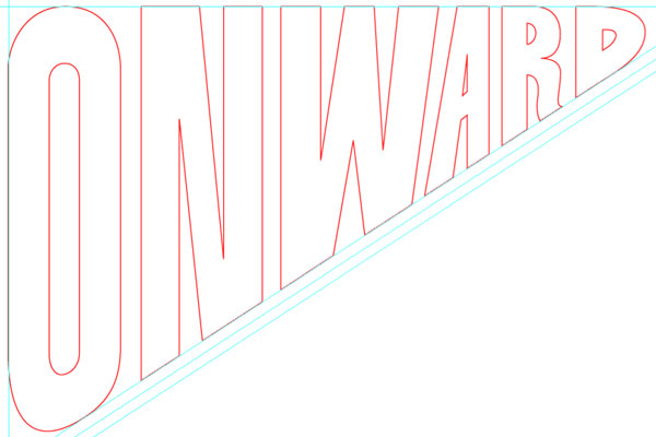
Step 6d
Here are the completed vector letterforms, shown compared to the sketch.
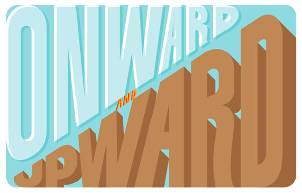
Multiply and Move
Finally, we get to the 3D effects. Let’s start simple, with a basic approach.
Step 7a
Using the Round Rectangle Tool, draw a background shape/color (C:30, Y:10) that aligns with the left and top/bottom guides. And send them to back (Shift + Command + Left Bracket key).
Step 7b
Change the “ONWARD” to a white fill.
Step 7c
Next, select the “ONWARD” lettering and Copy > Paste in Front (Command + F). While holding shift, move it diagonally (approx. to the center diagonal guide). Change the fill color to 50% of the background color (C:15, Y:5).
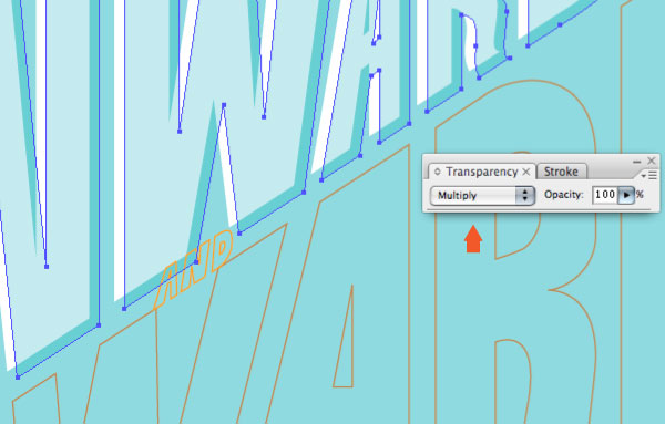
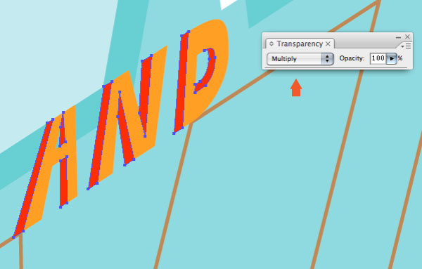
Step 7d
With the “ONWARD” lettering selected, in the Transparency palette, simply change the blending mode to Multiply. That’s it, a simple, vintage looking 3D effect.
Draw and Multiply
Next, we tackle a slightly more complicated effect. This will have more drawing of shapes, and uses the same blending mode as the previous approach, but with a different 3-Dimensional effect. The basic idea is that by drawing shapes that overlap and applying the Multiply blending mode, it will create a darker third color to achieve the 3D effect. The trick is getting the hang of how to draw the shapes. Its hard to explain exactly the process of how to draw the shapes, but seeing it help will help. Here we go!
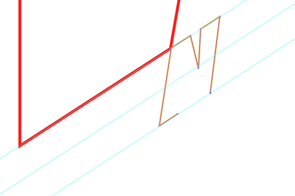
Step 8a
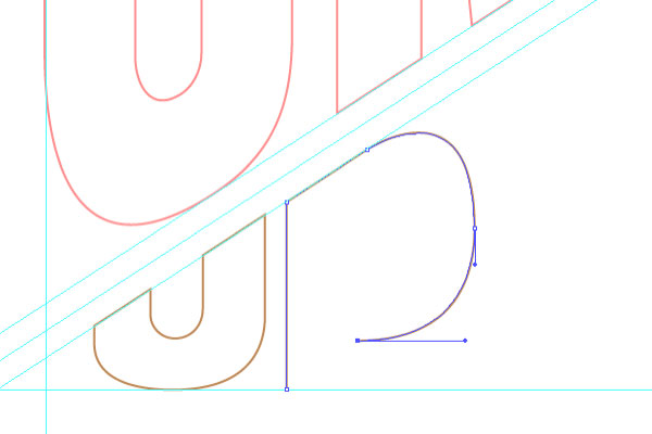
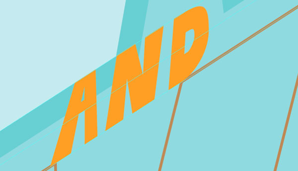
With the “AND” lettering selected, change it to an orange fill (M: 35, Y: 85).
Step 8b
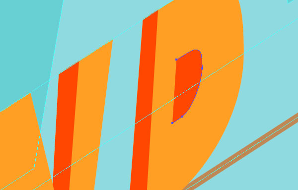
Making sure Smart Guides is active, start drawing inside the shapes of the “AND” letterform using the Pen Tool. These shapes should have a darker orange fill color (M: 75, Y:100). You should start to see the 3D effect.
Step 8c
To complete the interior shape of the “D” within the word “AND,” select the two right bezier points and Copy, Deselect all and Paste in Front. Then continue drawing the shape.
Step 8d
With the “AND” interior shapes drawn the 3D effect is apparent.

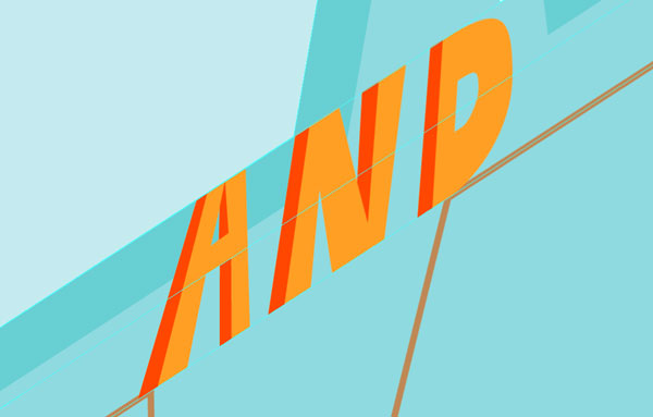
Step 8e
To really make the effect ‘pop,’ same as above, change the blending mode of the “AND” lettering to Multiply.
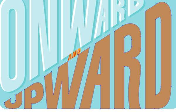
Drawn Traditional Color
The third 3D effect uses a more traditional approach of drawing the 3D shapes, extruding from the existing lettering. These letterforms will have a nice, thick 3D effect, achieved through drawing three shades of a color.
Step 9
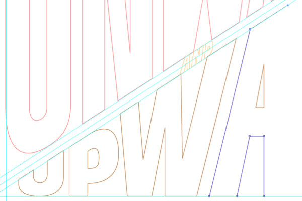
Change the color of the “UPWARD” lettering to a light brown (C:25, M:40, Y:65).
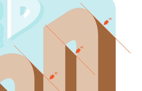
Step 10a
Again, make sure Smart Guides is active. Start by using the existing points, use the Copy + Paste in Front method, then draw outside the shapes of the “UPWARD” letterform using the Pen Tool. Color with a medium brown (C: 30, M: 50, Y: 75, K:10).
Step 10b
To keep the 3D consistency, and with the magic of Smart Guides, use a 45 degree angle for the 3D shapes.
Step 10c
Keep congruent with the exterior background shape and keep hammering out the medium brown shapes.
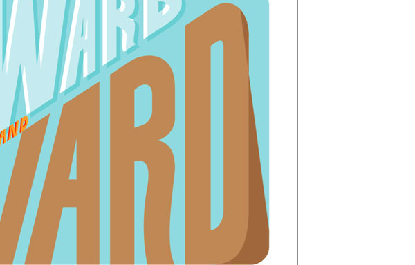
Step 10d
Here is shown the medium brown shapes finished.
Step 11a
To finish this off it should be fairly obvious, we need to draw the darkest shade of brown (C: 35, M: 60, Y: 80, K:25) for the letterforms. In many areas you may be able to just draw dark brown shapes over the gap of existing shapes.

Step 11b
Use copies of the existing light brown shapes and the Subtract from shape area option in the pathfinder palette to create the medium brown shapes.
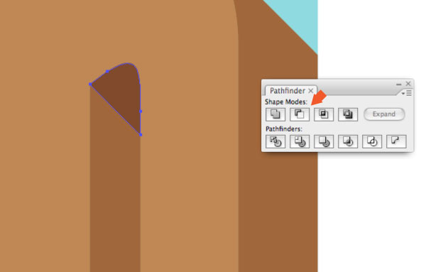
Step 11c
The dark brown 3D shapes are now complete, as well as the complete 3D lettering effect.
Drawn Traditional Color
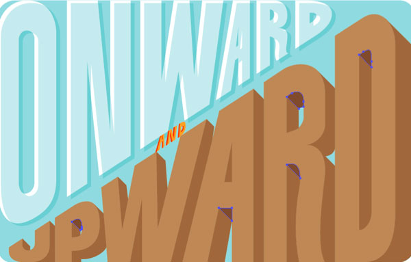
Now, to tie this all together and make it look like a real poster. We’ll use a few more shapes, textures and color effects to make it look like a vintage poster.
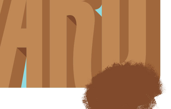
Step 12a
First, you may notice that there could be a few areas on the “ONWARD” lettering that might have the dark brown color. Let’s integrate some textures. First, Copy and Paste in Front the existing medium brown shape you want to integrate texture within.
Step 12b
Using textures from my previous tutorial “How to Create a Vector Texture From Scratch,” paste the texture into position.
Step 12c
Once the position is finalized (Tip: check the position with a simple clipping mask), select both the texture and copy of the medium brown shape. Use the Intersect shapes areas option in the Pathfinder palette.
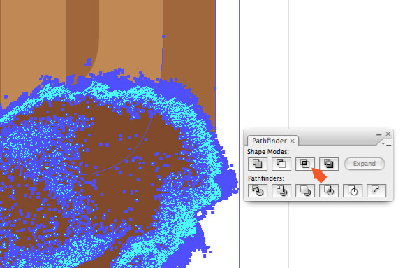
Step 12d
Hit expand in the pathfinder palette and you have texture shades!

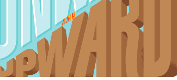
Step 13
Apply that process to any other areas that make sense. There are some questionable areas that could use texture but it’s a judgment call.
Step 14a
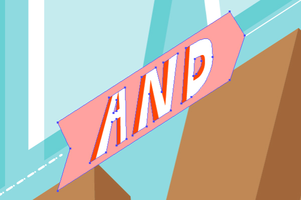
Draw a shape that follows the diagonal guides and fill it with a lighter pink color (M: 35, Y: 21). Add a point on the center diagonal guide and make the light pink shape look like a banner shape.
Step 14b
Change the color of the original “AND” lettering to white and scale the banner shape up (so it doesn’t get lost in the other lettering).
Step 15
Next, lets make this a bit more fun. Draw an old biplane flying through the letters, with a white string connecting the banner and a dotted white line coming from the banner.
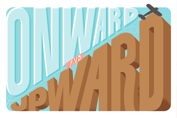
Step 16
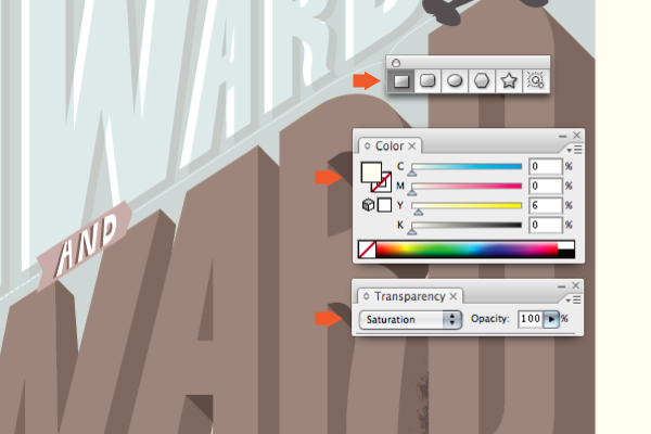
And finally, to really give it that vintage, muted tone. Draw a light yellow (Y:6) rectangle over the entire document and change the blending mode to Saturation. Print!
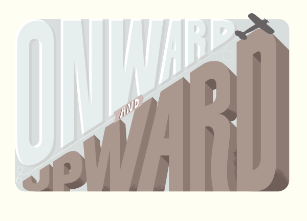
Final Image
Some of this info is fairly straightforward, but hopefully there were a few bits in there that you could learn from. The final image is below. You can view the large version here. Cheers!

サイト内検索
イラストレータの勉強
グラデーションと分割 図形と合流・型抜き ロゴマークの作成 テキスト落書き VECTIPS Logo Vectortuts Logo 水滴の作り方 WATER グラデーション背景 竹 リボン 薬カプセル かぼちゃ 緑の玉 亀さん 気球 花びら つやのある球 ロゴ vectips ロゴ Zee ロゴ 風船 ロゴ UPWARD ロゴ ZERO ロゴ VECTORS ロゴ VECTORSその2 ロゴ WOOF ロゴ Don't Break ロゴ Smooth ロゴ VECTORSその3 ロゴ VECTORSその4 ロゴ VECTORSその5 ロゴ VECTORSその6 ロゴ VECTORSその7 ロゴ VECTORSその8 ロゴ VECTTIPSその1 ロゴ VECTTIPS その2 ロゴ VECTTIPS その3 ロゴ VECTTIPS その4 ロゴ VECTTIPS その5 ロゴ VECTORSその8 ロゴ VECTORSその9 ロゴ VECTTIPS その6 ロゴ ROMERO WEEK ロゴ VECTORSその10 ロゴ ECLIPS ロゴ ROCKEY ロゴ VECTORSその11 ロゴ VECTORSその12 ロゴ Tutorial Shock ロゴ VECTORSその13 ロゴ VECTORSTUTS ロゴ ARCADE LOVE ロゴ Zeeその2 ロゴ VECTORS PUFFS イラスト1 イラスト2 イラスト3 イラスト4 イラスト5 イラスト6 夜空 3D ロゴ 葉と水玉とテントウムシ イラスト10 イラストカーテン イラスト木目 イラスト 幻想 イラスト メッシュの葉 イラスト 靴 イラスト 家 イラスト9 イラストレータ フォトショップ イラストレータV10の使い方デザインの勉強
デザインの基礎 AIRに挑戦 AOBADAIに挑戦 DOWNFALLに挑戦 フレームに挑戦 BOXグラフに挑戦 LUCKに挑戦 オレンジに挑戦 リングに挑戦 STORMに挑戦テキストにチャレンジ
カタカナ入力 七夕様 相田みつをの世界 誕生石 誕生石と誕生花 フランスの国旗 ドイツの国旗 イタリアの国旗 日本の国旗 ロシアの国旗 シャガール 犬のおまわりさん 拡張子 メニュー パン 世界の国旗 気になる言葉2 気になる言葉3 大きな古時計 オリエント急行 お料理教室 おしながき パソコン専門用語 地図・・・PC検定 メニュー 紅茶 特殊文字 占いいろいろ ウォルトディズニー 全館停電 ひまわり図鑑 ゆり図鑑 テキスト 初級 テキスト 中級① テキスト 中級② テキスト 上級① テキスト 上級② アロマセラピー講座1 あなたと薬 アロマセラピー講座2 オーストラリアの動物 美人が作るレシピ ブログ お料理知恵袋 ゆば ドトールコーヒー物語 地震 円の国際化 福原 愛 振り込め詐欺 楽しいガーデニング ガーリック クリップアートの色を 埼玉の観光 山梨の観光 ゴールデンウィーク はがきで挨拶 敗戦の時 阪神タイガース ハワイに行こう ヒアルロン酸 肥満の知識 ほくろがガンに要注意 今すぐトライ インターネットで調べよう ITニュース 日本のお茶 時代を切り開いた女性1 時代を切り開いた女性2 地獄めぐり 時間割 スポーツの審判 花粉症 段落番号の設定 神奈川県 漢文とは中国語か? 阪神タイガース 漢字の偏見 関節痛 ゴールデンウィーク 簡単お弁当レシピ キーボード 国民年金 暮らしを楽しく 草花図鑑その1 草花図鑑その2 行頭文字の設定 段落番号の設定 主な国際機構 浅田真央のプロファイル 数学図形の問題1 パソコンについて 中原中也 オーガニックコットン1 オーガニックコットン2 落ち葉の森 お大事に 奥の細道 ページ番号の設定 埼玉の観光 ラーメン博物館 レシピ1 レシピ2 連絡網 履歴書 竜宮城 竜宮城バザー 世界の気候 脂肪を燃やせ 資格 四季折々の野菜 春 四季折々の野菜 冬 下町で 食品の分類 生涯学習 生姜と豚肉 四季の折々野菜(春) 四季折々の野菜 秋 四季の野菜 春 下町で遊ぼう そばの献立 サッカー世界標準 スターバックス すだちとかぼす スーパーサッカー 数学の問題2 体内チェック 寅さんシリーズ1 寅さんシリーズ2 寅さんシリーズ3 寅さんシリーズ4 海から吹く風 横浜ベースターズ 郵便払込み 湯河原独歩の湯 ゆかた祭り模写は意外と簡単
大黒様 着物の柄 富岳百景 ベートーベン オペラ座 ミニー ゴメン 母の日 ドラゴンボール 潮干狩りパソコン教室
パソコン教室の特徴 会員の最大の特典は? パソコン教室の会員の種類 すべて個人指導で、解りやすく 出張!パソコン家庭教師 追加受講する場合 日曜教室、始めました パソコン教室の料金体系何を学ぶか?
どんなサービスか? 学べるソフト一覧 ホームページを作ろう パワーポイントを勉強しよう 模写の勉強 デザインの基礎 ビデオの編集をやってみよう。