


イラストレータでデザインをやってみましょう
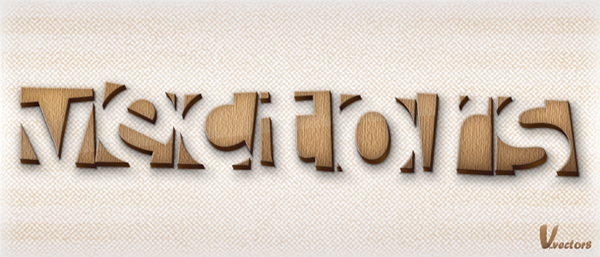
Final Product What You'll Be Creating
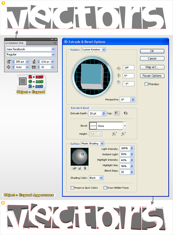
Step 1
Create a 700 by 300px document. Select the Type Tool (T) and add your text. I’ve used the New Facebook font, but you can use any font you like. Fill your text with the color shown below (R=128 G=128 B=128). Expand the text. Select the resulting group of shapes, add the 3D > Extrude & Bevel effect then go to Object > Expand Appearance.
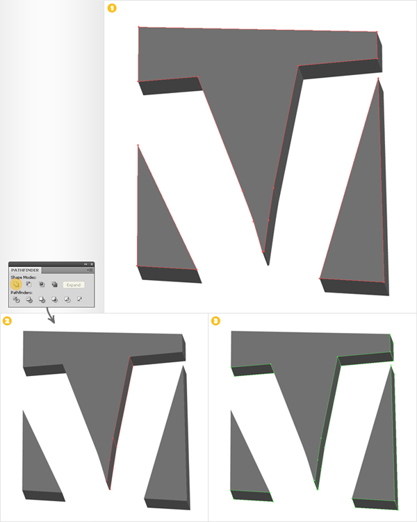
Step 2
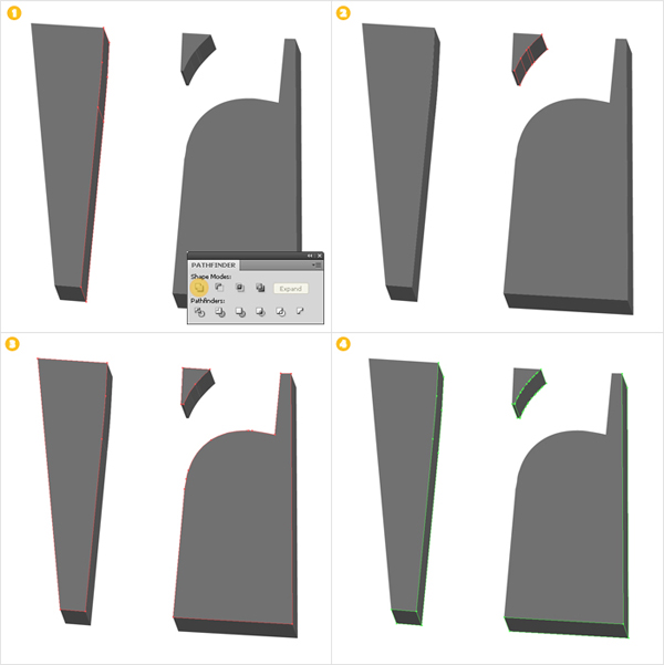
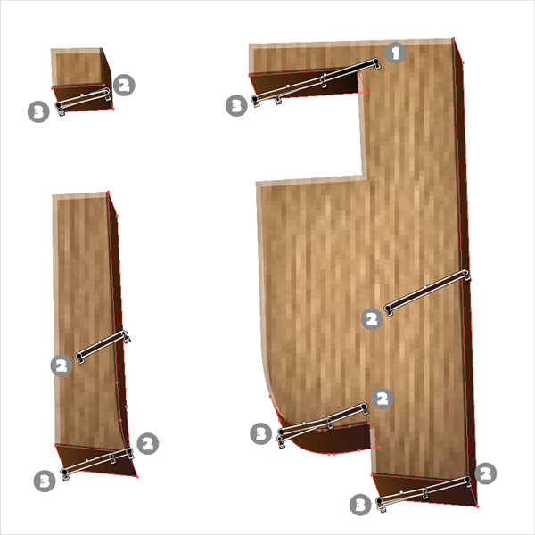
Now, you should have a selection of shapes and groups. You need to organize these before moving on to the next step. For starters, let’s focus on the "V". Select the top shapes (the ones filled with a lighter shade of gray), press Control + Shift + G to un-group each shape separately then press Control + G to group them together.
Select the shapes shown in image #2 and click on the Unite button from the Pathfinder panel. Un-group the rest of the shapes (filled with a darker shade of gray) then group them together (image #3).
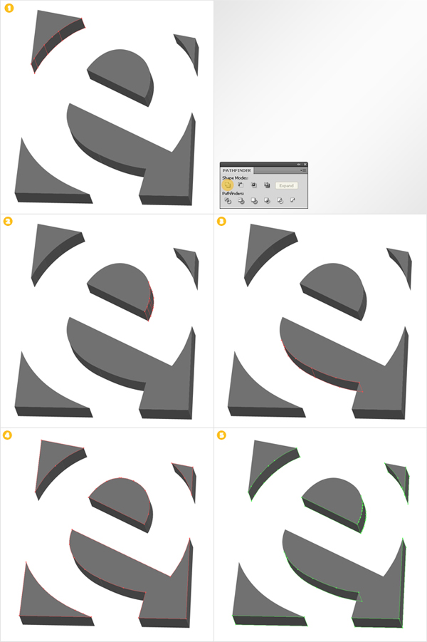
Step 3
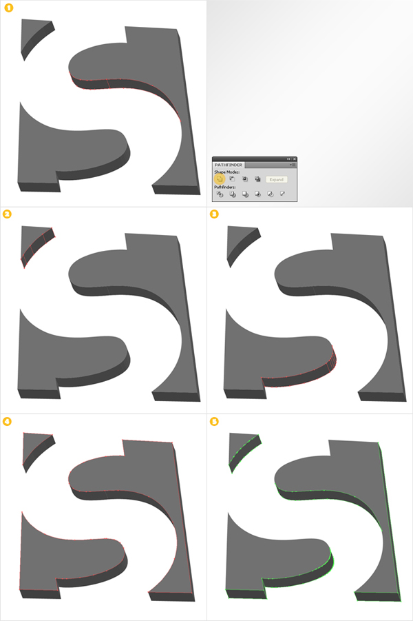
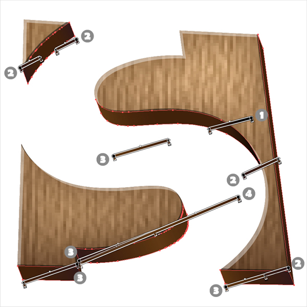
Let’s continue with the "e". Use the Unite button from the Pathfinder panel to connect the groups of shapes selected in images #1, #2 and #3. In the end, you must have two groups. One with the dark shapes (image #5) and one with the lighter shapes (image #4).
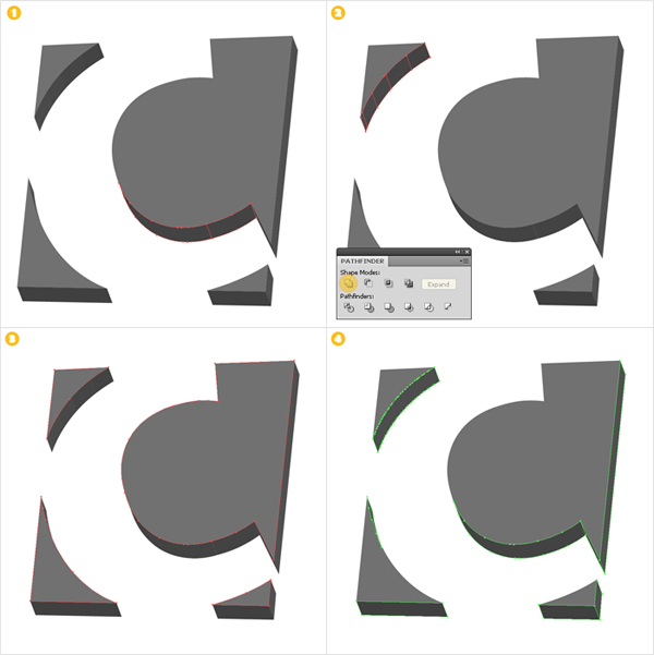
Step 4
Next, is the "C". Again, unite the shapes selected in images #1 and #2 then make the two groups.
Step 5
Now, the "T". Unite the shapes selected in images #1 and #2 then create the groups.
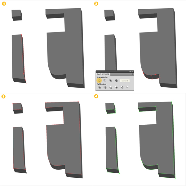
Step 6
Unite the shapes shown in images #1 and #2 then make the two groups.
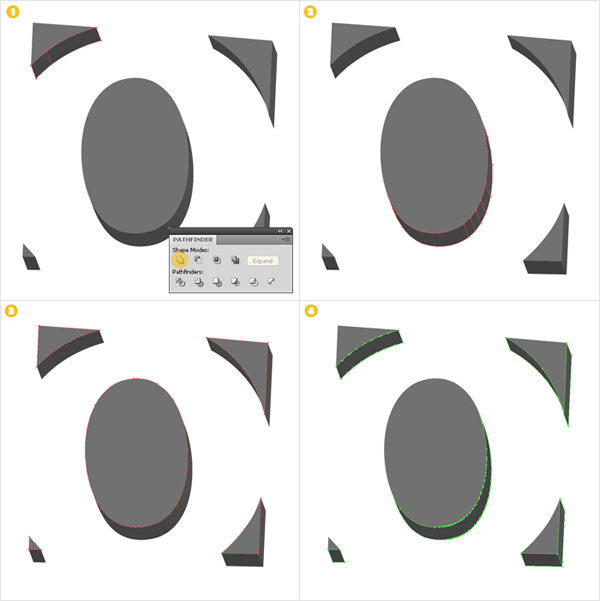
Step 7
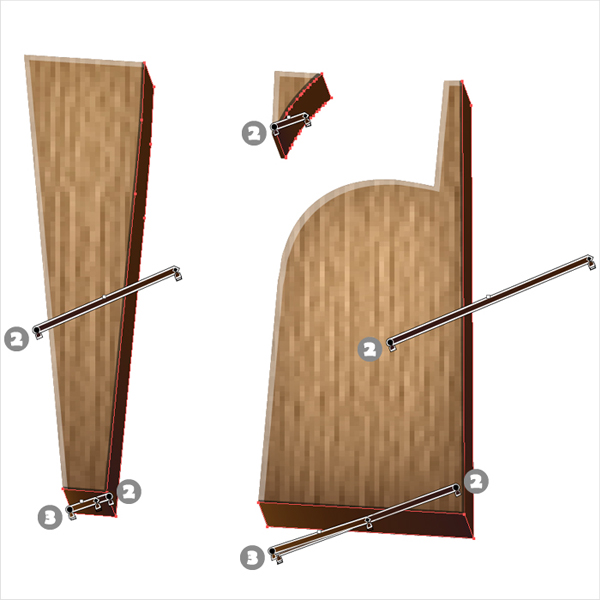
Once again, use the Unite button for the shapes selected in images #1 and #2 then make the two groups.
Step 8
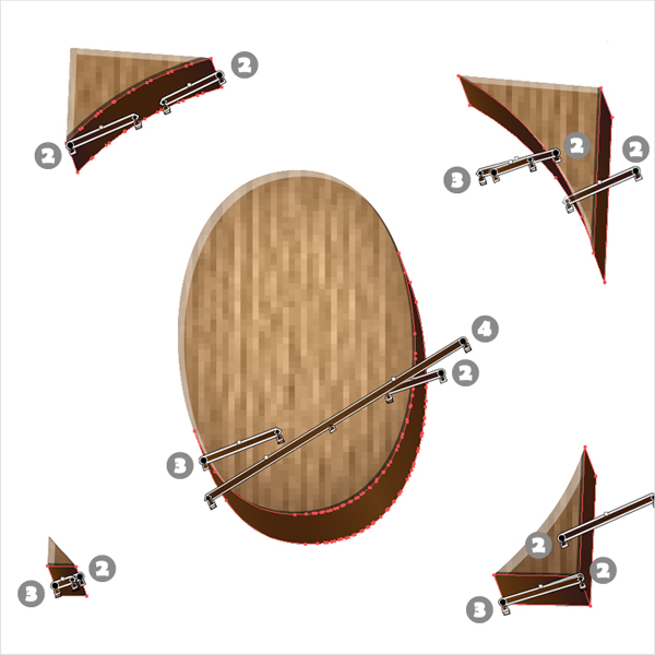
Once last time, unite the shapes shown in images #1, #2 and #3 then make the groups.
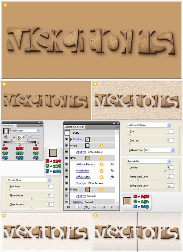
Step 9
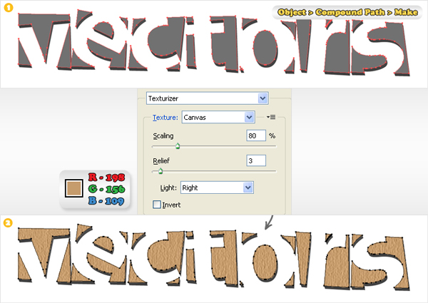
Duplicate all the top shapes (the ones filled with a lighter shade of grey). Select the copies and go to Object > Compound Path > Make then name the resulting shape "vvv". You’ll need this shape in several future steps, so make sure that you always have a copy.
Select a "vvv" copy, fill it with R=198 G=156 B=109 then add the Texturizer effect (Effect > Texture > Texturizer).
Step 10
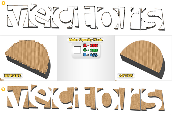
Next, you need to get rid of the pixelated edges. Open the Transparency palette. Select a "vvv" copy, fill it with white and move it above the texturized shape. Now, select both shapes, go to the fly-out menu of the Transparency panel and click on Make Opacity Mask.
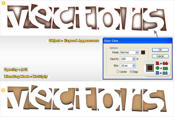
Step 11
Select a new "vvv" copy and bring it to the front (Shift + Control + Right Square Bracket). Fill it with white, add the Inner Glow then go to Object > Expand Appearance. Keep only the expanded Inner Glow (delete the other shape). Change its blending mode to Multiply and lower its opacity to 30%.
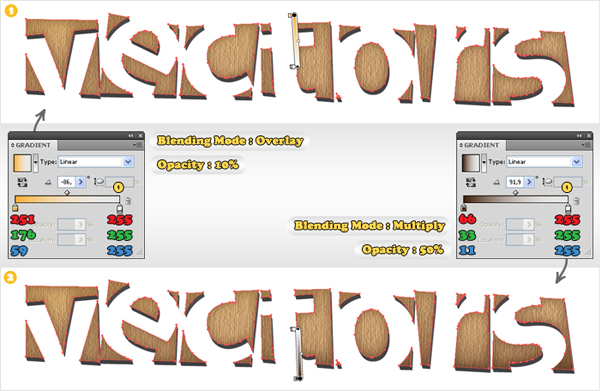
Step 12
Create a new "vvv" copy and bring it to the front (Shift + Control + Right Square Bracket). Fill it with the left linear gradient then add a new fill (from the fly-out menu of the Appearance panel) and use the right linear gradient.
Select the first fill (from the Appearance panel), change its blending mode to Overlay and lower its opacity to 10%. Select the second gradient, change its blending mode to Multiply and lower its opacity to 50%. Select the shapes made in steps #9, #10, #11 and #12 and group them. Name it "Wood" and make it invisible (for the moment).
Step 13
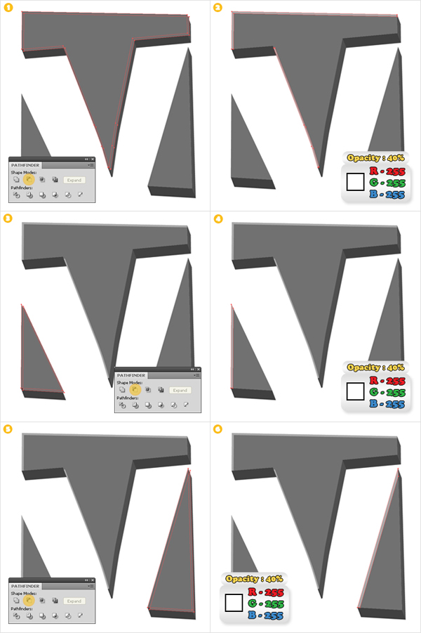
Next, you’ll need to create a series of thin shapes along the edge of the top shapes. First, go to Edit > Preferences > General and enter a 0.5px Keyboard Increment.
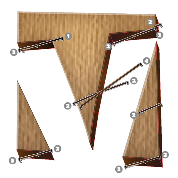
Now, let’s focus on the "V" shapes. Select the shape shown in image #1 and make two copies. Select the top one then press the down arrow and the right arrow twice (to move it 1px to the right and 1px down). Reselect the two copies and click on the Minus Front button from the Pathfinder panel. Fill the resulting shapes with white and lower their opacity to 40%. Repeat the same techniques for the other two shapes (image #3 and image #5).
Step 14
Duplicate the shape highlighted in image #1. Select the top one and press the left arrow and up arrow once (to move it 0,5px up and 0,5px to the left). Reselect both copies and click on the Minus Front button from the Pathfinder panel. Fill the resulting shapes with black and lower their opacity to 50%. Repeat the same techniques for the other two shapes (image #3 and image #5).
Step 15
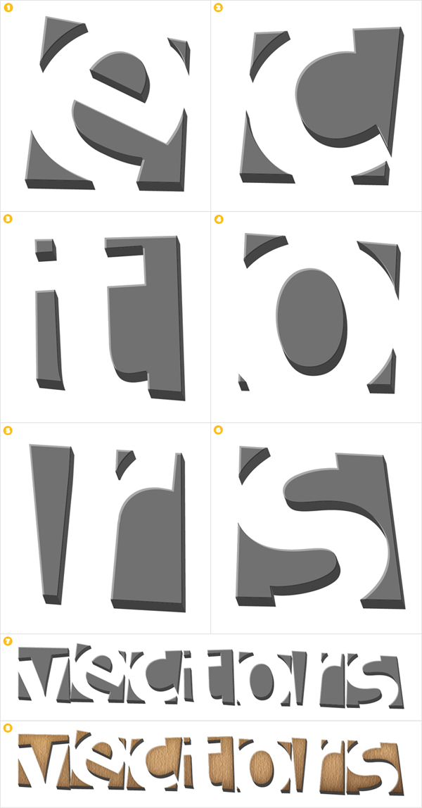
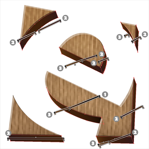
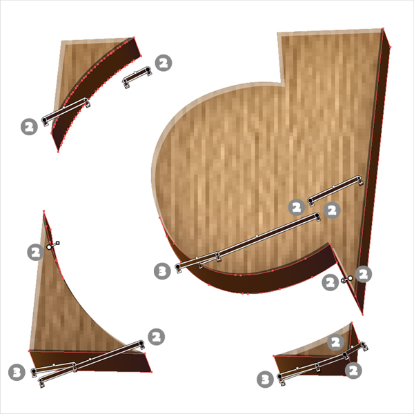
Repeat the same techniques for the rest of the top shapes. Select all these thin shapes and group them. Bring this new group to the front (Shift + Control + Right Square Bracket). Turn "Wood" back to visible then lock both groups.
Step 16
Now, let’s focus on the darker shapes. First, fill them all with R=66 G=33 B=11. Next, create the four gradients and save them in the Swatches panel. Simply name them "1", "2", "3" and "4". You’ll need them in the next step.
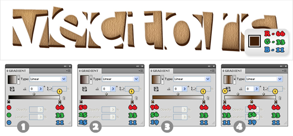
Step 17
Now, you need to add some new fills for most of these shapes. Take a look at the images to understand exactly how many and which are the gradients that you need to use for each fill.
Step 18
Next, is the shadow. Select a copy of "vvv" and go to Object > Path > Offset Path. Enter a 1px Offset and press OK. Select the resulting shape, send it to the back (Shift + Control + Left Square Bracket) and move it a few pixels down and to the right. Fill it with black, add a 0,5 Gaussian Blur and lower its opacity to 30%.
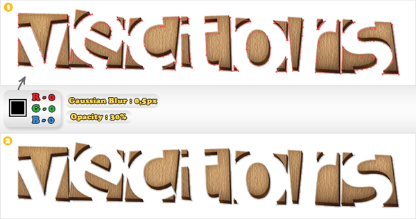
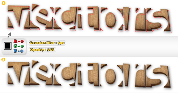
Step 19
Duplicate the shape made in the previous step. Select this copy, move it below the original and make it a little bigger (simply resize it). Leave it black but raise the Gaussian Blur to 5px and the opacity to 50%.
Step 20
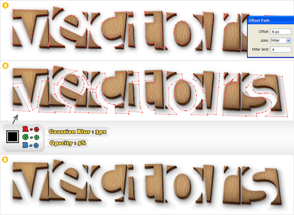
Select another "vvv" copy and go to Object > Path > Offset Path. Enter a 6px offset and click OK. Select the resulting shape, send it to the back and move it a few pixels down and to the right. Fill it with black, add a 3px Gaussian Blur and lower its opacity to 5%.
Step 21
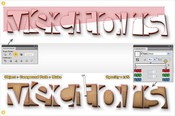
Select the Pen Tool (P) and create a shape like the red one shown in image #1. Select it along with the "vvv" shape (it’s the last time you need this shape) and click on the Intersect button from the Pathfinder panel. Select the resulting shapes and go to Object > Compound Path > Make. Bring the resulting shape to the front. Fill it with the linear gradient and lower its opacity to 10%.
Step 22
Finally, the background. Create a 600 x 300px rectangle, send it to back (Shift + Control + Left Square Bracket) and fill it with R=198 G=156 B=109. Add a new fill (from the fly-out menu of the Appearance panel), use the other color and change its blending mode to Screen.
Select this second fill (from the Appearance panel) then add the Halftone Pattern (Effect > Sketch > Halftone Pattern), the Reticulation (Effect > Sketch > Reticulation) and the Diffuse Glow (Effect > Distort > Diffuse Glow) effects (in this order).
Add a third fill and use the linear gradient. Select this final fill, change its blending mode to Multiply then lower its opacity to 10%.
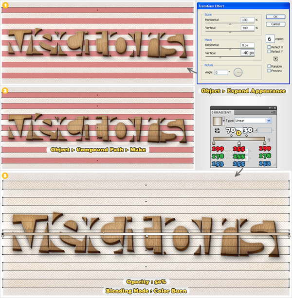
Step 23
For a final effect select the Rectangle Tool (M). Create a 700 by 20px shape and place it in the top of your Artboard. Add the Transform effect (Effect > Distort & Transform > Transform) then go to Object > Expand Appearance. Select all seven rectangles and go to Object > Compound Path > Make. Fill the resulting shape with the linear gradient (pay attention at the slider Location), change its blending mode to Color Burn and lower its opacity to 50%.
Conclusion
There you have it, a wooden text effect. You can use the steps in this tutorial to make your own custom headings for web designs, or even to create some wood style icon sets. Use your imagination and the skills learned and you’ll be surprised by what you can come up with.
サイト内検索
イラストレータの勉強
グラデーションと分割 図形と合流・型抜き ロゴマークの作成 テキスト落書き VECTIPS Logo Vectortuts Logo 水滴の作り方 WATER グラデーション背景 竹 リボン 薬カプセル かぼちゃ 緑の玉 亀さん 気球 花びら つやのある球 ロゴ vectips ロゴ Zee ロゴ 風船 ロゴ UPWARD ロゴ ZERO ロゴ VECTORS ロゴ VECTORSその2 ロゴ WOOF ロゴ Don't Break ロゴ Smooth ロゴ VECTORSその3 ロゴ VECTORSその4 ロゴ VECTORSその5 ロゴ VECTORSその6 ロゴ VECTORSその7 ロゴ VECTORSその8 ロゴ VECTTIPSその1 ロゴ VECTTIPS その2 ロゴ VECTTIPS その3 ロゴ VECTTIPS その4 ロゴ VECTTIPS その5 ロゴ VECTORSその8 ロゴ VECTORSその9 ロゴ VECTTIPS その6 ロゴ ROMERO WEEK ロゴ VECTORSその10 ロゴ ECLIPS ロゴ ROCKEY ロゴ VECTORSその11 ロゴ VECTORSその12 ロゴ Tutorial Shock ロゴ VECTORSその13 ロゴ VECTORSTUTS ロゴ ARCADE LOVE ロゴ Zeeその2 ロゴ VECTORS PUFFS イラスト1 イラスト2 イラスト3 イラスト4 イラスト5 イラスト6 夜空 3D ロゴ 葉と水玉とテントウムシ イラスト10 イラストカーテン イラスト木目 イラスト 幻想 イラスト メッシュの葉 イラスト 靴 イラスト 家 イラスト9 イラストレータ フォトショップ イラストレータV10の使い方デザインの勉強
デザインの基礎 AIRに挑戦 AOBADAIに挑戦 DOWNFALLに挑戦 フレームに挑戦 BOXグラフに挑戦 LUCKに挑戦 オレンジに挑戦 リングに挑戦 STORMに挑戦テキストにチャレンジ
カタカナ入力 七夕様 相田みつをの世界 誕生石 誕生石と誕生花 フランスの国旗 ドイツの国旗 イタリアの国旗 日本の国旗 ロシアの国旗 シャガール 犬のおまわりさん 拡張子 メニュー パン 世界の国旗 気になる言葉2 気になる言葉3 大きな古時計 オリエント急行 お料理教室 おしながき パソコン専門用語 地図・・・PC検定 メニュー 紅茶 特殊文字 占いいろいろ ウォルトディズニー 全館停電 ひまわり図鑑 ゆり図鑑 テキスト 初級 テキスト 中級① テキスト 中級② テキスト 上級① テキスト 上級② アロマセラピー講座1 あなたと薬 アロマセラピー講座2 オーストラリアの動物 美人が作るレシピ ブログ お料理知恵袋 ゆば ドトールコーヒー物語 地震 円の国際化 福原 愛 振り込め詐欺 楽しいガーデニング ガーリック クリップアートの色を 埼玉の観光 山梨の観光 ゴールデンウィーク はがきで挨拶 敗戦の時 阪神タイガース ハワイに行こう ヒアルロン酸 肥満の知識 ほくろがガンに要注意 今すぐトライ インターネットで調べよう ITニュース 日本のお茶 時代を切り開いた女性1 時代を切り開いた女性2 地獄めぐり 時間割 スポーツの審判 花粉症 段落番号の設定 神奈川県 漢文とは中国語か? 阪神タイガース 漢字の偏見 関節痛 ゴールデンウィーク 簡単お弁当レシピ キーボード 国民年金 暮らしを楽しく 草花図鑑その1 草花図鑑その2 行頭文字の設定 段落番号の設定 主な国際機構 浅田真央のプロファイル 数学図形の問題1 パソコンについて 中原中也 オーガニックコットン1 オーガニックコットン2 落ち葉の森 お大事に 奥の細道 ページ番号の設定 埼玉の観光 ラーメン博物館 レシピ1 レシピ2 連絡網 履歴書 竜宮城 竜宮城バザー 世界の気候 脂肪を燃やせ 資格 四季折々の野菜 春 四季折々の野菜 冬 下町で 食品の分類 生涯学習 生姜と豚肉 四季の折々野菜(春) 四季折々の野菜 秋 四季の野菜 春 下町で遊ぼう そばの献立 サッカー世界標準 スターバックス すだちとかぼす スーパーサッカー 数学の問題2 体内チェック 寅さんシリーズ1 寅さんシリーズ2 寅さんシリーズ3 寅さんシリーズ4 海から吹く風 横浜ベースターズ 郵便払込み 湯河原独歩の湯 ゆかた祭り模写は意外と簡単
大黒様 着物の柄 富岳百景 ベートーベン オペラ座 ミニー ゴメン 母の日 ドラゴンボール 潮干狩りパソコン教室
パソコン教室の特徴 会員の最大の特典は? パソコン教室の会員の種類 すべて個人指導で、解りやすく 出張!パソコン家庭教師 追加受講する場合 日曜教室、始めました パソコン教室の料金体系何を学ぶか?
どんなサービスか? 学べるソフト一覧 ホームページを作ろう パワーポイントを勉強しよう 模写の勉強 デザインの基礎 ビデオの編集をやってみよう。