


イラストレータでデザインをやってみましょう
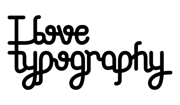
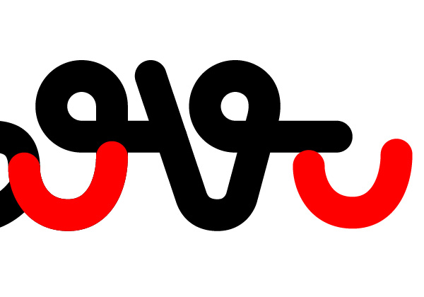
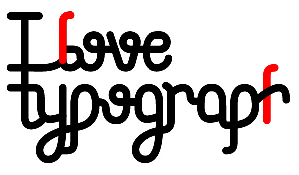
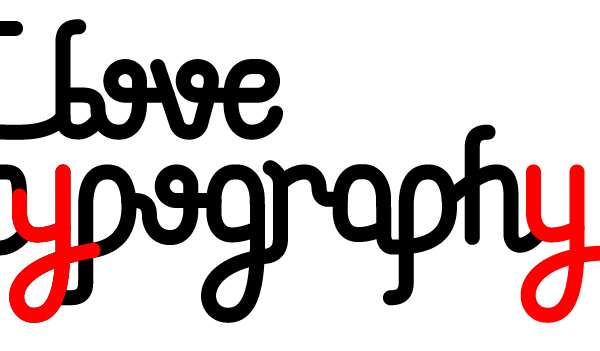
Final Product What You'll Be Creating
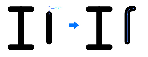
Step 1
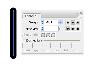
Start by creating a simple line, which will become a capital letter “i.” Deciding the size and weight of your writing is a trial and error matter. I’ve decided on a stroke weight of 45, but you may need to adjust your own along the way.
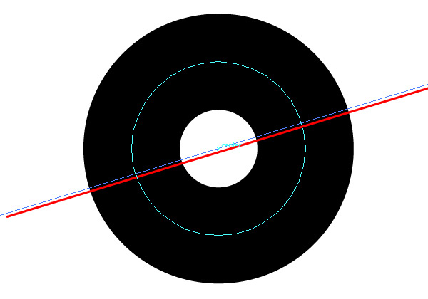
Step 2
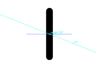
Duplicate the line (Command + C, Command + F) and go to Object > Transform > Rotate, and rotate it by 90 degrees. Alternatively, you can use the Rotate Tool (R) and drag it to a horizontal position by holding Option.
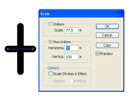
Step 3
We duplicated the vertical line in order to form the top and bottom bracket of the letter “i.” Now go to Object > Transform > Scale and shrink the Horizontal size to 55%.
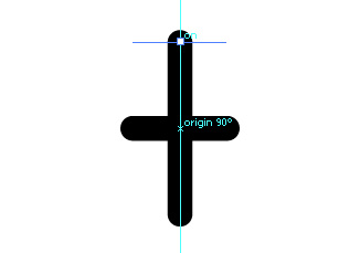
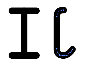
Step 4
Make sure you have Smart Guides and Snapping enabled. These can be found in the View tab. Hold the mouse over the intersecting point (of the horizontal and vertical backed, while keeping the horizontal one on top of the other) and drag the horizontal bracket until it snaps to the end point of the vertical one. You may lock the movement to a straight angle by holding down Option after you’ve started dragging.
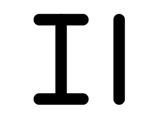
Step 5
Duplicate the top bracket and place one on the bottom as well. Now duplicate the horizontal one as well and move it. This will be the letter “l.”
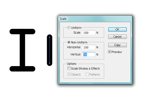
Step 6
Reduce the vertical size of this line to 70% of its original size.
Step 7
We’re using geometric methods as a starting point, but you’re going to need to grab the pen tool (P) and draw the top with it. While hovering over the top anchor point of the line, drag a handle while holding Option. Then place the second anchor point somewhere near a 90 degree angle. You can edit the anchors and handles with the Direct Selection Tool (A) if you’re not happy with how it looks.
Step 8
Trace the bottom half just as you did with the top, but this time with an additional anchor point.
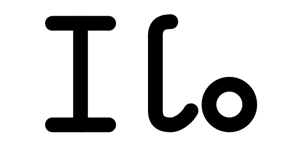
Step 9
The “o” letter is obviously a simple circle path with a stroke. Again, the size and proportion is something you may want to experiment with and adjust later, so keep a copy somewhere outside the active area.
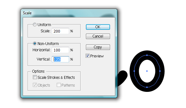
Step 10
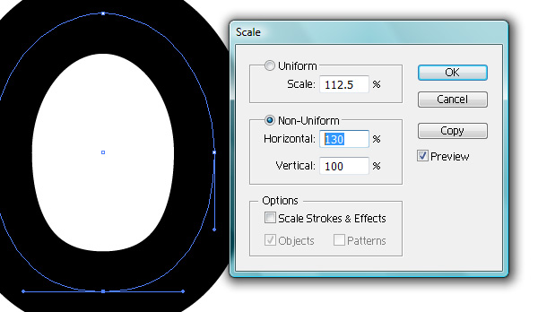
Use the Scale Tool again and change its Vertical proportion to 125%.
Step 11
Use the Direct Selection Tool (A) to select just the bottom anchor. Change the Horizontal size of this endpoint to 130%.
Step 12
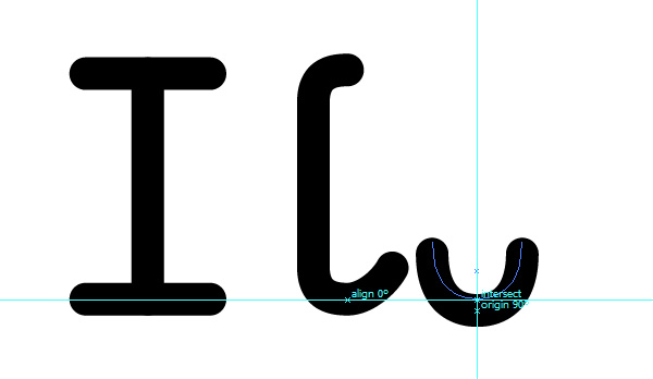
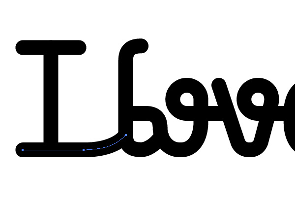
Using the Smart Guides, drag the entire ring from the bottom anchor, hover over the bottom anchor of the letter “l,” then slide it horizontally near its initial position. By doing this, you’re lowering the ring to the same baseline of the letter “l.”
Step 13
Lower the left anchor, and create a bracket that hides underneath the “l.” Be sure to make a connector that isn’t too sharp (hence the lowering of the left anchor
Step 14
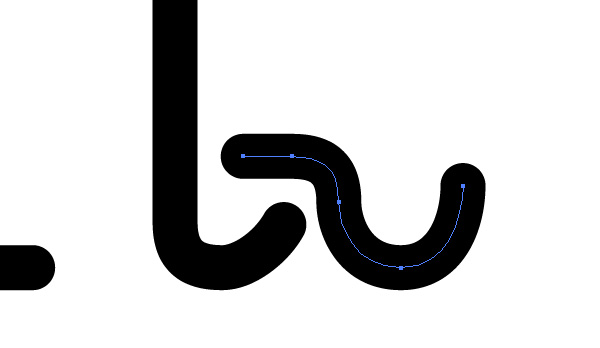
Create a new circle with the Ellipse Tool (L). Make sure you keep a duplicate as a backup; we’ll need it later. How far up you place it from the position of the bottom ring decides the x-height of your font.
Step 15
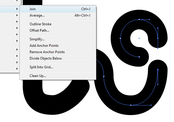
With the Direct Selection Tool (A), delete the lower right corner of the circle. Then join the right anchor with the top of the bottom ring anchor by pressing Command + J.
Step 16
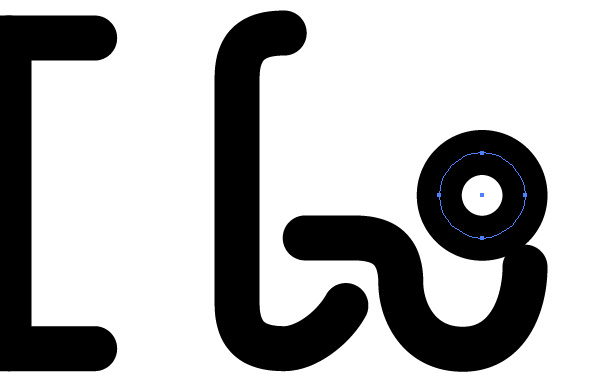
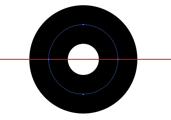
Remember the small circle I asked you to create a duplicate of? Make another copy (hold on the original still).
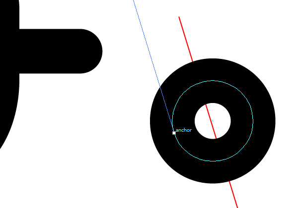
Step 17
Create a horizontal line and snap it to the center (also horizontal anchors) of the new small circle. You can easily do this with the Smart Guides and Snapping enabled by dragging the line on top of one of the anchors.
Step 18
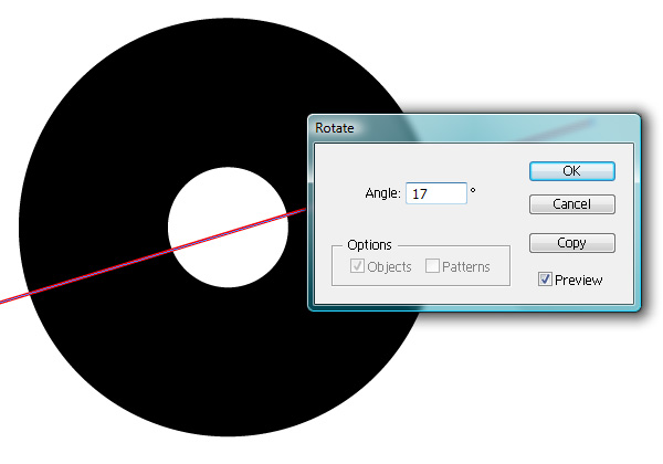
Go to Object > Transform > Rotate and rotate it by 17 degrees.
Step 19
Drag the line until it snaps to the center point of the circle.
Step 20
While having the line selected, go to Object > Arrange > Send to back. Then, select the circle. With the Pen Tool (P) active, add an anchor point where the red line intersects with the circle.
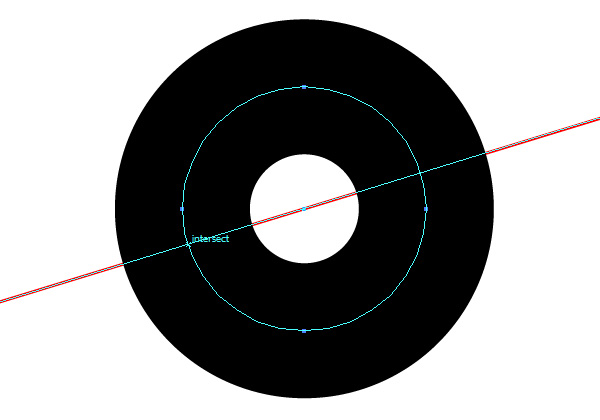
Step 21
Flip the line horizontally (Object > Transform > Reflect by Vertical Axis), snap the line to the center of the circle, select the circle and add another intersecting point.
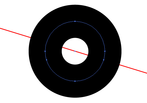
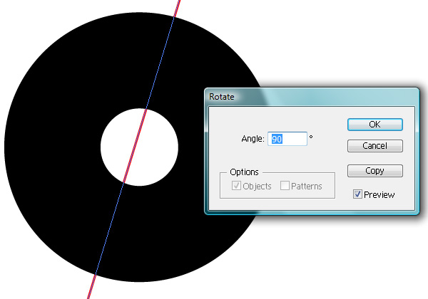
Step 22
Go to Object > Transform > Rotate and rotate it by 90 degrees.
Step 23
Drag the line from the bottom anchor and snap it to the left sided anchor of the circle.
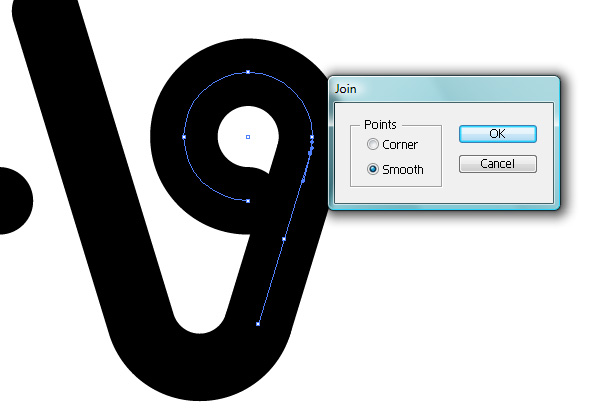
Step 24
Using the Direct Selection Tool (A), delete the left, right and top of the anchors. Now drag the remaining anchor as to select the overlapping left anchor of the circle and bottom anchor of the line, and merge them by pressing Command + J and selecting Smooth.
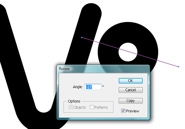
Step 25
Make another copy of the small circle and another line and rotate the line by -17 degrees this time.
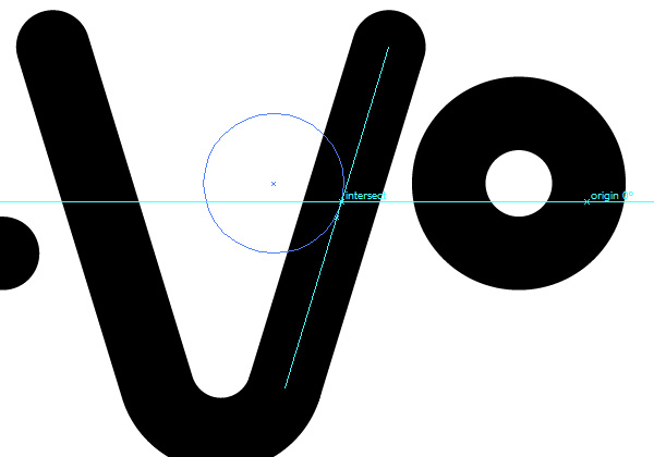
Step 26
Add an intersecting point just like before, and drag the circle by the newly created anchor until it snaps to the line of the letter “v.”
Step 27
Delete the bottom anchor of the circle, and drag the top anchor from the letter “v” until it snaps to the circle’s -17 degree anchor point. Join these two overlapping points (Command + J).
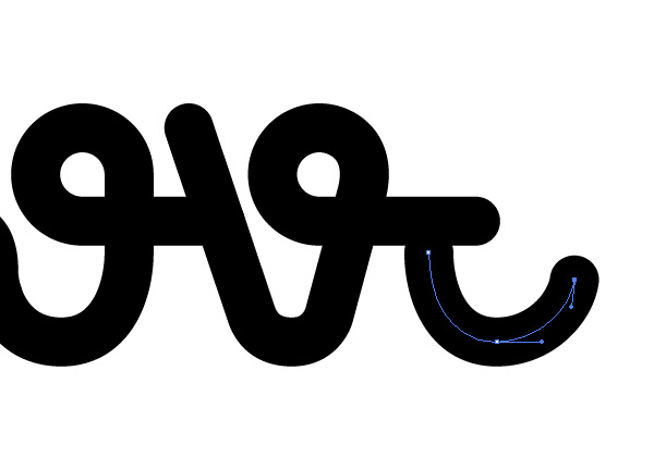
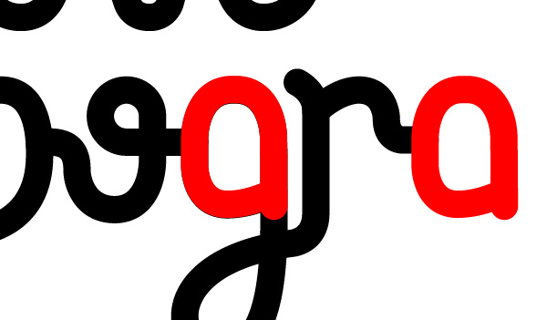
Step 28
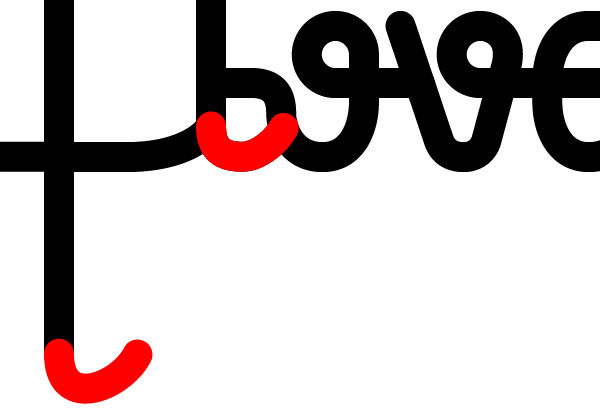
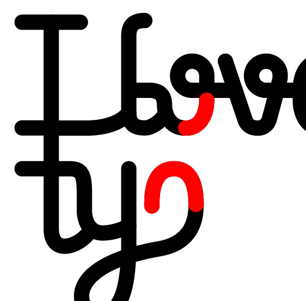
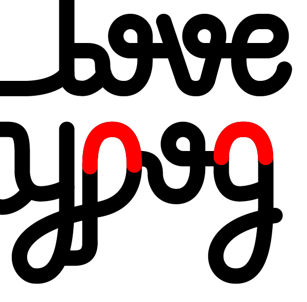
From now on, we’ll be able to use certain parts of a letter in multiple ways. I’ve highlighted them with red to show which portions to copy and paste. Duplicate the highlighted portion and place it as shown in the screenshot below.
Step 29
Using the Pen Tool, add an anchor a bit lower from the right-hand end point. Delete the top one with the Direct Selection Tool
Step 30
Duplicate the left side of the “o” ring and place it on the right side of the “e.”
Step 31
The top left corner you’ll have to create using the Pen Tool.
Step 32
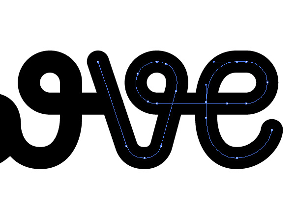
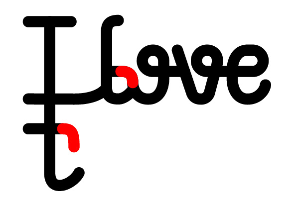
Modify the bottom line of the letter “i” so that it ties to the second word. You may need to play around with the space between it and the word “love,” but it will become more clear once you create the bottom half.
Step 33
Let’s start the second row and third word. The height of the letter “t” depends on how much spacing you want to leave between the two rows. This can be adjusted later, so for now use the length of the letter “i” and add a bit of spacing.
Step 34
Let’s get started on the “y” now. At this point and in other situations you may have to modify the section just a bit. In this case, the bottom anchor has been lowered.
Step 35
Before tracing this portion of the letter, it’s good to decide a baseline for the rest of the word. The lowest anchor will be ours.
Step 36
Stretching into the descender area is the rest of the letter “y.” Try doing this with as few anchors as possible. We’ll be using this part in other letters as well, and that will keep it easy to modify and adapt.
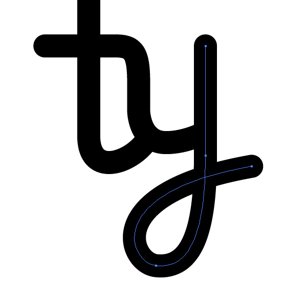
Step 37
Continue the “y” loop into the “p.” I used a portion from the “o” to create the “p.” Once you’ve joined it with the “y,” duplicate it and flip it horizontally. That will give us a semicircle that we’ll use in a few other letters as well.
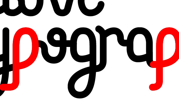
Step 38
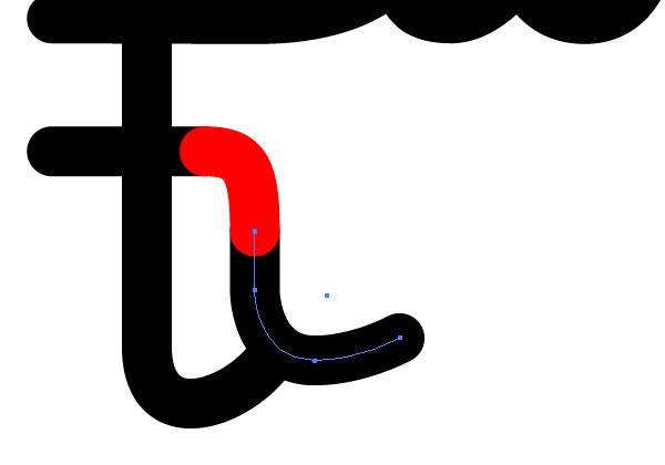
Don’t forget to make the bracket of the “p” slide under the loop from the “y.” You can duplicate the highlighted section to achieve this.
Step 39
Since we created the “o” before, just duplicate it and place it as the next letter. Remember to align it to the baseline.
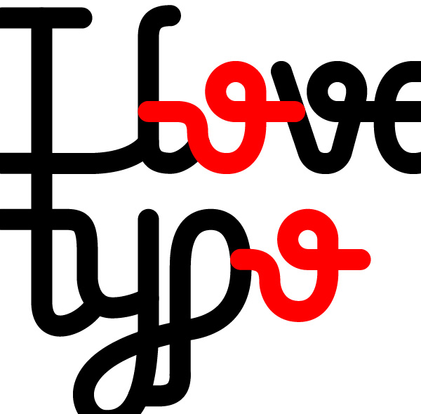
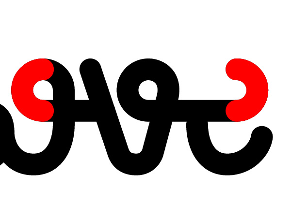
Step 40
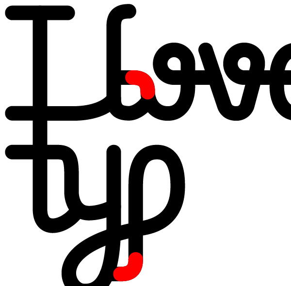
Part of the “g” can be found in the “y.” Duplicate it, and lower the top anchors similar to the screenshot below.
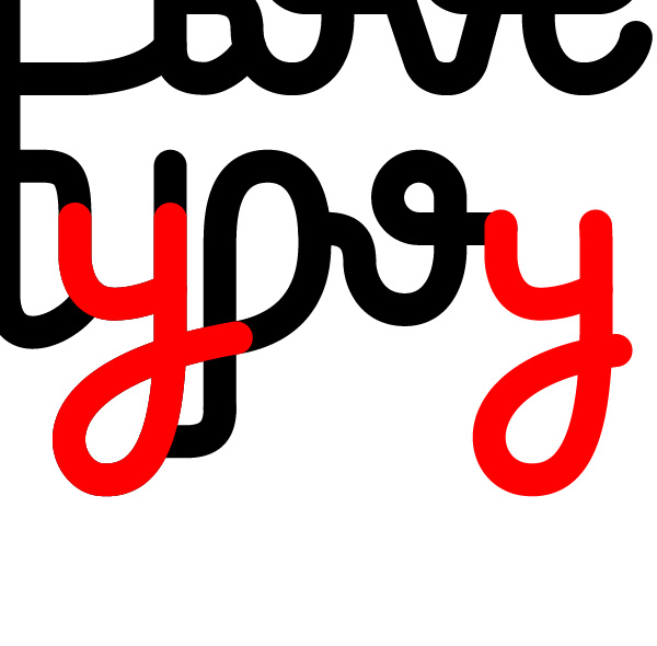
Step 41
Finish off the bowl by duplicating the top from the “p.”
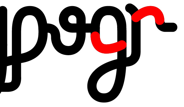
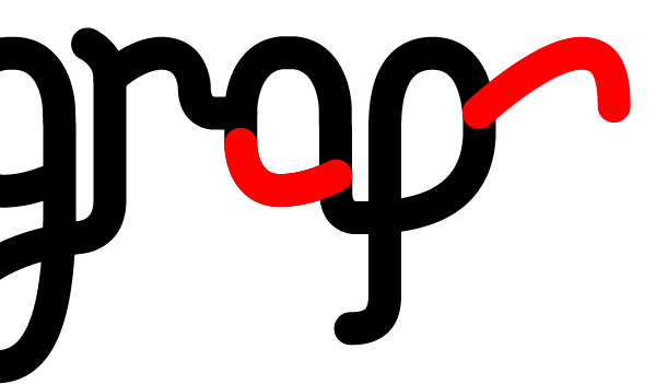
Step 42
I used the end of the “p” in the “r,” but their anchors have been slightly modified.
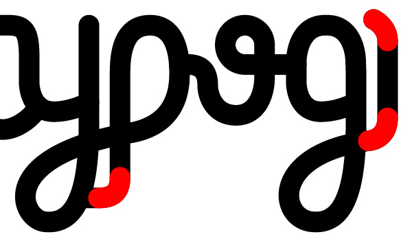
Step 43
I initially went for a cursive letter “r,” but the large weight of the font made that too difficult to construct. As long as you keep the shoulder of the “r” not too low, it should be perceivable from a letter “n.”
Step 44
The “a” is another simple fix. duplicate the bowl from the letter “g.”
Step 45
Copy and paste the “p” in its proper position
Step 46
The shoulder of the “h” is another case where I used an already created portion but modified it. Move one side further out, but remember to increase the scale of the arch as well, otherwise it will look skewed.
Step 47
Complete the ‘h’ by reusing the “l.”
Step 48
And finally, add the letter “y” found near the beginning of the word.
Final Image
That’s it for this part! Stick around for part 2, when we turn this endless string into a colorful type treatment.
サイト内検索
イラストレータの勉強
グラデーションと分割 図形と合流・型抜き ロゴマークの作成 テキスト落書き VECTIPS Logo Vectortuts Logo 水滴の作り方 WATER グラデーション背景 竹 リボン 薬カプセル かぼちゃ 緑の玉 亀さん 気球 花びら つやのある球 ロゴ vectips ロゴ Zee ロゴ 風船 ロゴ UPWARD ロゴ ZERO ロゴ VECTORS ロゴ VECTORSその2 ロゴ WOOF ロゴ Don't Break ロゴ Smooth ロゴ VECTORSその3 ロゴ VECTORSその4 ロゴ VECTORSその5 ロゴ VECTORSその6 ロゴ VECTORSその7 ロゴ VECTORSその8 ロゴ VECTTIPSその1 ロゴ VECTTIPS その2 ロゴ VECTTIPS その3 ロゴ VECTTIPS その4 ロゴ VECTTIPS その5 ロゴ VECTORSその8 ロゴ VECTORSその9 ロゴ VECTTIPS その6 ロゴ ROMERO WEEK ロゴ VECTORSその10 ロゴ ECLIPS ロゴ ROCKEY ロゴ VECTORSその11 ロゴ VECTORSその12 ロゴ Tutorial Shock ロゴ VECTORSその13 ロゴ VECTORSTUTS ロゴ ARCADE LOVE ロゴ Zeeその2 ロゴ VECTORS PUFFS イラスト1 イラスト2 イラスト3 イラスト4 イラスト5 イラスト6 夜空 3D ロゴ 葉と水玉とテントウムシ イラスト10 イラストカーテン イラスト木目 イラスト 幻想 イラスト メッシュの葉 イラスト 靴 イラスト 家 イラスト9 イラストレータ フォトショップ イラストレータV10の使い方デザインの勉強
デザインの基礎 AIRに挑戦 AOBADAIに挑戦 DOWNFALLに挑戦 フレームに挑戦 BOXグラフに挑戦 LUCKに挑戦 オレンジに挑戦 リングに挑戦 STORMに挑戦テキストにチャレンジ
カタカナ入力 七夕様 相田みつをの世界 誕生石 誕生石と誕生花 フランスの国旗 ドイツの国旗 イタリアの国旗 日本の国旗 ロシアの国旗 シャガール 犬のおまわりさん 拡張子 メニュー パン 世界の国旗 気になる言葉2 気になる言葉3 大きな古時計 オリエント急行 お料理教室 おしながき パソコン専門用語 地図・・・PC検定 メニュー 紅茶 特殊文字 占いいろいろ ウォルトディズニー 全館停電 ひまわり図鑑 ゆり図鑑 テキスト 初級 テキスト 中級① テキスト 中級② テキスト 上級① テキスト 上級② アロマセラピー講座1 あなたと薬 アロマセラピー講座2 オーストラリアの動物 美人が作るレシピ ブログ お料理知恵袋 ゆば ドトールコーヒー物語 地震 円の国際化 福原 愛 振り込め詐欺 楽しいガーデニング ガーリック クリップアートの色を 埼玉の観光 山梨の観光 ゴールデンウィーク はがきで挨拶 敗戦の時 阪神タイガース ハワイに行こう ヒアルロン酸 肥満の知識 ほくろがガンに要注意 今すぐトライ インターネットで調べよう ITニュース 日本のお茶 時代を切り開いた女性1 時代を切り開いた女性2 地獄めぐり 時間割 スポーツの審判 花粉症 段落番号の設定 神奈川県 漢文とは中国語か? 阪神タイガース 漢字の偏見 関節痛 ゴールデンウィーク 簡単お弁当レシピ キーボード 国民年金 暮らしを楽しく 草花図鑑その1 草花図鑑その2 行頭文字の設定 段落番号の設定 主な国際機構 浅田真央のプロファイル 数学図形の問題1 パソコンについて 中原中也 オーガニックコットン1 オーガニックコットン2 落ち葉の森 お大事に 奥の細道 ページ番号の設定 埼玉の観光 ラーメン博物館 レシピ1 レシピ2 連絡網 履歴書 竜宮城 竜宮城バザー 世界の気候 脂肪を燃やせ 資格 四季折々の野菜 春 四季折々の野菜 冬 下町で 食品の分類 生涯学習 生姜と豚肉 四季の折々野菜(春) 四季折々の野菜 秋 四季の野菜 春 下町で遊ぼう そばの献立 サッカー世界標準 スターバックス すだちとかぼす スーパーサッカー 数学の問題2 体内チェック 寅さんシリーズ1 寅さんシリーズ2 寅さんシリーズ3 寅さんシリーズ4 海から吹く風 横浜ベースターズ 郵便払込み 湯河原独歩の湯 ゆかた祭り模写は意外と簡単
大黒様 着物の柄 富岳百景 ベートーベン オペラ座 ミニー ゴメン 母の日 ドラゴンボール 潮干狩りパソコン教室
パソコン教室の特徴 会員の最大の特典は? パソコン教室の会員の種類 すべて個人指導で、解りやすく 出張!パソコン家庭教師 追加受講する場合 日曜教室、始めました パソコン教室の料金体系何を学ぶか?
どんなサービスか? 学べるソフト一覧 ホームページを作ろう パワーポイントを勉強しよう 模写の勉強 デザインの基礎 ビデオの編集をやってみよう。